

Lawrence & Co: Brand Refresh & System Design
Lawrence & Co (L&Co) is a coaching agency for entrepreneurial & mid-market companies, known for a direct, no-nonsense approach to growth strategy. The goal was to refresh their identity so the visuals matched the clarity & confidence of their voice.
Client: Lawrence & Co (L&Co)
Role: Lead Visual Designer
Deliverables: Logo redesign, brand system, visual guidelines, marketing asset templates.
Timeline: 5 Months.
Brief
Refresh the brand identity for Lawrence & Co to better reflect their simplicity, impact & straightforward approach.
Objective
Design a confident, versatile identity system that reflects L&Co’s simplicity and strategic thinking - while giving internal teams strength and consistency in execution.
Challenge
L&Co’s previous visual identity didn’t match their strategic voice. The brand needed to feel clear, bold & refined, but without losing authenticity. It also had to work well in everyday use - including by teams without design experience - across decks, documents, social & web.
Understanding the Brand Voice
Early conversations made it clear what mattered: “Simple. Impactful. No BS. No fluff.” Those words became the guiding principles.
I created two design routes for the client to chose from each with strengths.
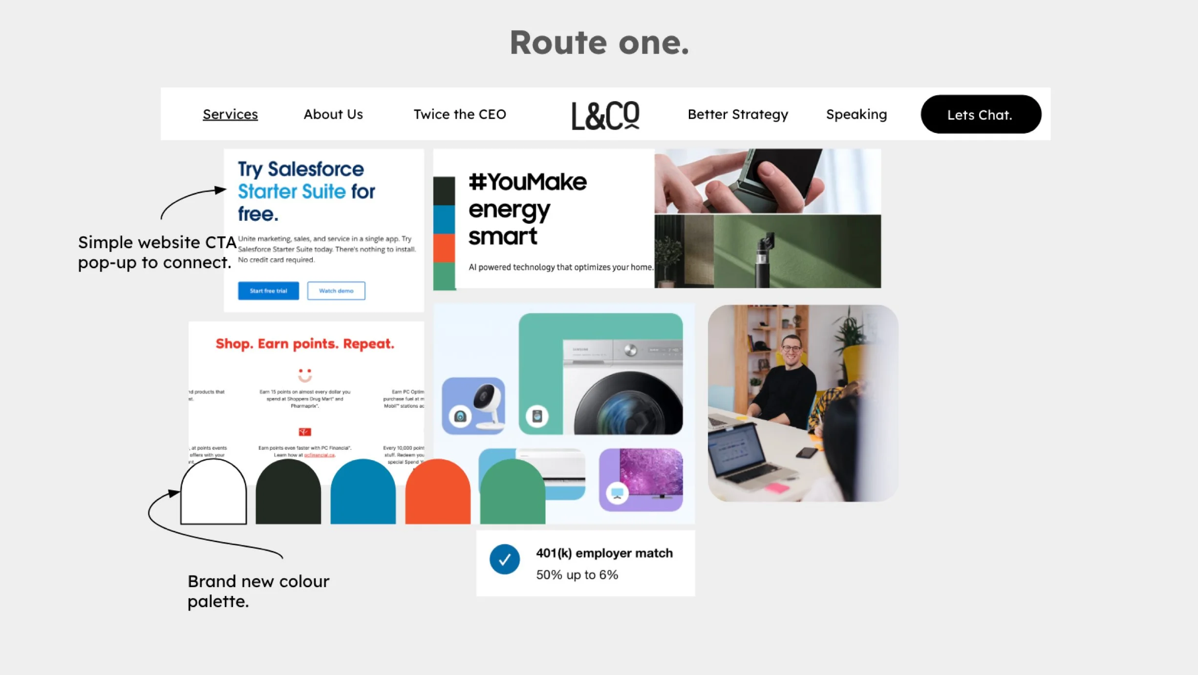
Direction 1: Structured & Confident
This direction balanced strong colours, clear hierarchy, & purposeful typography. It emphasised clarity & presence without unnecessary detail - mirroring the brand’s strategic simplicity.
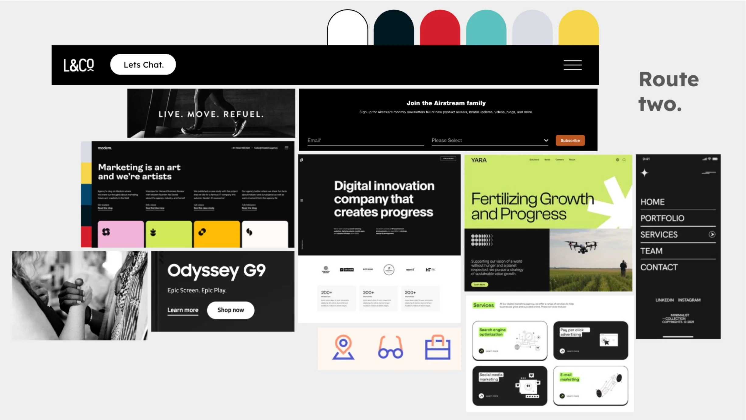
Direction 2: More black space
A classic & impactful black & bold theme following the same principles as Direction 1.
After evaluation & client review, the Structured & Confident direction was selected: offering the right balance of clarity & authority.
Instead of adding more, we focused on removing everything unnecessary. Visuals were stripped back, hierarchy was sharpened, & structure became a tool for clarity, not just decoration.
Refresh
Logo Exploration
The logo exploration was about finding a mark that feels confident & grounded, without being loud. Iterations leaned into simplicity & presence, removing visual fluff & making sure the mark could scale across contexts with ease.
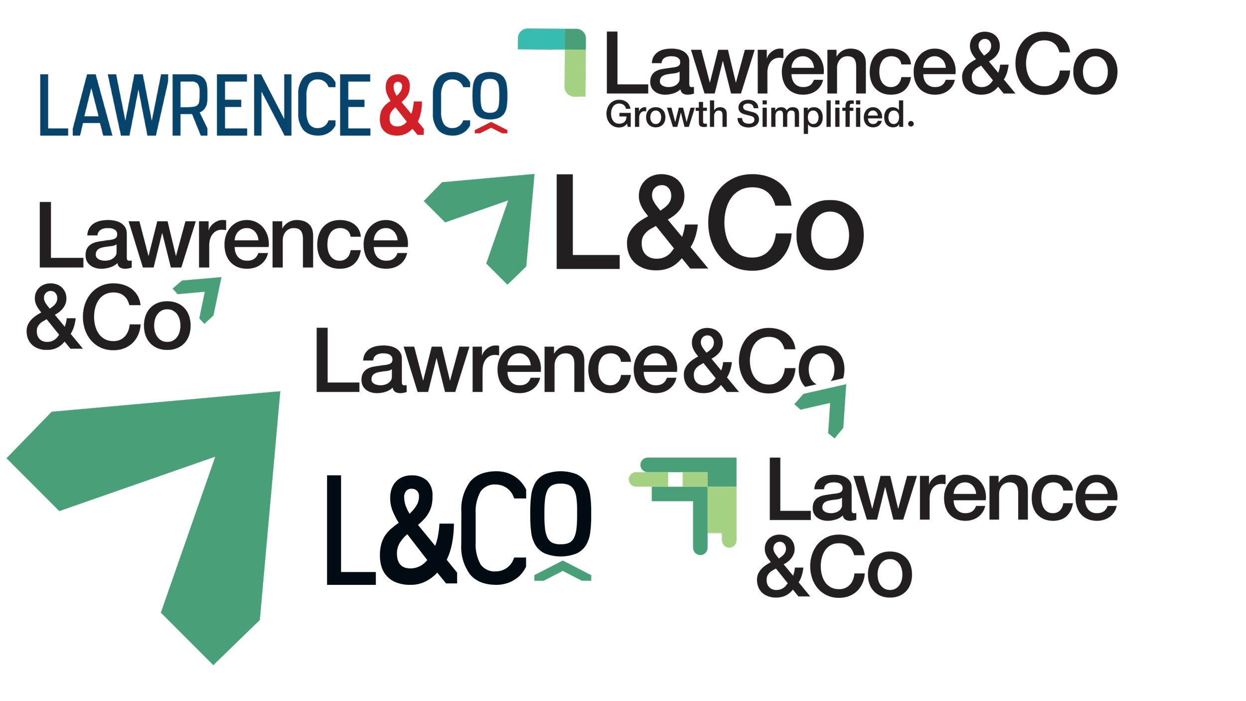
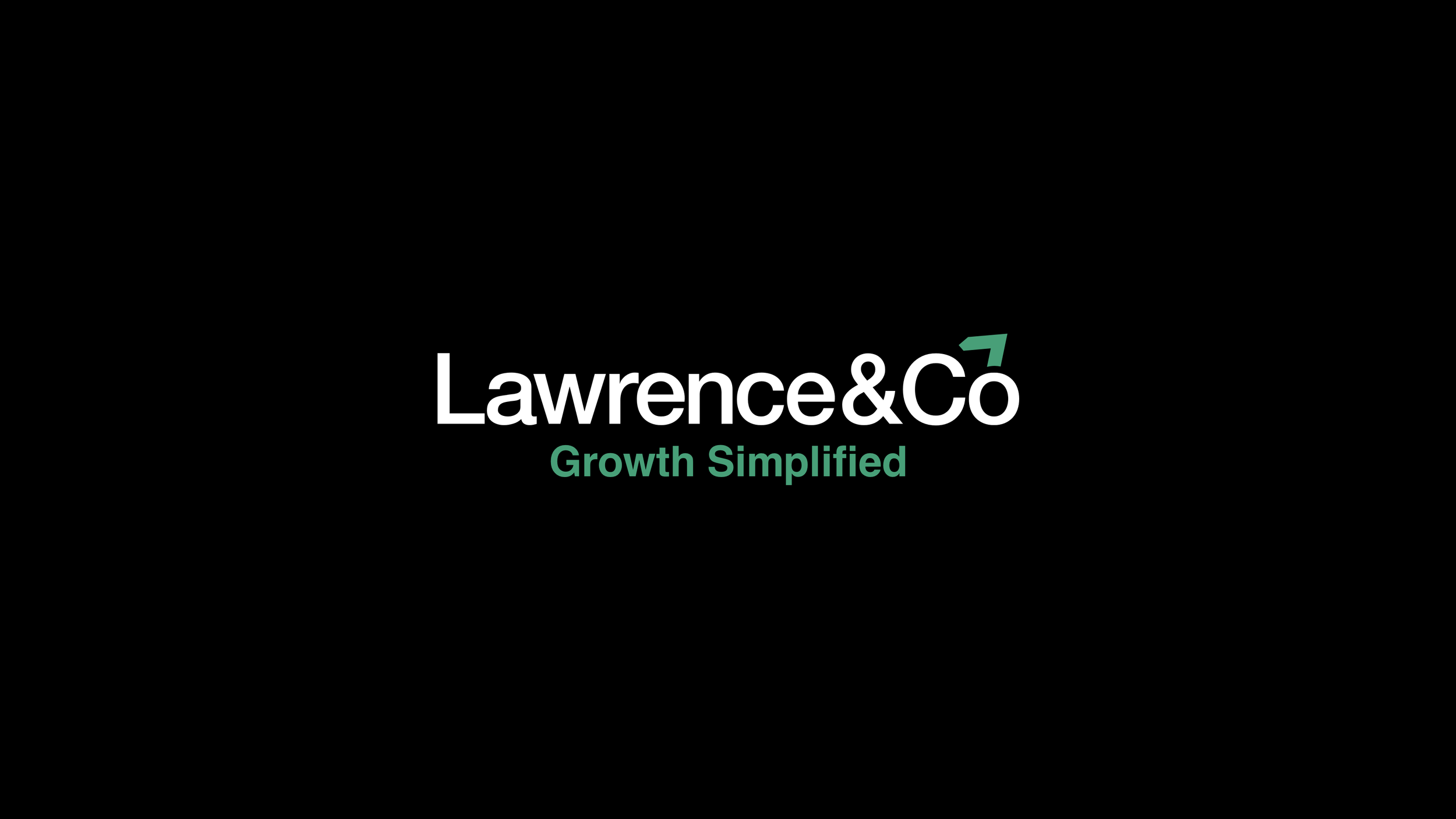
The final logo uses a strong, structured form that suggests direction & momentum - a subtle nod to Simplified Growth.
Brand System Development
With the logo in place, attention turned to building a practical system:
A refined colour palette that feels confident without being aggressive
Clear typographic hierarchy for readability & structure
Rules for layout & whitespace that prioritise clarity over decoration
Pattern & graphic elements that add voice without clutter
The aim was never to be flashy - it was to make the brand feel purposeful & usable, on purpose.
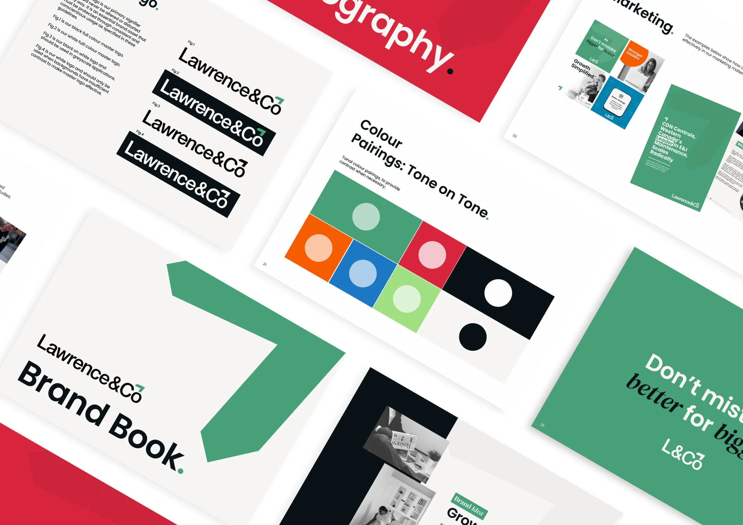
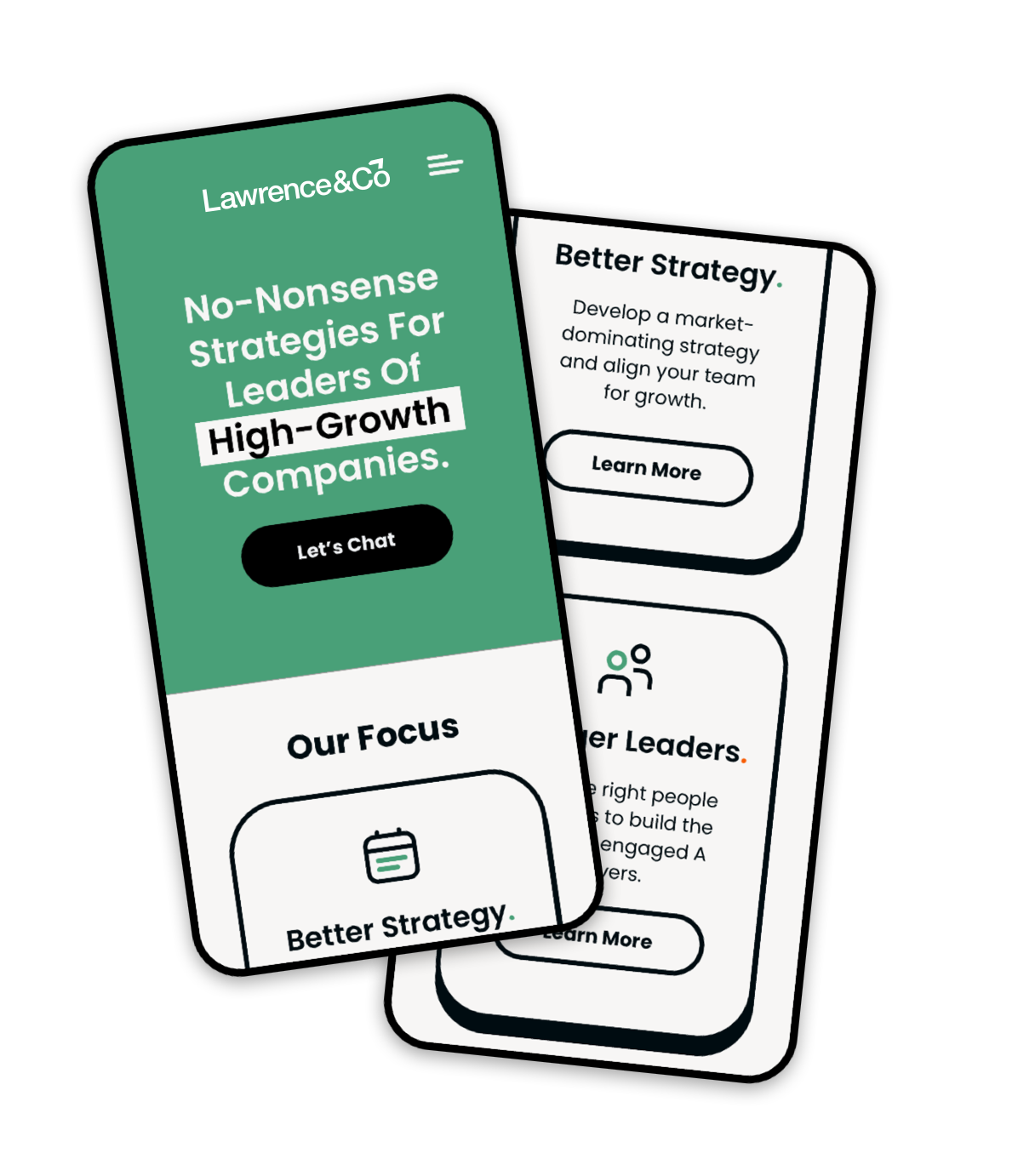
Marketing & Collateral
Once the system was defined, it was applied across core touchpoints:
Pitch deck templates that feel structured, confident & easy to update
Proposal layouts that look professional, not generic
Social graphics with a consistent visual logic
Case study & white paper layouts that let content lead
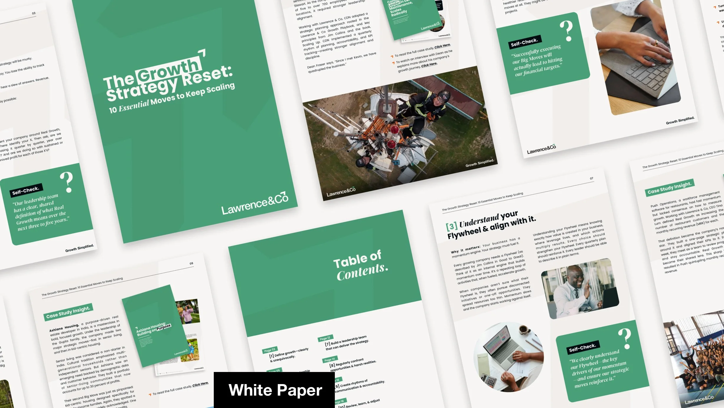
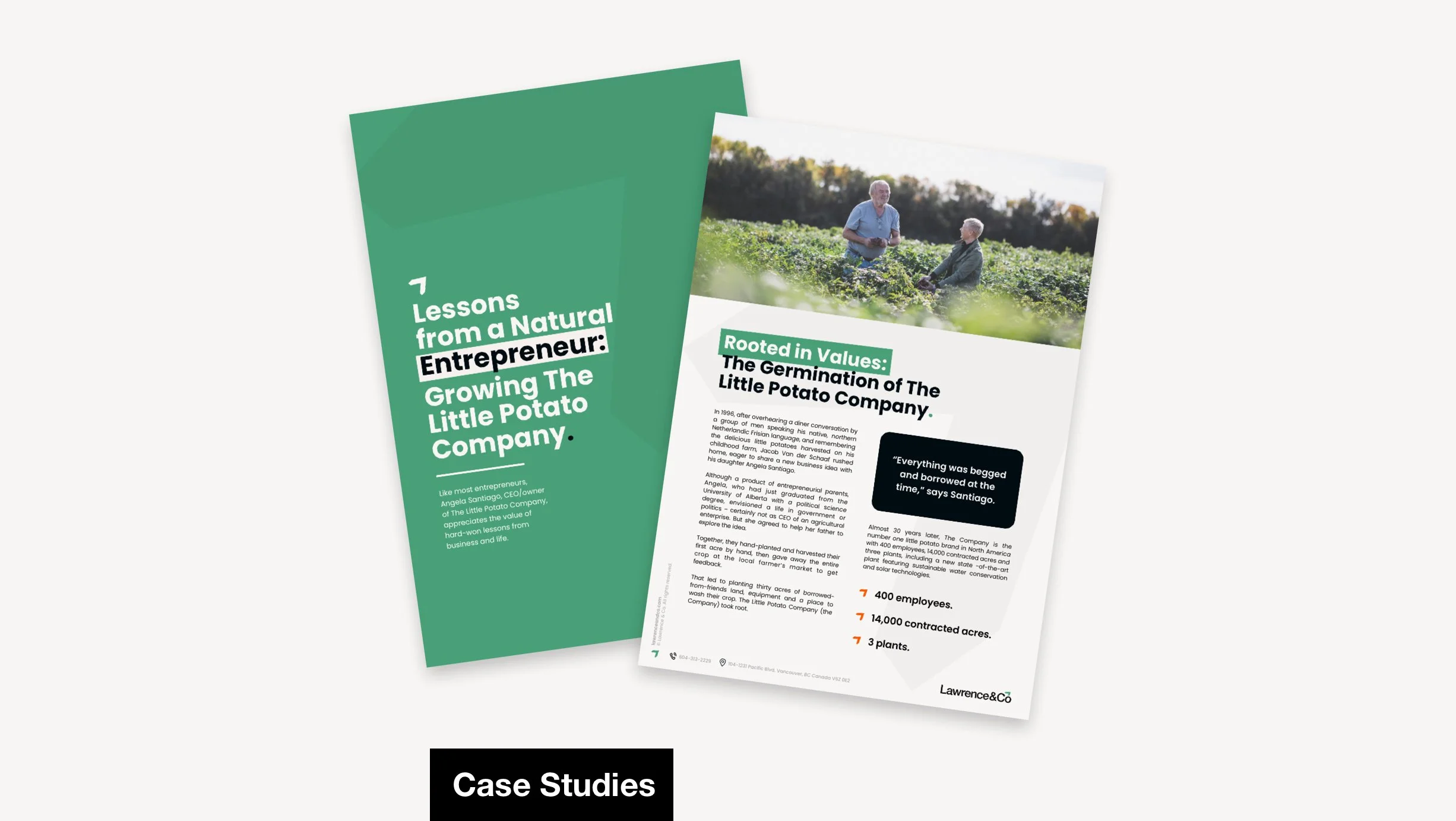
Each asset was designed to make the brand look intentional without overdesigning for the sake of it.
The refreshed visual system gives Lawrence & Co a stronger, more consistent brand presence. It now feels strategic, refined & ready to support real business communication. Teams can use it without guessing, & it holds up across formats without needing constant firefighting.
Rather than just looking better, the identity now works better. It provides clarity for internal use, reduces design guesswork, & gives the brand a visual voice that’s aligned with its no-nonsense philosophy. The brand isn’t just seen as more confident - it feels more coherent everywhere it appears.
Outcome & Impact
This project reinforced how far simplicity can carry a brand. When the visual system truly reflects the values everyone talks about in meetings - in this case, clarity, structure & honesty - it becomes more than just logos & colours. It becomes a tool for confidence, not just decoration.
Reflection
“We have worked with Josh on several projects & he always brings great work, ideas & collaboration. I would not hesitate to recommend Josh to anyone looking for a great designer. He’s fantastic”