

AEQ: Brand Refresh & Visual System Design
Refreshing the identity of a digital consulting company based in Vancouver, Canada - to communicate modernity, confidence, & strategic balance.
Client: Aequilibrium (AEQ)
Role: Lead Visual Designer
Deliverables: Brand identity refresh, iconography, gradients & visual elements, web design support, marketing asset system.
Brief
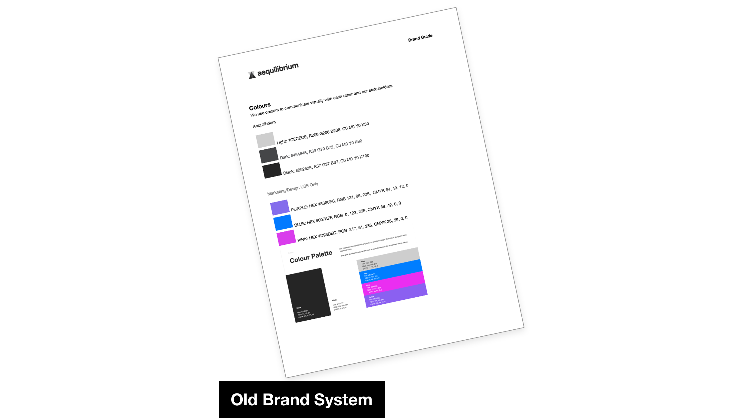
Aequilibrium (AEQ) is a digital consulting company specialising in VR training & digital banking solutions. While the company had a strong market position, it’s visual identity lacked distinctiveness & energy - especially in a competitive tech & consulting landscape.
I was tasked with revitalising the brand’s identity & visual language to create a cohesive system that expressed both strategic balance & modern vitality across digital & print mediums.
Objective
Design a refreshed brand system that needed to feel modern & distinctive without losing professionalism, aligning with AEQ’s positioning.
Challenge
AEQ’s previous style was uninspired & inconsistent - making it harder for the brand to stand out in innovation-driven sectors like VR & FinTech.
The design had to:
Communicate balance - a core brand concept
Translate across multiple formats (digital, social, print)
Support both strategic communication (whitepapers, decks) & brand personality (website, social presence)
Strategic Visual Approach
AEQ is built on the idea of balance - a concept we used as the foundation for the entire visual refresh. Rather than applying a superficial redesign, I translated this principle into a visual logic that guided key design decisions.
Visual Strategy Highlights
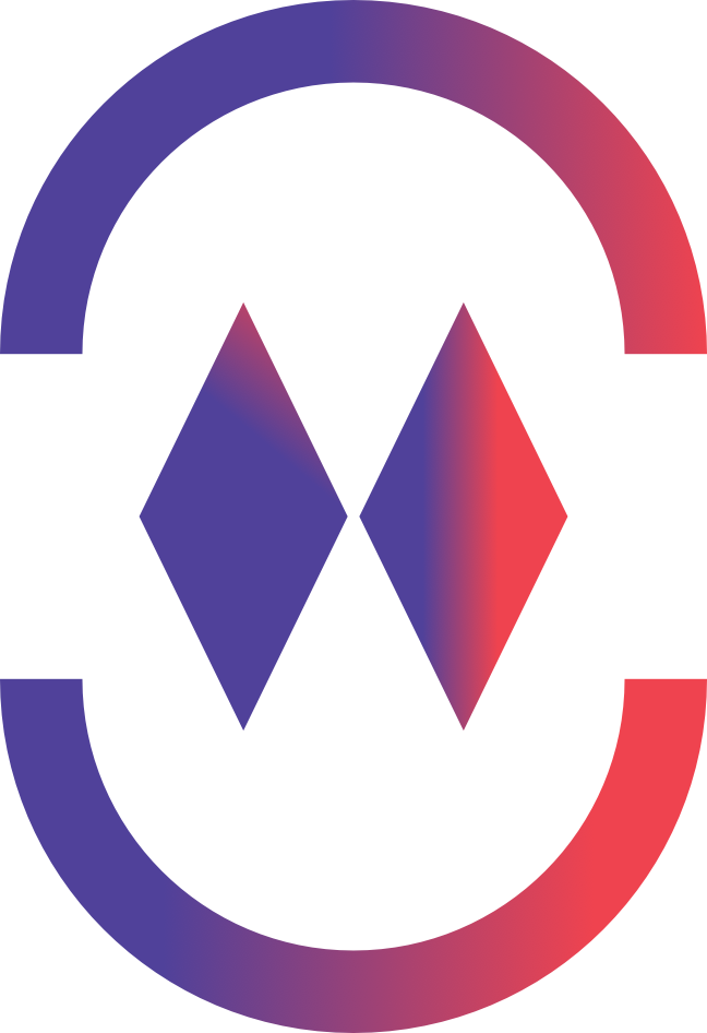
Shapes & Geometry: Introduced balanced forms to communicate structure & stability, reflecting the new logo.
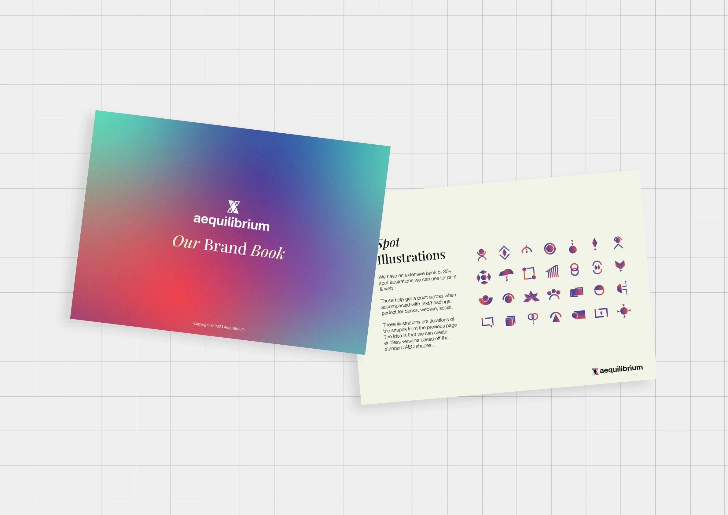
Iconography: Developed bespoke icons with balanced visual weight to support meaning & navigation.
Colour & Gradients: Adopted a more vibrant palette & dynamic gradients to bring energy while retaining clarity & professionalism.
Tone of Voice: Evolved copy and messaging style to feel modern, confident, and user-focused.
These visual decisions ensured the brand system was expressive & consistent across assets, enhancing meaning rather than distracting from it.
Re-branding
Brand System & Identity Components
Once the core direction was agreed, I defined a robust brand system including:
Colour palette & gradients: Built for flexibility & personality across media
Typography hierarchy: Balanced to ensure readability & brand consistency
Illustrative elements: Bespoke iconography & shapes reflecting strategic balance
Usage guidelines: Clear do’s & don’ts for applying brand elements across channels
This system functions as a toolkit for both design and non-design teams, allowing AEQ to maintain quality and consistency whether producing web assets, pitch decks, or white papers.
Design Applications
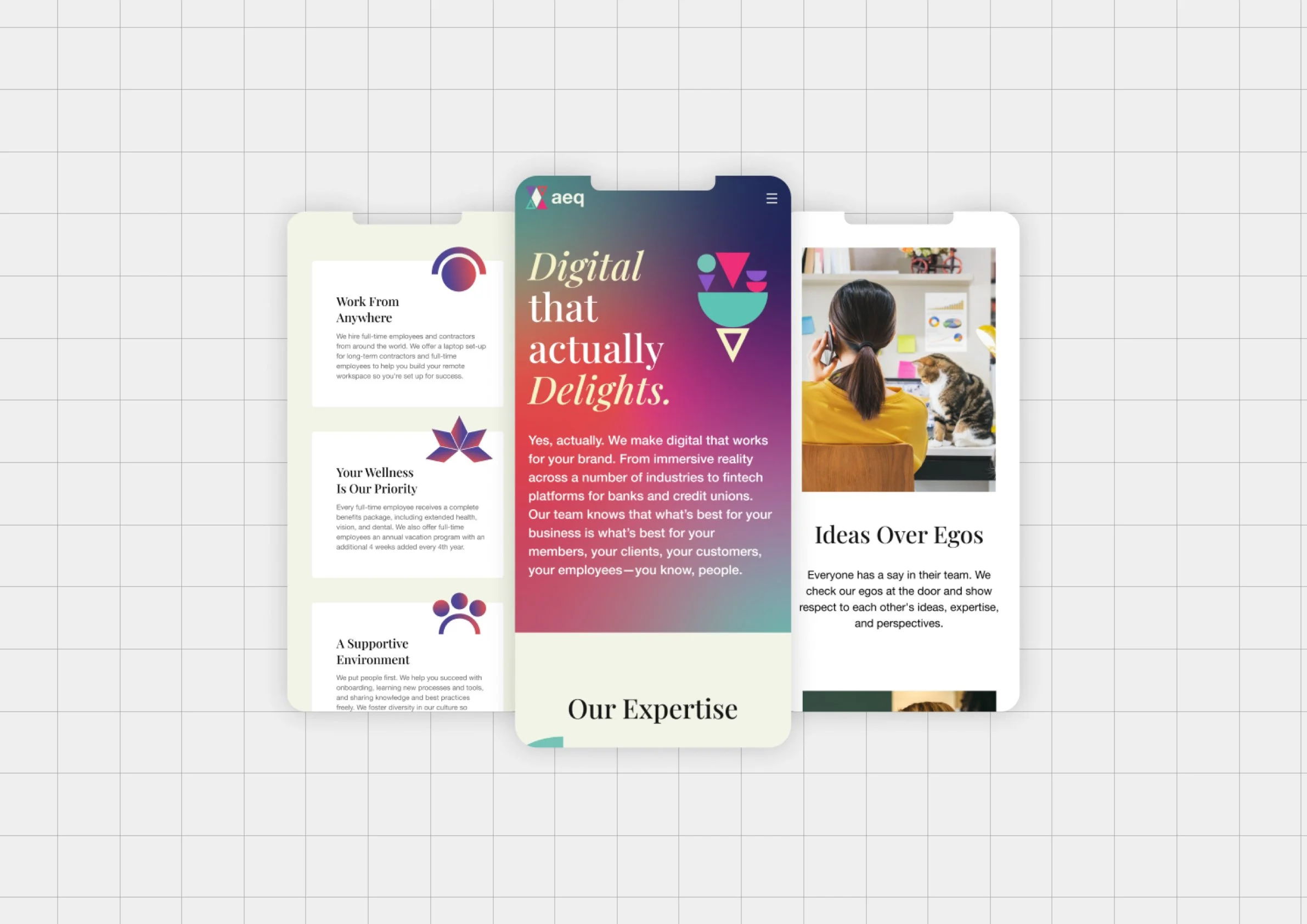
We applied the new visual system to the website through high-fidelity mockups and visual direction - incorporating new brand colours, gradients, & icons while elevating the site’s visual clarity & nav flow.
Web Interface & Visual Assets
Traditional AEQ materials like white papers & 1-pagers were redesigned to feel modern & engaging, using visual hierarchy & balanced layout systems to highlight insights without overwhelming the reader.
Marketing & Print Materials
These applications made AEQ’s communications both more dynamic & more coherent - increasing visual interest & strategic clarity.
The updated AEQ brand system achieved:
A fresh, modern visual identity that clearly distinguishes AEQ from competitors
A balanced design language that embodies the company’s core principles
A versatile system supporting both internal & external communications across formats
The new identity not only feels more cohesive and confident, but also gives AEQ a visual platform that scales as the business grows - making it easier to produce branded assets that feel on strategy and polished.
Outcome & Impact
Reflection
This project reinforced the value of grounding visual systems in a strategic core idea - in this case, balance. When visual choice flows from meaning, the resulting design feels intentional rather than decorative.
“I’ve had the chance to work with Josh on a few occasions & each time I am impressed with his thoughtful design, great demeanour & great communication.”