

Moss & Adams: Brand Identity & Website Design
Moss & Adams is an affordable British hand soap brand inspired by the landscapes & fragrances of the UK countryside. The aim of the project was to make the brand feel premium, without losing its everyday, accessible nature.
Client: Moss & Adams
Role: Lead Visual Designer
Deliverables: Brand system, website design, social design & print.
Brief
Create a brand identity & website for an affordable hand soap brand that feels considered & premium.
Objective
Create a brand that:
Raises the perceived value of the brand
Create a visual language rooted in the British countryside
Translate fragrance notes & place into a digital experience
Challenge
The UK hand soap market is crowded & visually noisy. Many brands rely on bold colours and generic layouts. Moss & Adams needed to stand out in a quieter way, feeling premium through detail & restraint rather than price or luxury cues.
Approach
Because the fragrances are inspired by English countryside locations, I wanted the brand to feel personal & nostalgic - almost like a scrapbook.
Polaroid-style photography was used to capture the places behind each scent, while hand-drawn illustrations reference individual fragrance notes. Grain, texture & a muted colour palette help give the brand a sense of memory & place, making it feel crafted rather than manufactured.
Refresh
Web Design
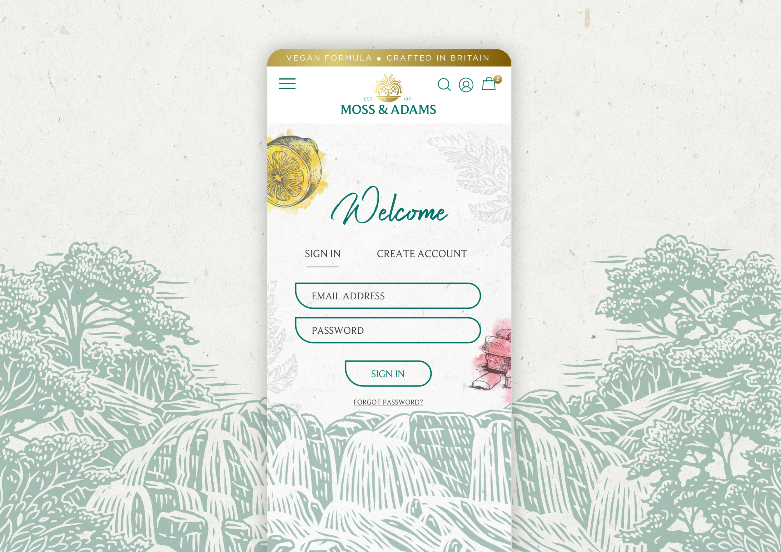
The website brings the scrapbook idea to life online. Layouts are intentionally loose, with space to let imagery & illustrations breathe.
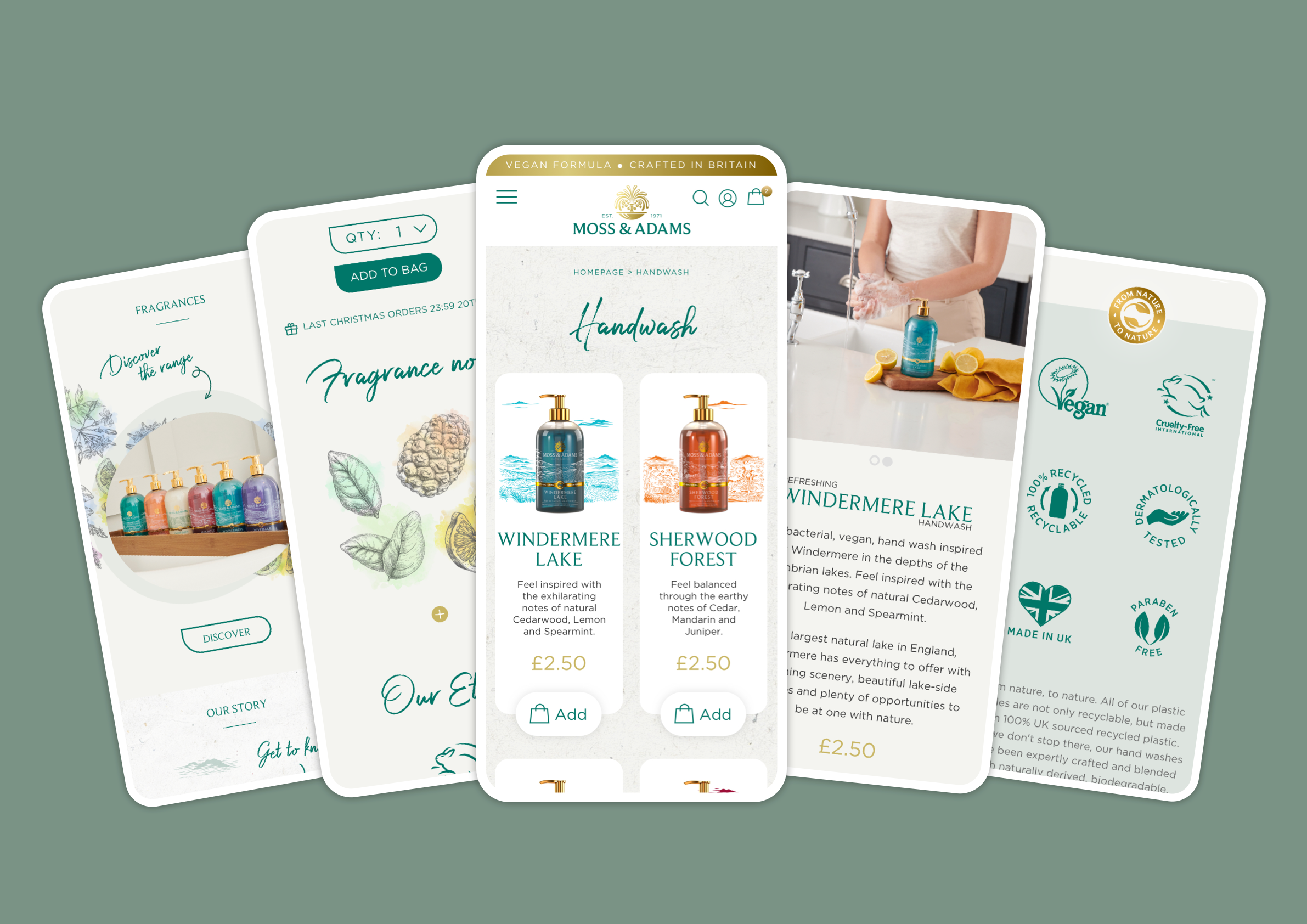
Hand-drawn details reinforce the countryside influence, making the fragrance notes of the products shine.
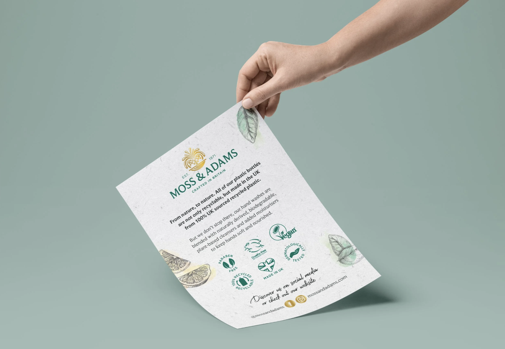
Print assets were kept minimal & tactile, using texture & illustration to extend the scrapbook aesthetic offline. This helped the brand feel more physical & crafted, even outside of the digital space.
Social Media
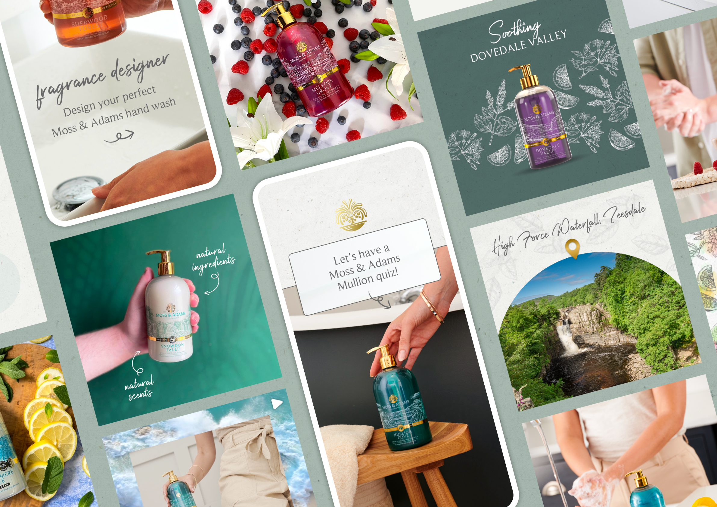
Social content follows the same approach as the website. Scenic imagery, a grounding colour palette & simple compositions help maintain a premium feel, while illustrations & textures help convey a warm & familiar feeling.
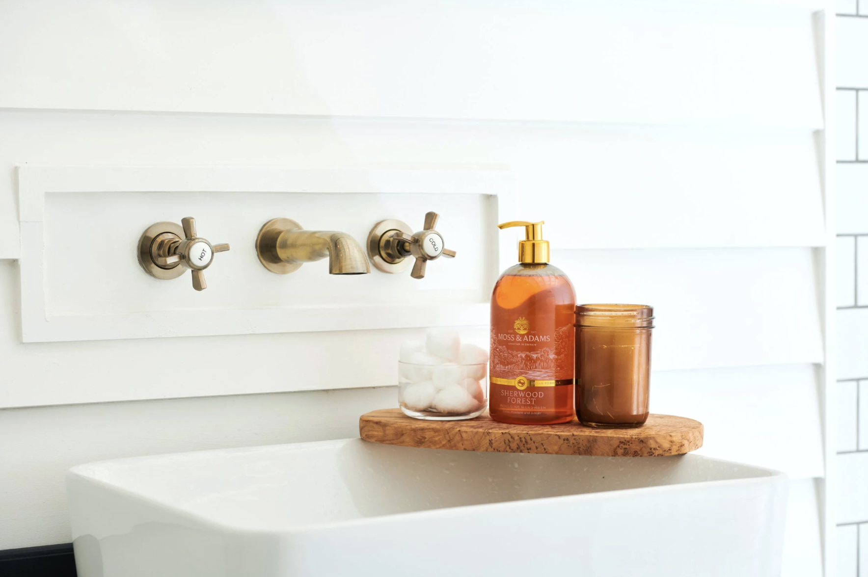
Photoshoot
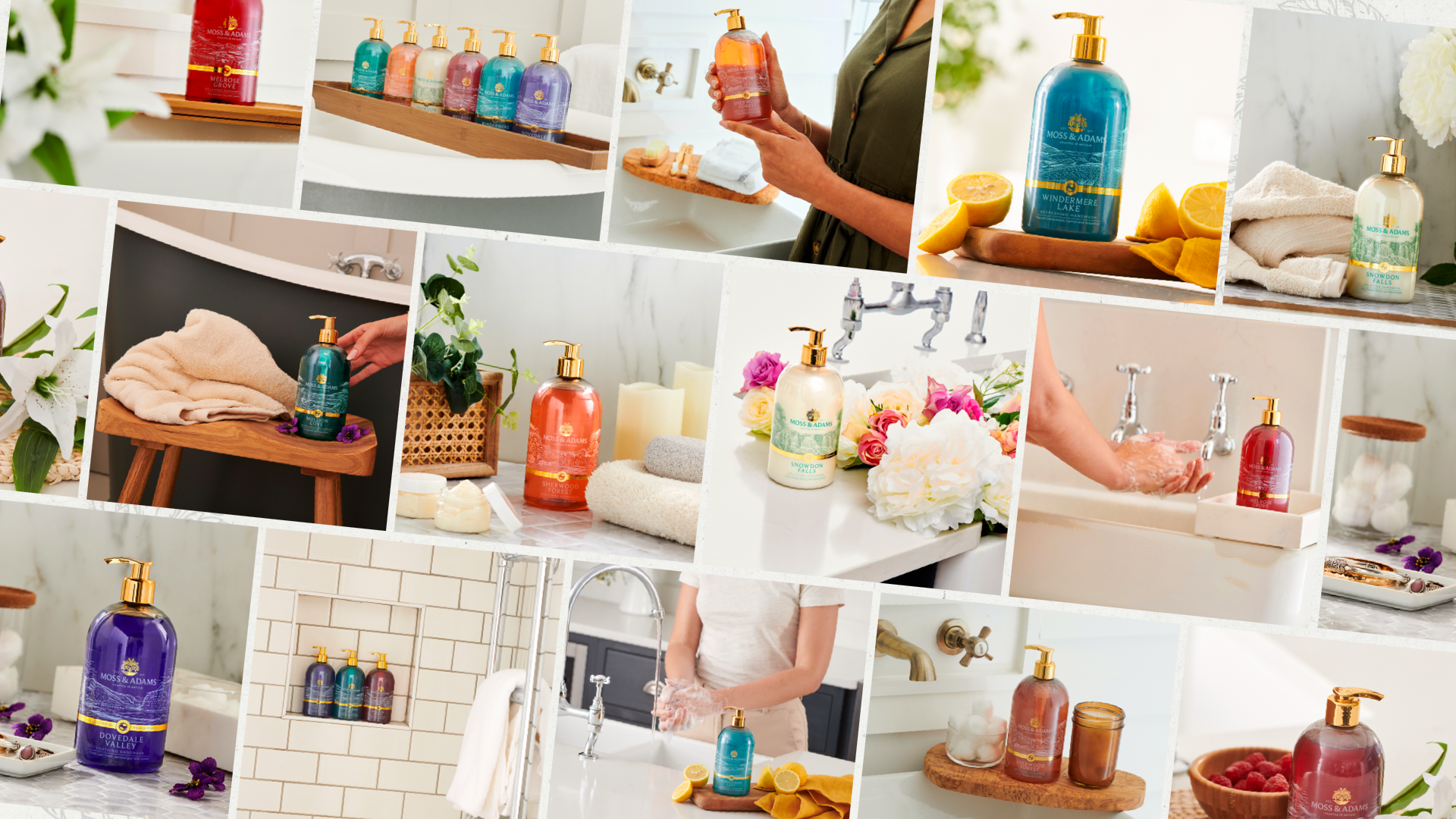
I art-directed a photoshoot focused on natural light & honest compositions. The goal was to capture the luxe bottle illustrations & how they fit seamlessly in home locations/everyday use.
Outcome & Impact
The final outcome is a cohesive brand system & website that successfully elevate the perception of Moss & Adams while keeping it approachable. The brand feels calm, considered & distinctive within a crowded category.
The project created a strong foundation for Moss & Adams to grow. The scrapbook-inspired system allows the brand to tell richer stories around fragrance & place, while remaining flexible enough to adapt across future products & campaigns.
Reflection
This project highlighted how much atmosphere & emotion can be created through small design decisions. Working with texture, illustration & photography allowed the brand to feel premium without over-designing.