


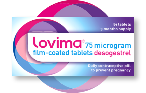
Lovima is a daily contraceptive pill that women in the UK can now buy without having to see a doctor first. It puts real choice & convenience into women’s hands, helping them make confident decisions about their health.
I was brought on to design the main Lovima consumer website, plus a connected Healthcare Professional (HCP) portal, all rooted in an already established brand system. I also created exploratory marketing assets - like social, print, & billboard visuals - to show the client where the brand could go beyond the core website.
Lovima: Website Design
Client: Lovima
Role: Lead Visual Designer
Deliverables: Website design, advertising design: social concepts, print & OOH mockups.
Timeline: 3 Months
Brief
Design a digital experience that makes Lovima feel trustworthy, clear, & empowering - because this is a highly personal product & users need to feel confident & informed.
Also design a secondary HCP portal that sits in the main site’s navigation & gives pharmacists & clinicians access to training materials & professional resources.
Objective
Make a sensitive healthcare product feel approachable without being clinical.
Guide users smoothly through understanding the product & how to purchase it.
Translate the existing visual brand system into a cohesive online experience.
Provide a professional hub for healthcare providers with clear, practical resources.
Challenge
Lovima is one of the first contraceptive pills in the UK available without a prescription, so the main site had to balance credibility with approachability. It needed to rid confusion & help users make informed decisions without overwhelming them.
At the same time, the HCP portal needed to feel like an extension of the Lovima brand - consistent in tone & look - but tailored for a very different audience: pharmacists & healthcare professionals seeking training, product information & clinical guidance.
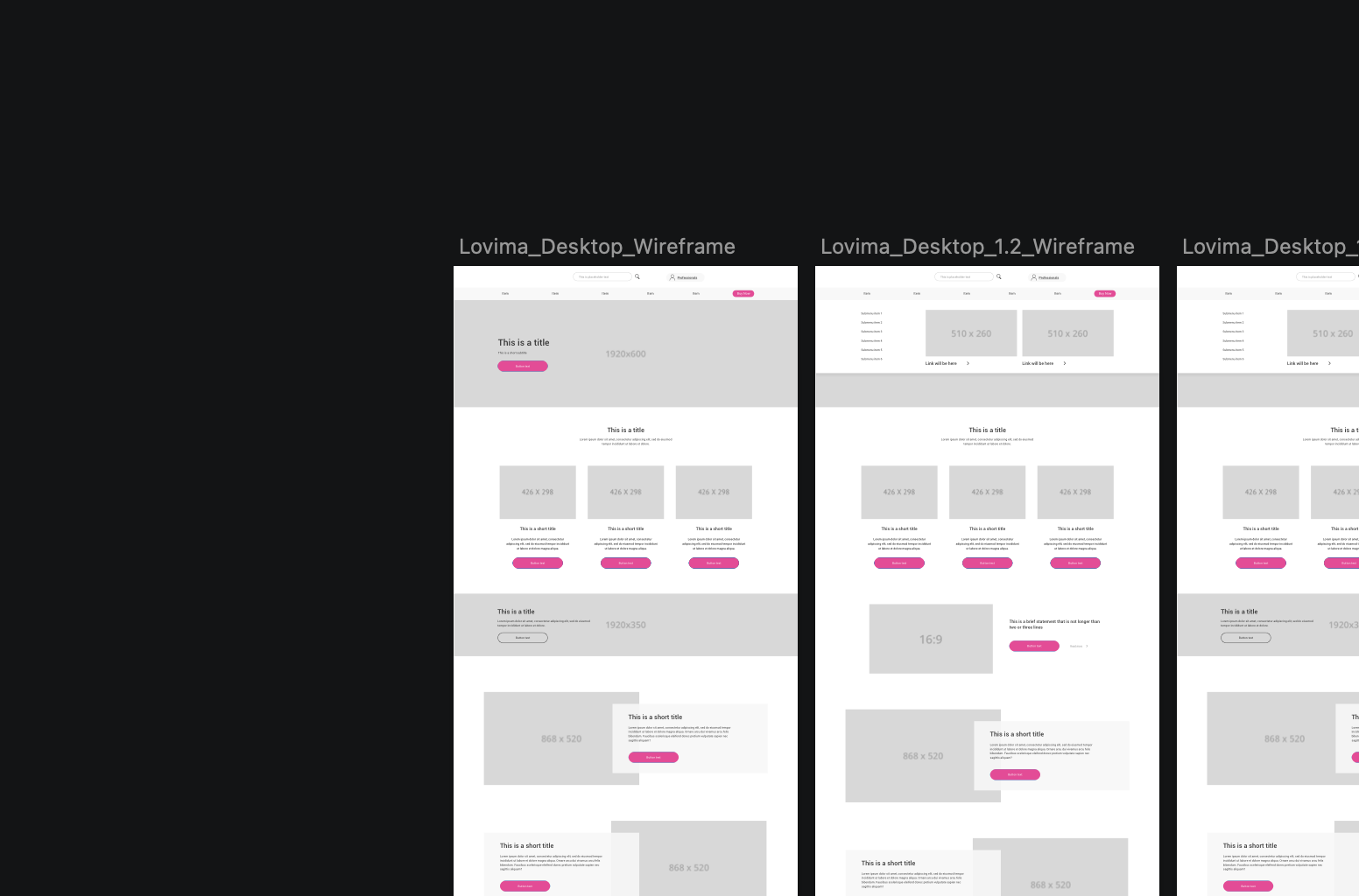
Wireframing
Before moving into visual design, I created wireframes for both mobile & desktop across the main Lovima website & the HCP portal.
I mapped out page layouts, content hierarchy & key user journeys to make sure information was easy to find & flows felt intuitive.
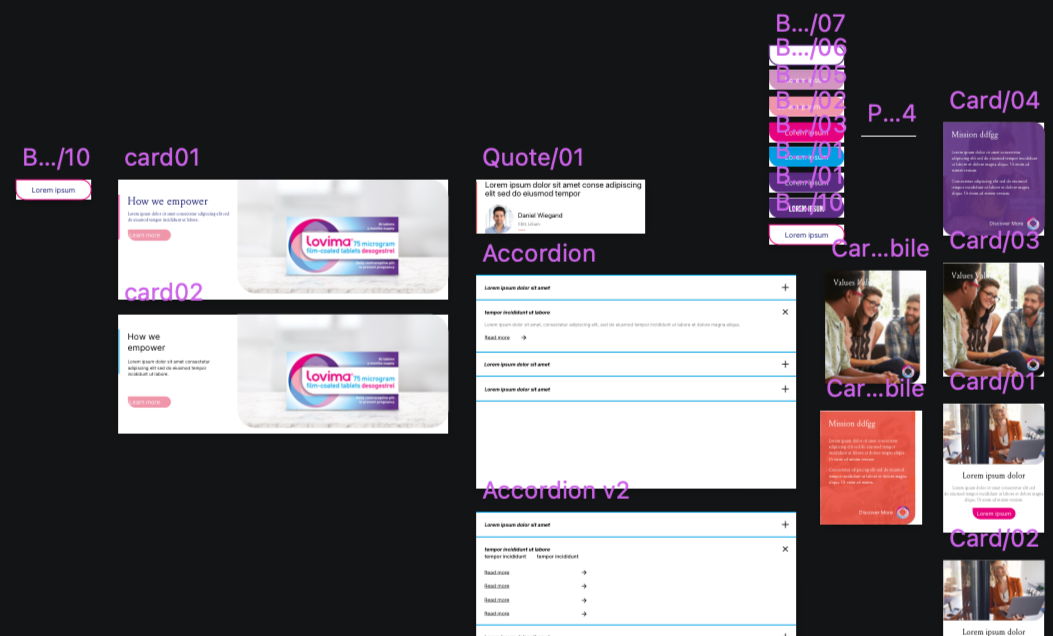
Pattern Library & Components
I built a pattern library in Sketch to support consistency across both the main Lovima website & the HCP portal.
This included core UI elements such as buttons, navigation styles, form elements & reusable page modules.
Design Approach
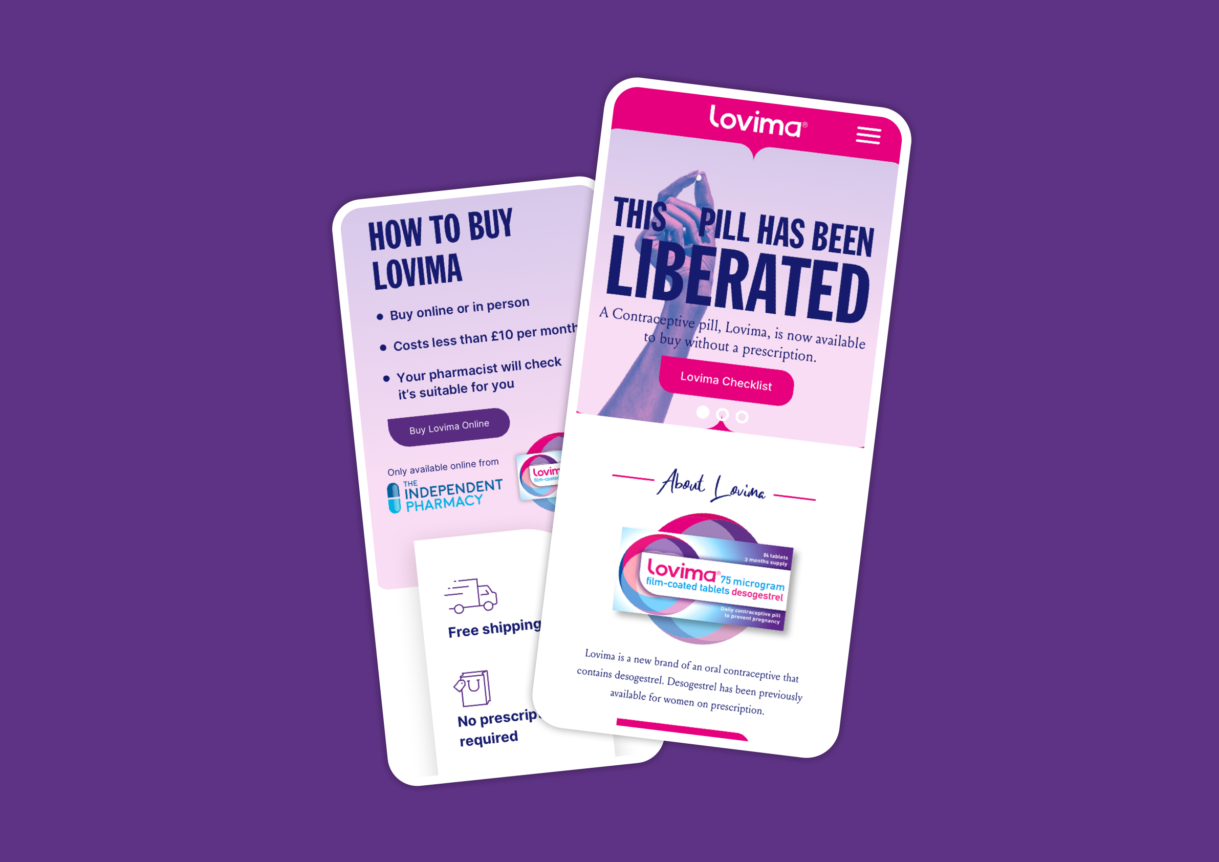
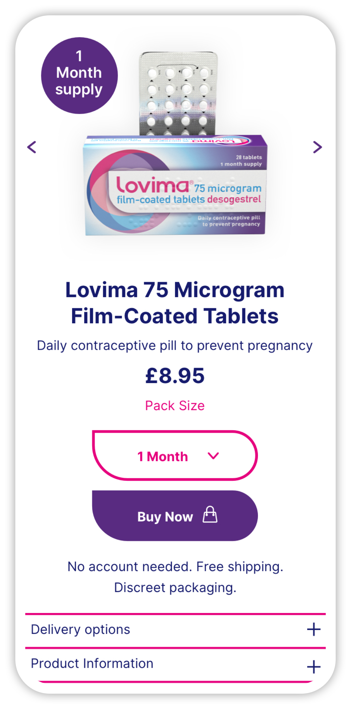
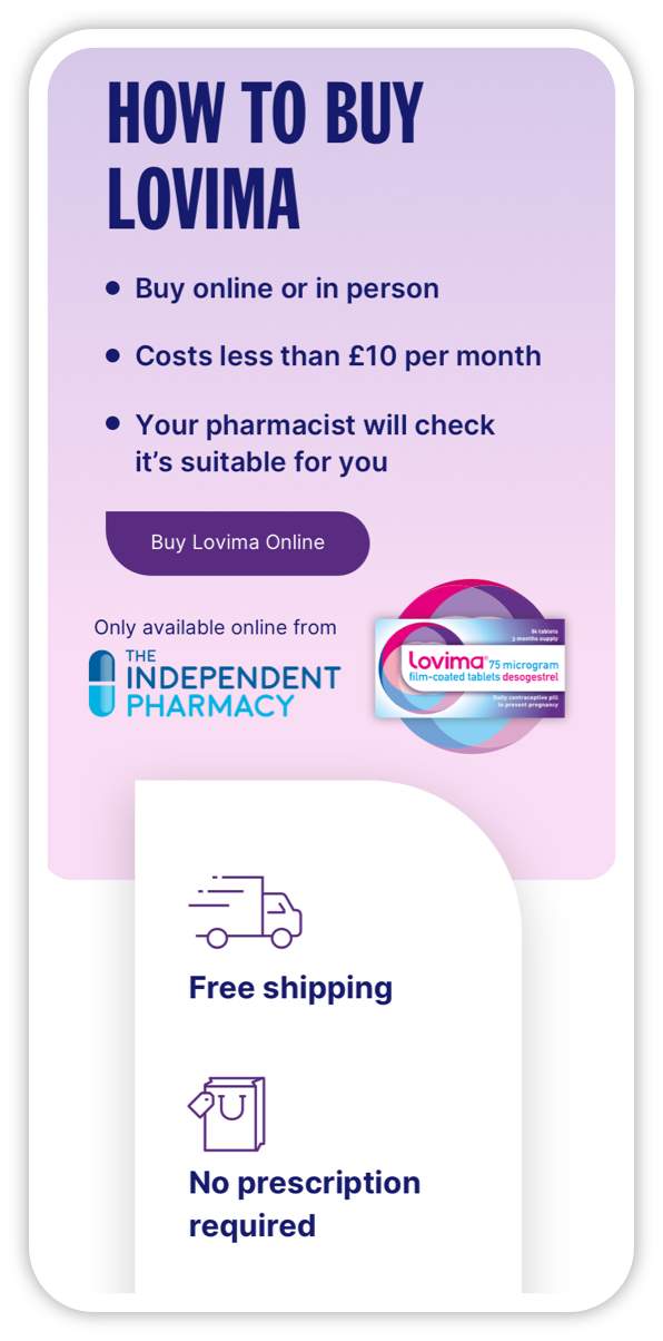
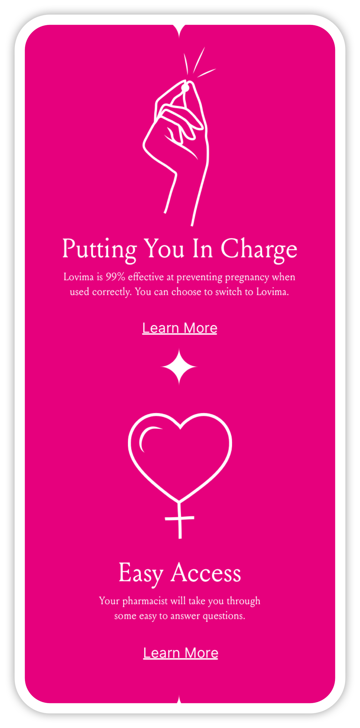
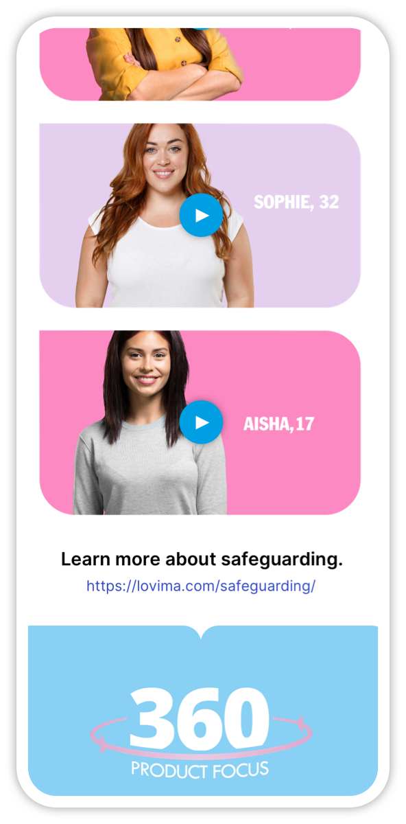
Main Website
For the consumer experience, the focus was on:
Clear information hierarchy - making it obvious what Lovima is, how it works & how users can access it.
Brand consistency - applying the existing colour palette, illustration style & typography in a way that feels authentic online.
Reassuring tone - balancing bold visual language with clarity, so users feel informed, not intimidated.
The homepage & key pages were structured around the most important user questions: what Lovima is, how to take it & how to buy it easily & safely.


HCP
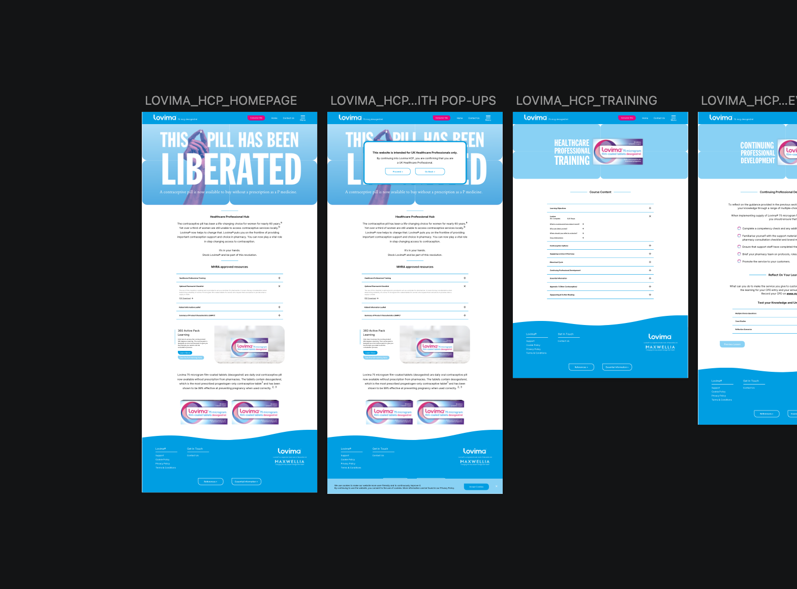
The secondary site - accessible from the main site’s navigation was designed specifically for healthcare professionals:
A clean, professional layout that makes training materials & clinical resources easy to find.
A visual language that feels connected to the main consumer site using alternate colours from the brand system.
Clear distribution of downloadable guides, training videos & continuing professional development resources.
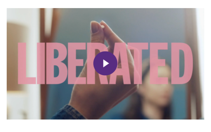
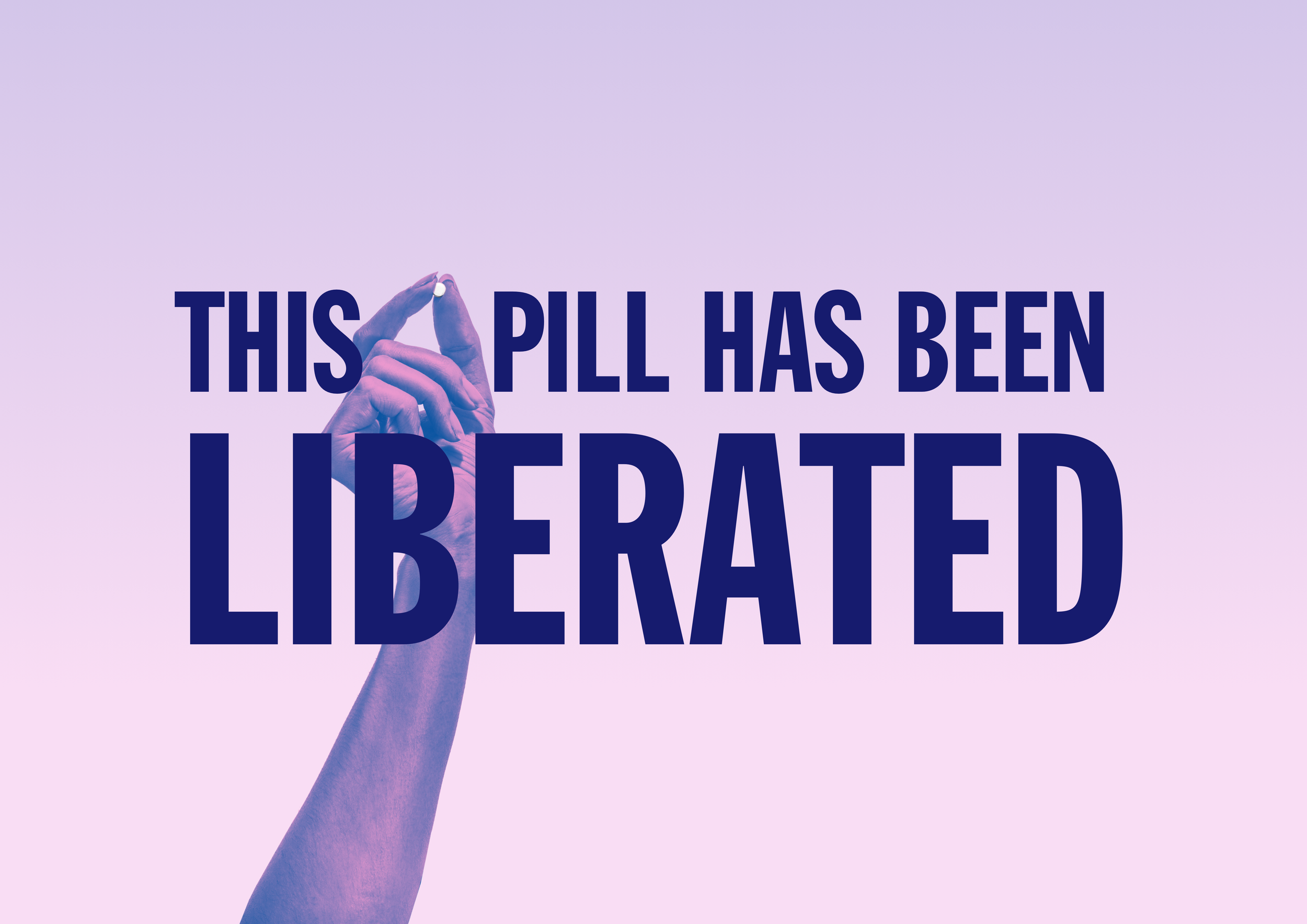
In addition, The client wanted to explore where the brand could go in regards to advertising etc so I created exploratory assets - including social, print, & billboard concepts - to show where the brand could go visually in future campaigns.

Print Advertising
Objective: Explore how Lovima could appear in magazines, posters, or other print media.
Design Approach:
Playful, yet professional layouts to make the brand feel accessible
Consistent use of typography, colour, and imagery from the brand system
Conceptual ads that highlight empowerment, education & clarity

Billboard
Objective: Visualize how the brand could stand out in out-of-home advertising.
Design Approach:
Eye-catching layouts & messaging that communicate the brand quickly
Use of bold typography & colour to maintain brand from a distance
Concepts that reinforce Lovima’s confident, approachable personality
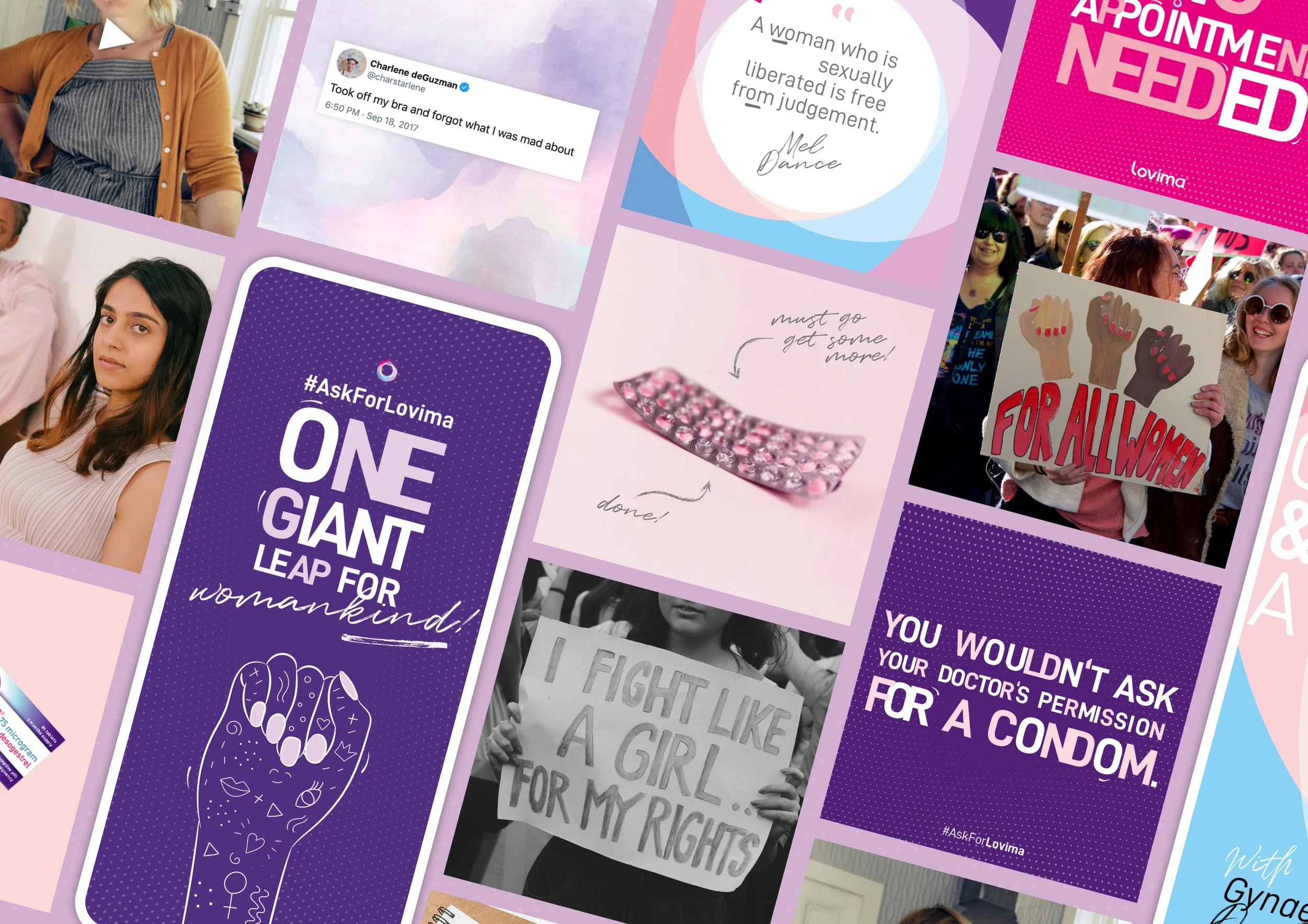
Social Media Concepts
Objective: Explore how Lovima could engage audiences on social channels.
Design Approach:
Friendly, approachable visuals that communicate key information quickly
Bold, confident messaging to align with the brand’s empowering tone
Concepts for educational posts, campaigns, & awareness-building
The website delivers a clear, approachable, and empowering experience. It guides users through learning about the product & completing a purchase in a way that feels confident but not intimidating.
Lovima now has a strong, user-centered online presence in a sensitive healthcare category & users can make decisions about contraception with clarity & confidence.
Outcome & Impact
This project reinforced how important tone and clarity are in healthcare design. Translating an existing brand into a digital space requires more than just visuals-it’s about how users feel when they interact with the product.