

Lawrence & Co — Creating a clearer brand system for a coaching agency
Lawrence & Co (L&Co) is a coaching agency working with entrepreneurial and mid-market businesses, known for a direct, no-nonsense approach to growth strategy. The aim of the project was to refresh the identity so the brand looked as clear and confident as the business sounded.
Client: Lawrence & Co (L&Co)
Role: Lead Visual Designer
Deliverables: Logo redesign, brand system, visual guidelines, marketing asset templates.
Brief
Refresh the brand identity for Lawrence & Co to better reflect their simplicity, impact & straightforward approach.
Objective
Design a confident, versatile identity system that reflects L&Co’s simplicity and strategic thinking - while giving internal teams strength and consistency in execution.
Challenge
L&Co’s previous visual identity didn’t match their strategic voice. The brand needed to feel clear, bold & refined, but without losing authenticity. It also had to work well in everyday use - including by teams without design experience - across decks, documents, social & web.
Understanding the Brand Voice
Early conversations made it clear what mattered: “Simple. Impactful. No BS. No fluff.” Those words became the guiding principles.
I developed two initial routes for review, each built around clarity and confidence but expressed in different ways.
One route was more structured and corporate, using strong hierarchy and purposeful typography. The second was bolder and more minimal, using black space and sharper contrast.
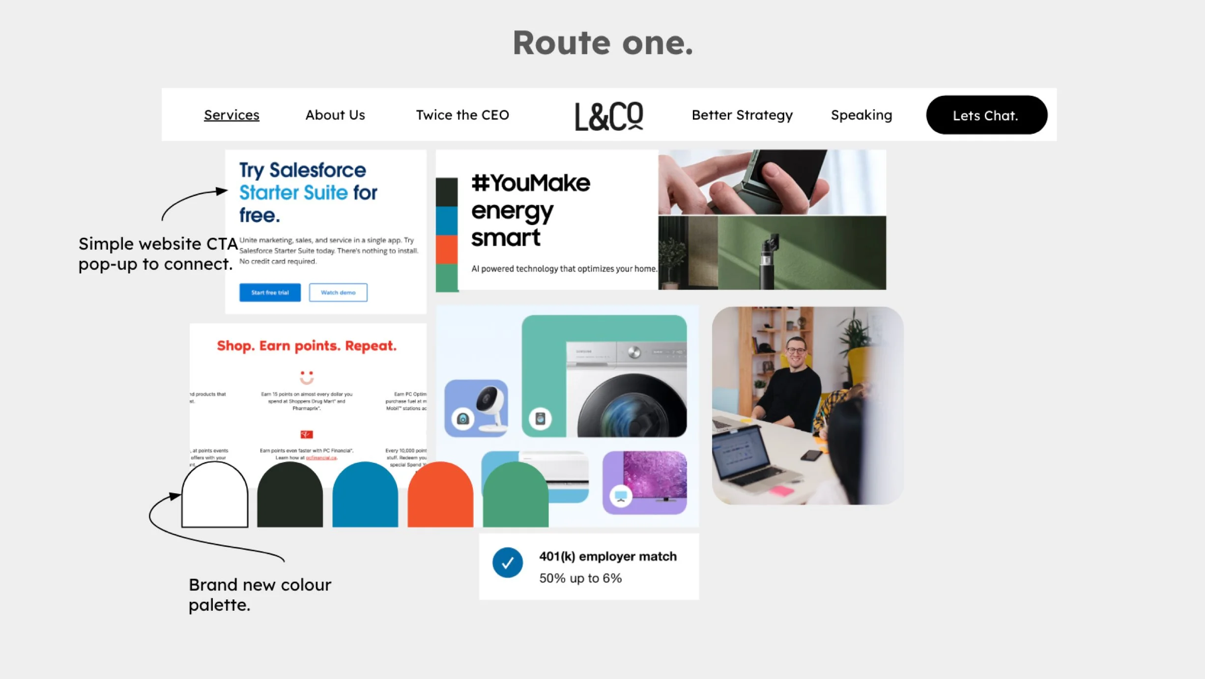
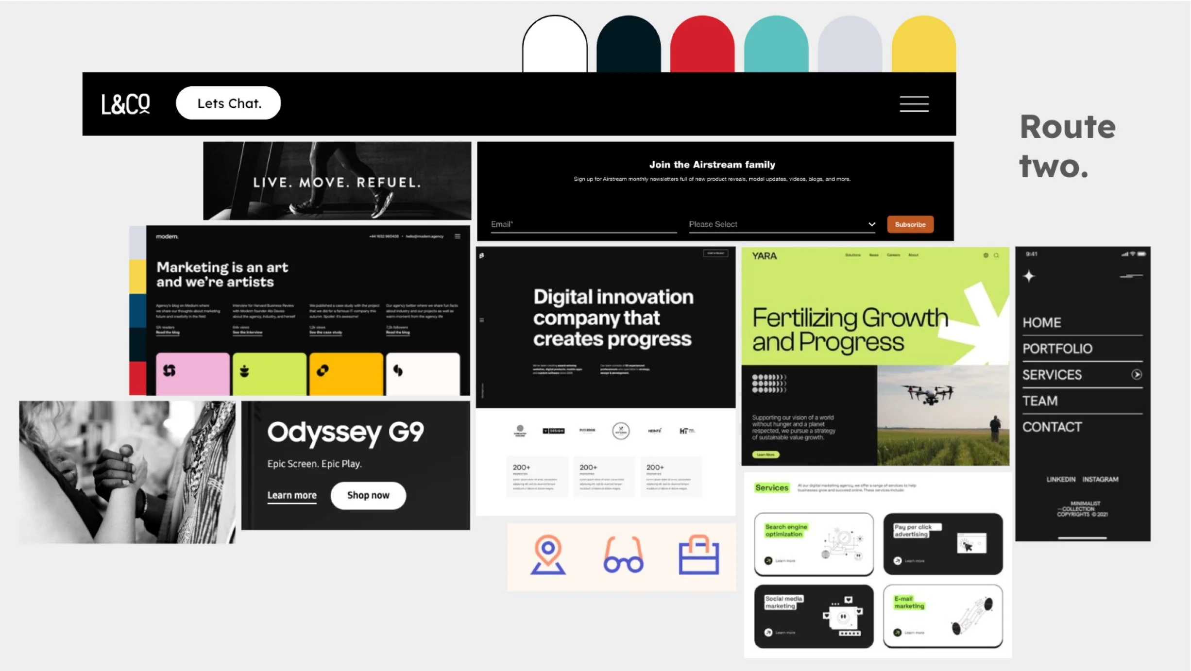
After review, the structured direction (route 1) was selected as it gave the right balance of authority, clarity and usability.
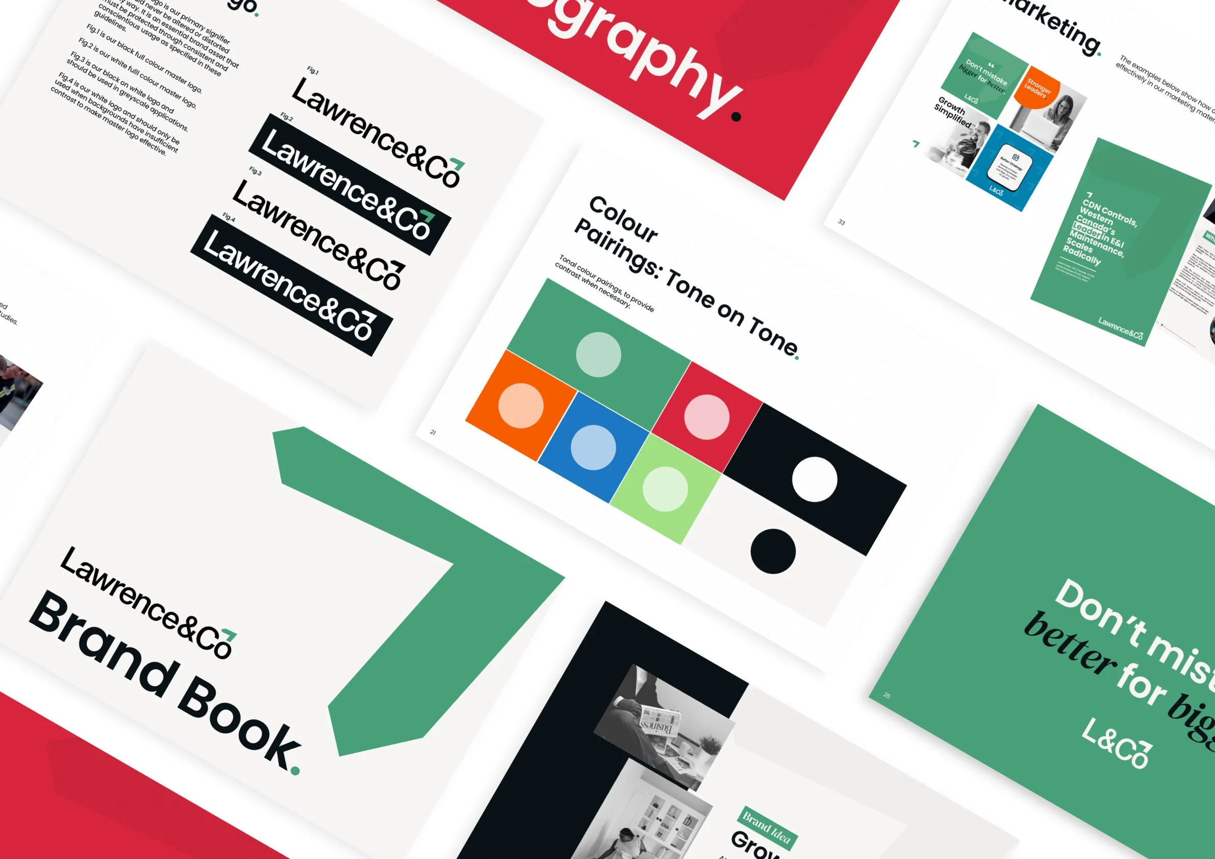
Logo Exploration
The logo exploration was about finding a mark that feels confident & grounded, without being loud. Iterations leaned into simplicity & presence, removing visual fluff & making sure the mark could scale across contexts with ease.
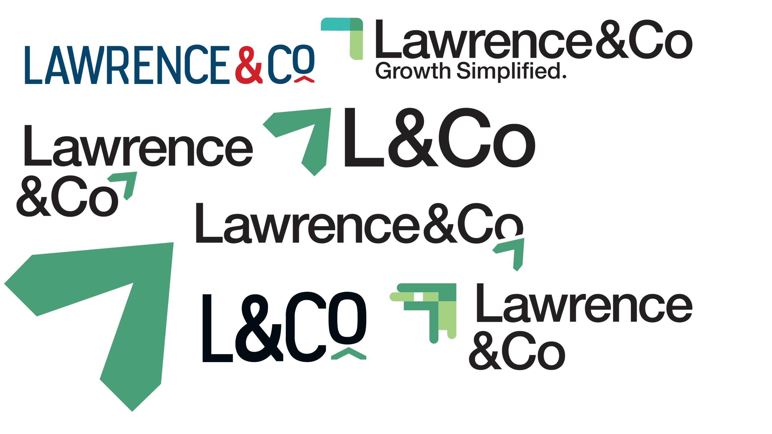
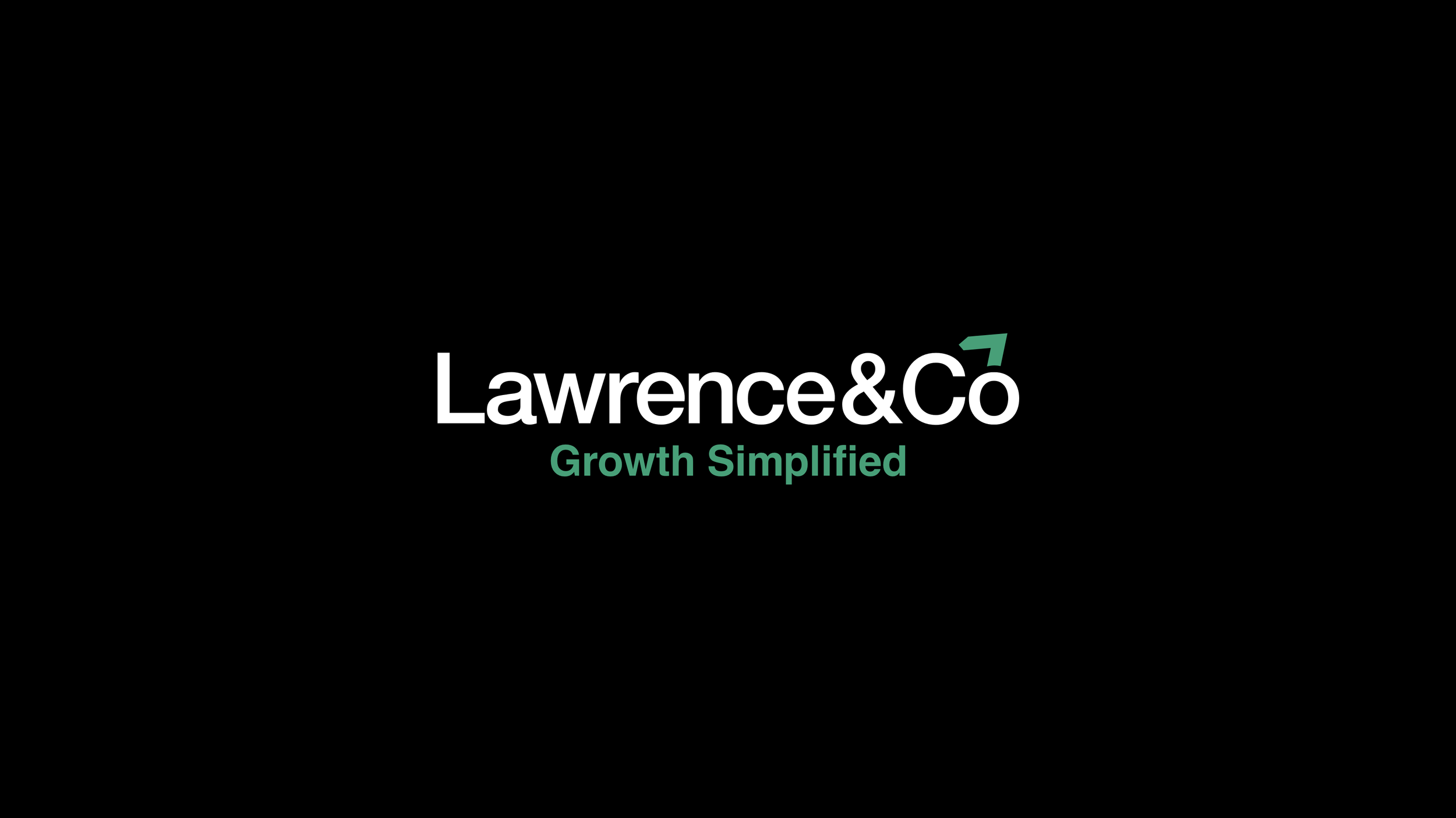
The final logo uses a strong, structured form that suggests direction & momentum - a subtle nod to Growth Simplified.
Brand System Development
Once the logo was approved, I developed a practical identity system built for everyday use.
This included a refined colour palette, a clear typographic hierarchy, layout principles, spacing rules and supporting graphic elements.
The focus was usability as much as aesthetics. The system needed to help teams create materials quickly while keeping everything consistent.
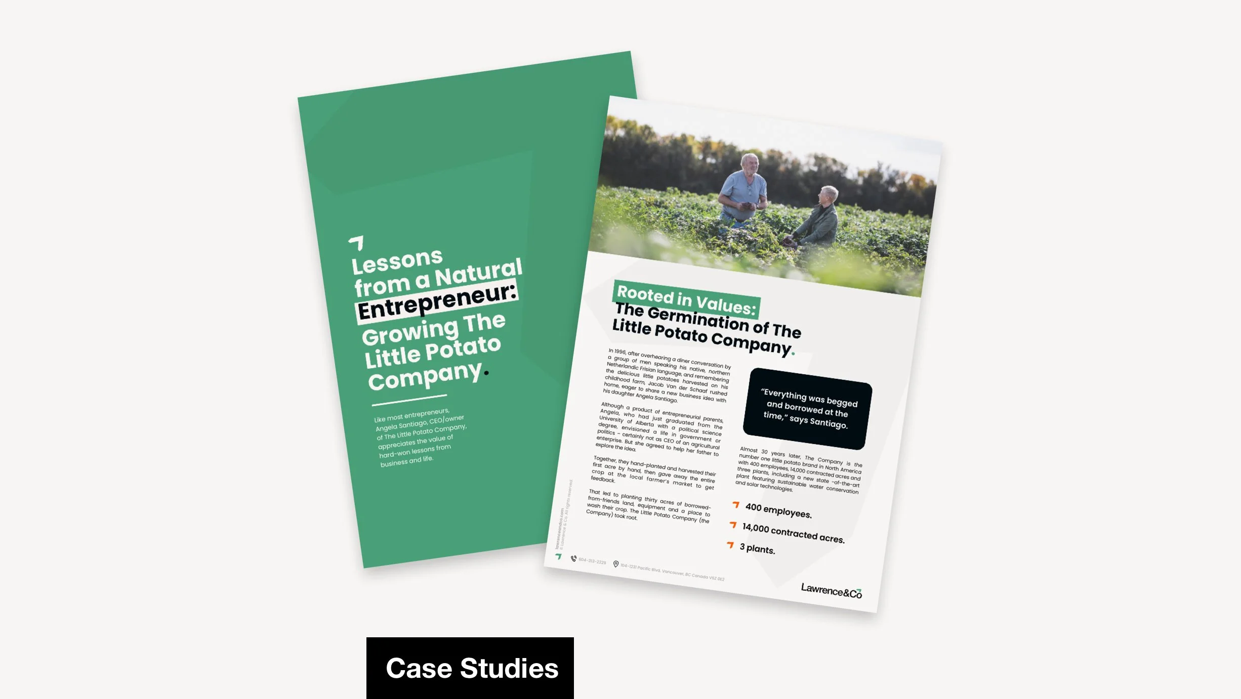
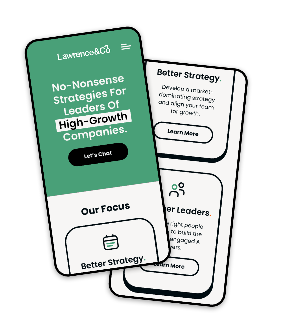
Marketing & Collateral
With the system in place, it was rolled out across core touchpoints.
I created pitch deck templates, proposal layouts, social graphics and white paper formats that felt professional, clear and easy to update internally.
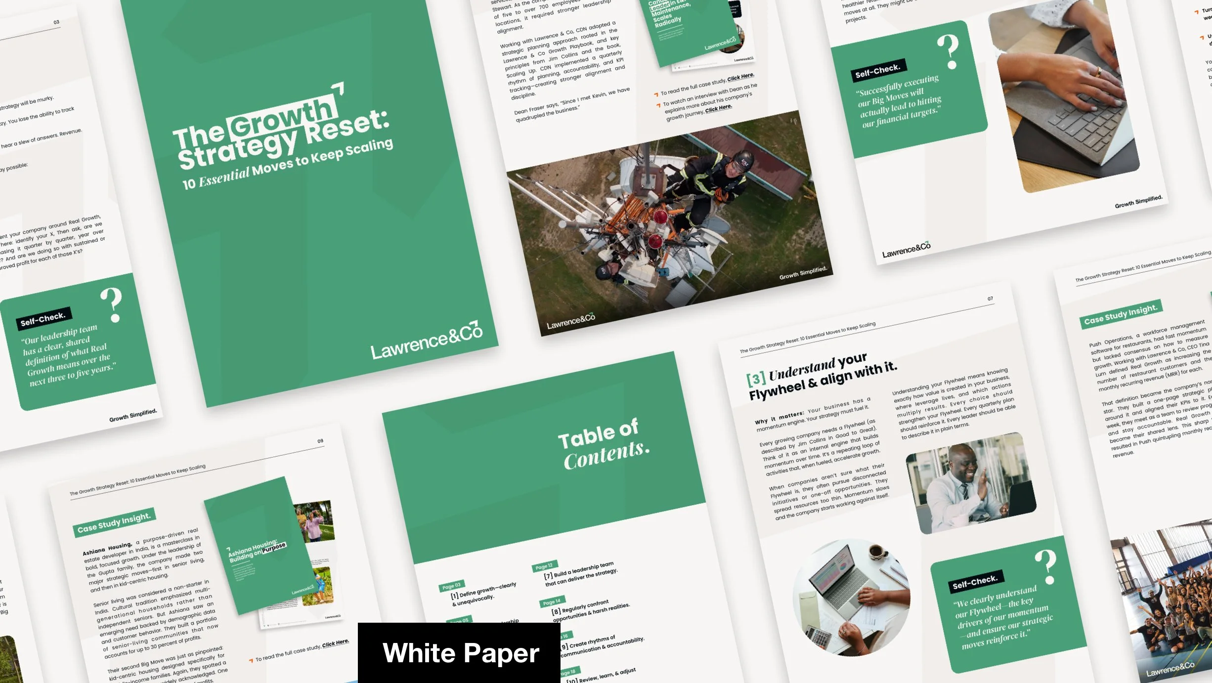
Each asset was designed to help the business show up consistently without overdesigning or adding unnecessary complexity, “Simple. Impactful. No BS. No fluff.”
The refreshed visual system gives Lawrence & Co a stronger, more consistent brand presence. It now feels strategic, refined & ready to support real business communication. Teams can use it without guessing, & it holds up across formats without needing constant firefighting.
Rather than just looking better, the identity now works better. It provides clarity for internal use, reduces design guesswork, & gives the brand a visual voice that’s aligned with its no-nonsense philosophy. The brand isn’t just seen as more confident - it feels more coherent everywhere it appears.
Outcome & Impact
This project reinforced how far simplicity can carry a brand. When the visual system truly reflects the values everyone talks about in meetings - in this case, clarity, structure & honesty - it becomes more than just logos & colours. It becomes a tool for confidence, not just decoration.
Reflection
“We have worked with Josh on several projects & he always brings great work, ideas & collaboration. I would not hesitate to recommend Josh to anyone looking for a great designer. He’s fantastic”