FARO — Full brand creation, from logo to a scalable design system
FARO is a platform designed to support people going through separation or divorce. The goal was to shape a brand system & digital experience that feels clear, calm & reassuring, helping users feel supported during a stressful time.
Client: FARO
Role: Lead Visual Designer
Deliverables: Brand identity, logo design, brand system, website design prototype
Brief
Create a brand identity and digital experience that reflected FARO's mission of providing clarity, guidance and reassurance for people navigating separation or divorce.
Objective
Build a flexible brand system that could scale consistently across digital and print.
Create a visual identity that communicated trust, empathy and stability.
Design a calm digital experience that prioritised clarity and guidance during an emotionally difficult time.
Balance professionalism with warmth, avoiding both clinical and overly expressive visual language.
Challenge
People using FARO were often navigating uncertainty during one of the most emotionally challenging periods of their lives. The brand needed to feel calm, trustworthy and supportive while remaining professional and credible.
The challenge wasn't simply to create a reassuring visual identity. It was to communicate guidance and stability without becoming overly clinical, generic or emotionally overwhelming, creating a brand that could support users without competing with the content itself.
Approach
Researching FARO's purpose made it clear that users weren't looking for a bold or attention-grabbing brand. They needed reassurance during an emotionally difficult life transition. Rather than competing for attention through expressive visuals, I explored how colour, typography and composition could create a calmer experience that reduced anxiety and allowed the content to lead. Two distinct visual directions were developed to explore different interpretations of trust, clarity and guidance.
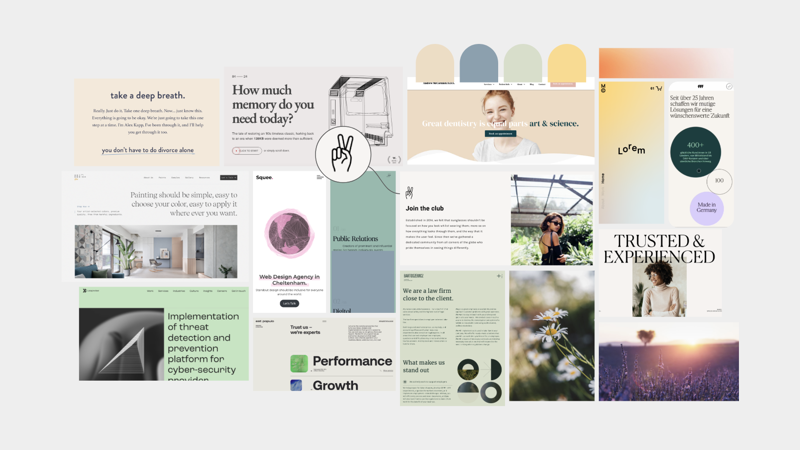
Option A - Muted & Calming
This direction explored muted colour palettes, gentle typography and restrained graphic elements to create a calm, reassuring visual language. Every decision prioritised clarity and emotional sensitivity, helping the platform feel supportive, approachable and appropriate for a sensitive life transition.
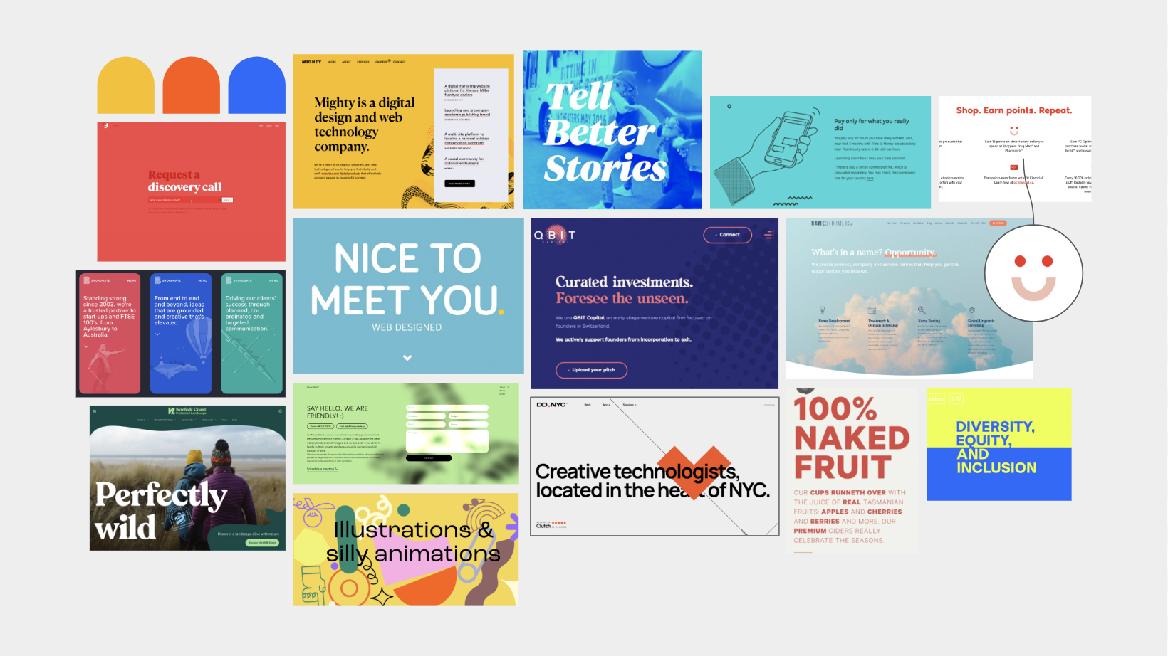
Option B - Bold & Bright
This direction explored stronger colour contrast, bolder typography and more expressive graphic elements to communicate confidence and optimism. While it created greater visual impact, the more energetic approach felt less aligned with the emotional needs of users seeking reassurance and guidance.
Every design choice was made with empathy in mind - from colour & type to spacing & hierarchy - helping users focus on content without unnecessary noise.
Logo Exploration & Meaning
The FARO logo was explored through the idea of guidance, inspired by the meaning of "Faro" – lighthouse. Rather than illustrating the concept literally, I explored a range of visual directions that interpreted guidance, trust and clarity in different ways.
These early concepts tested how the identity could balance emotional reassurance with simplicity, helping establish a cohesive visual direction before being developed into the wider brand system.
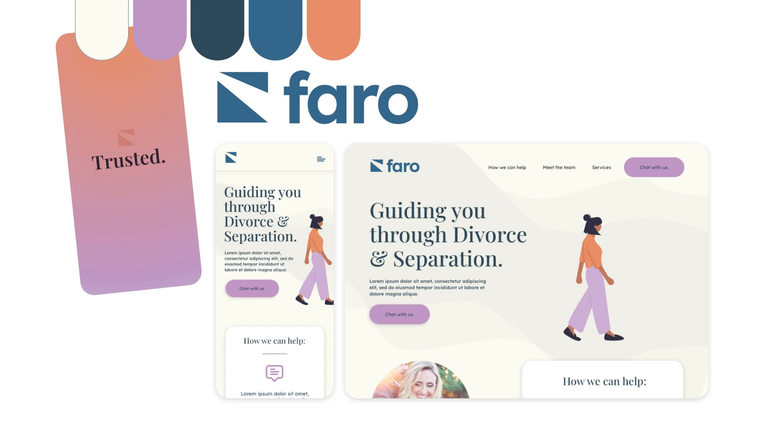
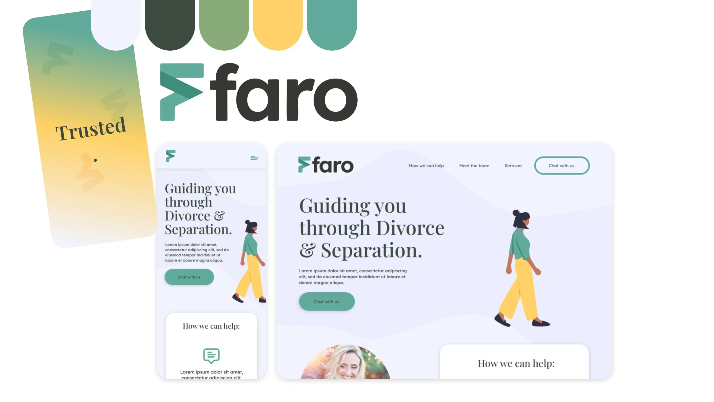
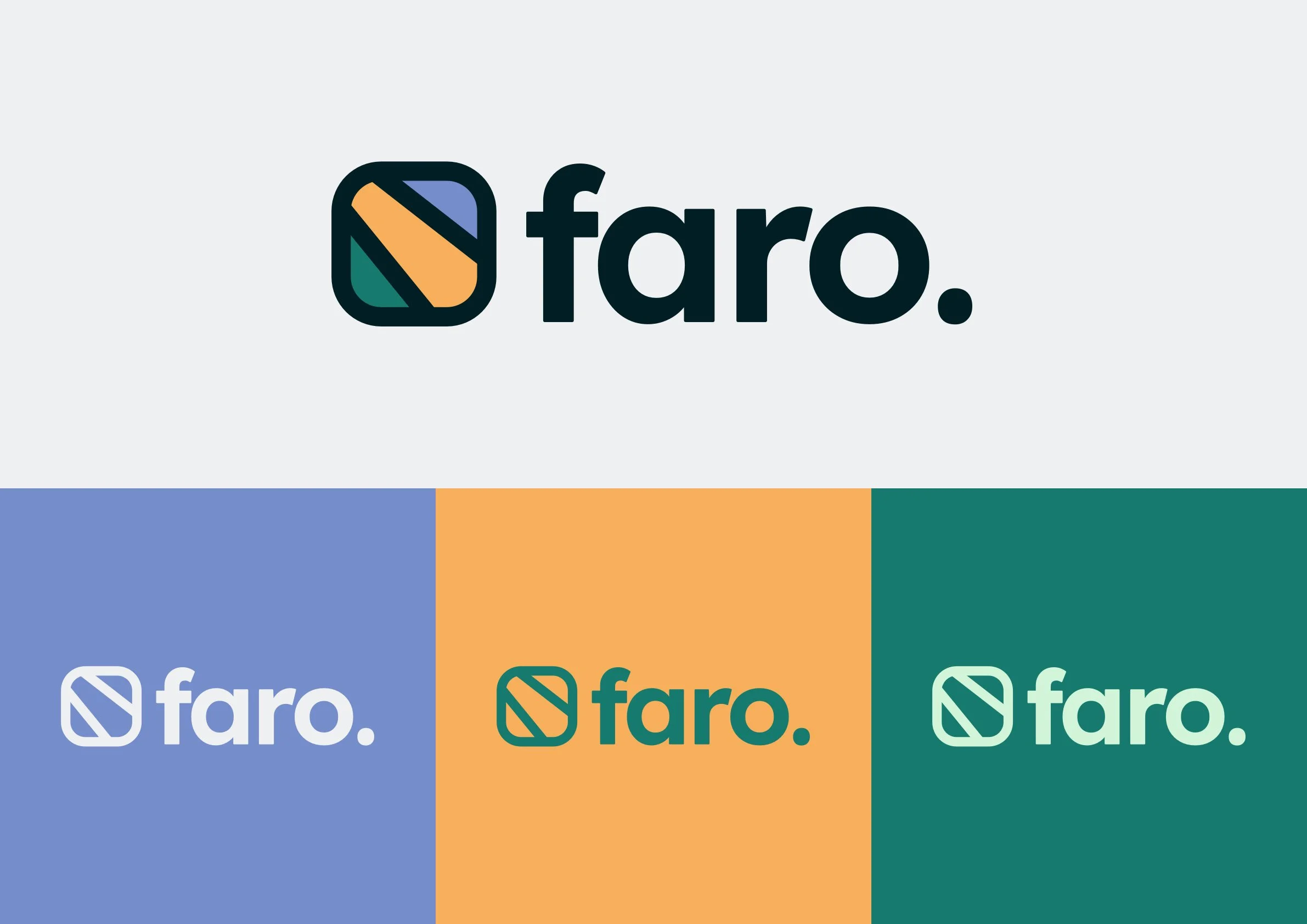
The FARO logo was designed to feel stable, simple and dependable. The customised lowercase wordmark, softened through rounded letterforms, was chosen to create a calmer and more approachable tone. Rather than feeling bold or authoritative, the typography reflects the platform's role as a reassuring guide during a difficult life transition.
Its simplicity allows the identity to sit comfortably across digital and print touchpoints without distracting from the content or emotional context of the platform, creating a recognisable mark that feels both flexible and enduring.
Brand System
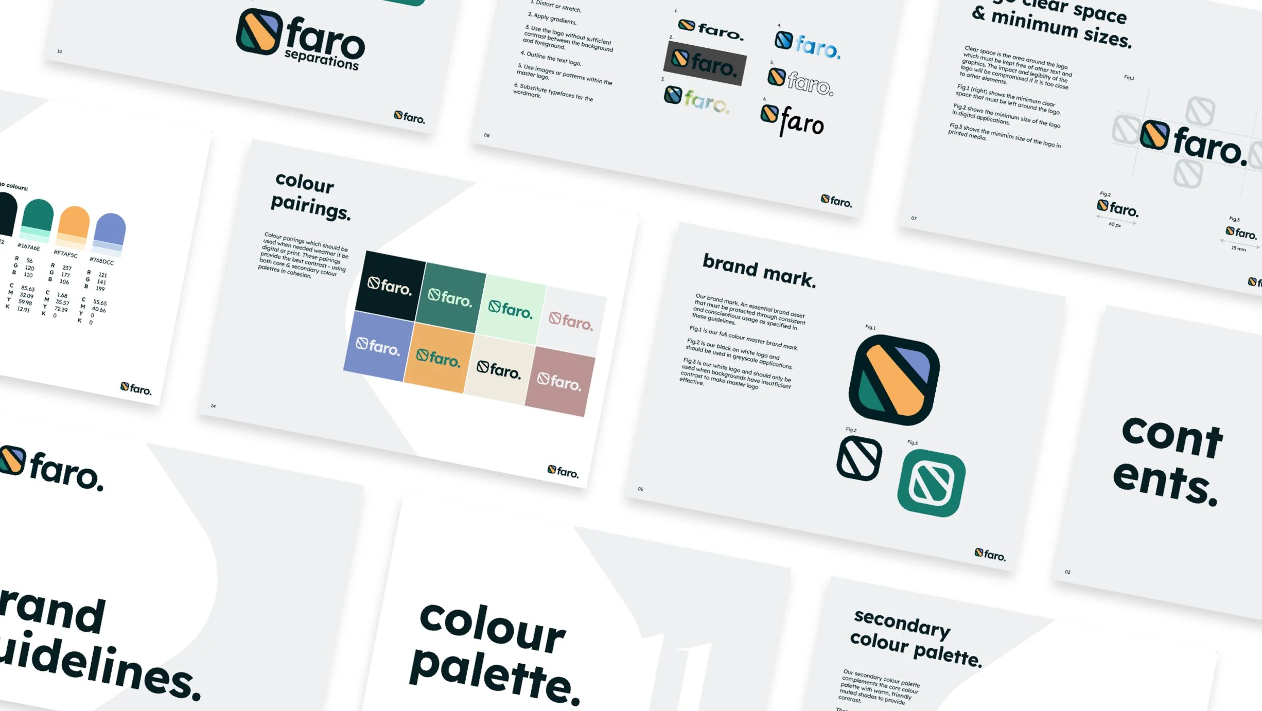
Once the logo was established, I developed a flexible brand system built around the same principles of trust, clarity and emotional reassurance.
Muted colour palettes, considered typography, generous spacing and supporting graphic elements worked together to create a calm visual rhythm that allowed content to remain the primary focus. Rather than relying on decoration, the system was designed to reduce visual noise while creating a consistent identity that could scale confidently across digital and print.
Website Design Prototype
The website prototype translated the brand system into a reassuring digital experience. Information architecture, user journeys and page layouts were designed to feel clear, predictable and easy to navigate, helping users focus on the guidance they needed during an emotionally challenging time.
Supporting iconography and interface components extended the visual language while reinforcing clarity and consistency throughout the experience. The prototype acted as a visual blueprint for how FARO would exist online.
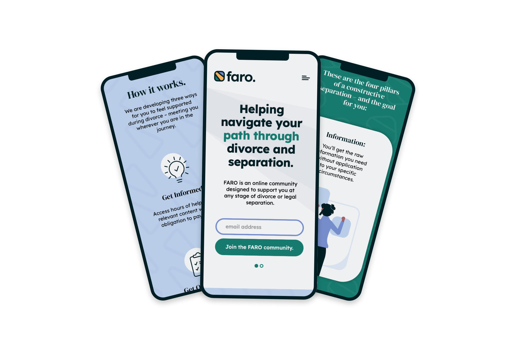
The final identity gave FARO a calm, trustworthy and supportive visual presence that reflected the platform's purpose.
By balancing clarity with emotional sensitivity, the project established a flexible design system capable of growing across digital and print while remaining consistent and reassuring for users. The result was a brand that communicated guidance through restraint, creating confidence without unnecessary visual complexity.
Outcome & Impact
Reflection
This project reinforced that empathy is often expressed through restraint. Small decisions around colour, spacing and typography can have a significant impact on how supported users feel. It was a reminder that good design doesn't need to be loud to be effective, particularly when trust and reassurance are the priority.
“I had a Fantastic experience working with Josh on Faro. His speed of delivery & efficiency were impressive! I highly recommend him for any design projects.”