

Metanium — Applying a healthcare consumer brand across ecommerce & social
Creating a cohesive digital rollout for a trusted healthcare brand across Amazon A+ and social channels.
Client: Metanium / STADA
Role: Digital Designer
Deliverables: Amazon A+ design, paid & organic social, digital brand rollout
Brief
As part of the wider STADA healthcare portfolio, create a cohesive digital rollout that translated the Metanium brand consistently across Amazon A+ and social platforms.
Objective
Strengthen brand consistency across ecommerce and social channels.
Create a cohesive digital experience that clearly communicated product benefits.
Adapt the existing brand identity to different digital platforms while maintaining trust and recognition.
Balance clarity, readability and brand presence across multiple customer touchpoints.
Challenge
Customers encounter healthcare brands across multiple digital touchpoints, each with different formats, technical constraints and user expectations.
The challenge wasn't simply to create Amazon A+ content or social assets. It was to translate an established healthcare brand into a cohesive digital experience that remained clear, trustworthy and recognisable whether users discovered the product through ecommerce or social media.
Approach
Although each platform required different layouts and content, the experience still needed to feel like the same brand. I began by working within Amazon's strict A+ module framework, focusing on information hierarchy, modular layouts and clear product communication that supported the wider Metanium identity.
These same principles were then adapted across social media, ensuring typography, imagery, colour and messaging remained consistent while responding to the requirements of each platform. The result was a flexible digital rollout that strengthened brand recognition across multiple customer touchpoints.
Amazon A+ Experience
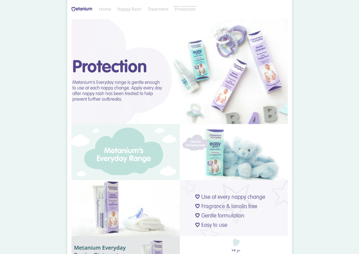
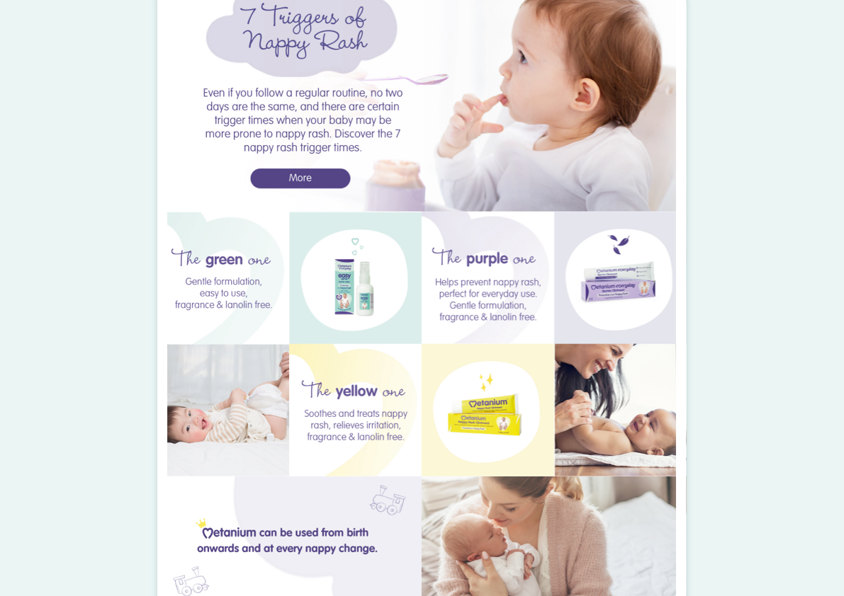
The Amazon A+ experience was designed to create a more structured and engaging product page within Amazon's fixed layout constraints. Clear information hierarchy and modular layouts helped communicate key product benefits while supporting the wider Metanium brand identity.
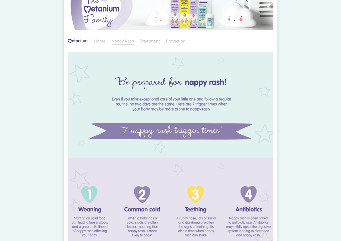
Existing brand guidelines were applied consistently across typography, colour, imagery and supporting graphic elements, creating a cohesive experience that strengthened product recognition while maintaining consistency across the wider digital rollout.
Product benefits, usage guidance and supporting information were organised into clear modular sections that improved readability and guided users naturally through the content, making complex healthcare information easier to understand.
Paid & Organic Social
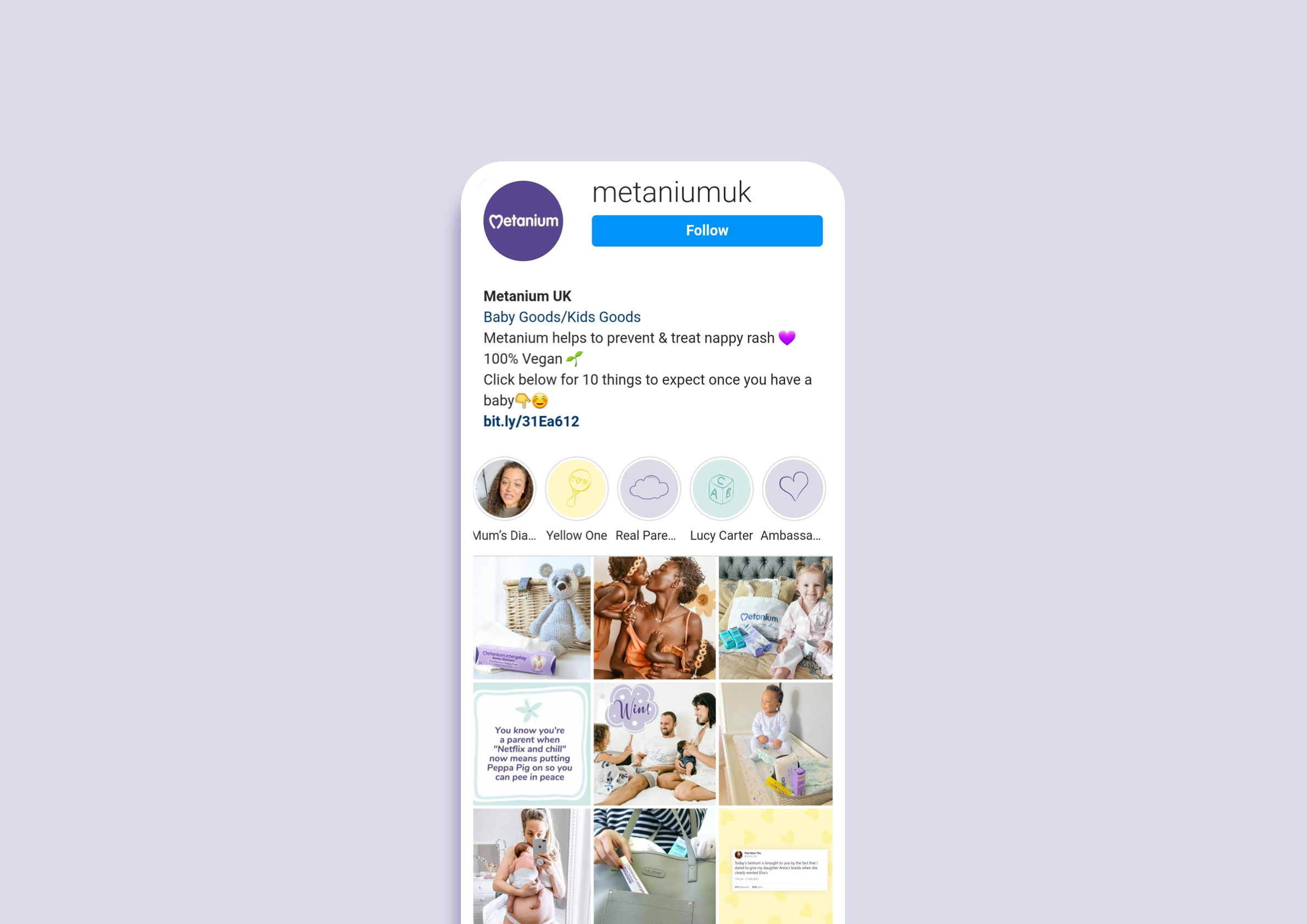
Alongside the Amazon rollout, I designed a range of paid and organic social assets that extended the same visual language across digital campaigns.
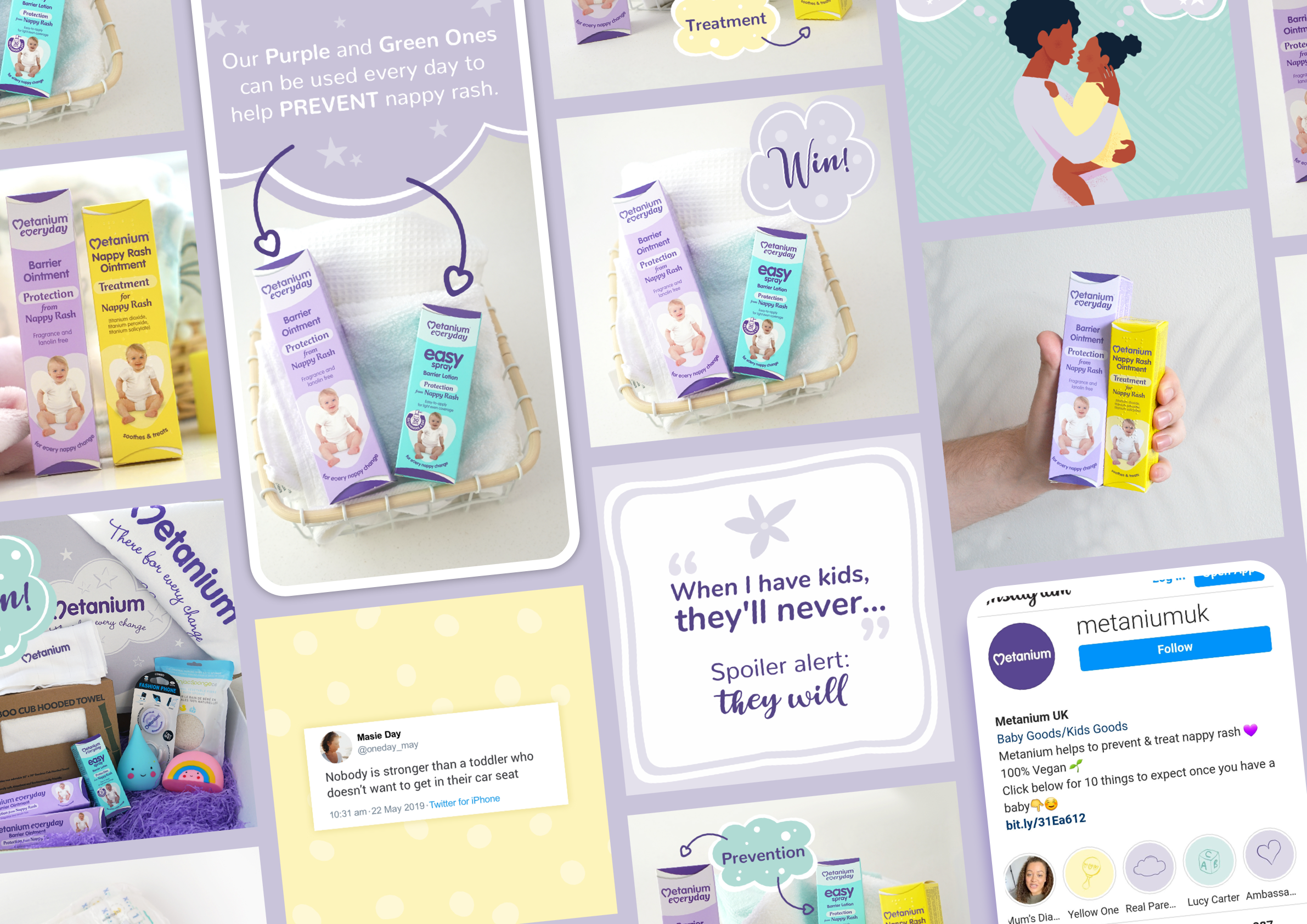
Layouts, messaging and imagery were adapted to suit different social formats while maintaining a consistent brand presence. I also created and art directed UGC-inspired photography to help the content feel more authentic and relatable without compromising the clarity and trust associated with the wider healthcare brand.
Outcome & Impact
The rollout created a more cohesive digital presence for Metanium across ecommerce and social platforms.
By applying the brand consistently across Amazon A+ and campaign assets, the project strengthened product communication while creating a more recognisable and unified brand experience across multiple customer touchpoints.
This project reinforced that consistency isn't about making every touchpoint look identical, it's about ensuring users recognise the same brand wherever they encounter it. By adapting a single visual system across different digital platforms, the experience remained both flexible and cohesive.