

KY Jelly — Evolving & rolling out a legacy consumer brand across digital & print
I was initially brought in to create a new visual direction for the existing KY Jelly brand in the UK, developing a more modern and inclusive identity that could work across social, print and digital channels.
Around eighteen months later, the brand was reintroduced in the UK as Kynect. By that stage, a new design system had been created and I was brought back to apply it across a new website and refreshed social presence.
Client: KY Jelly / Kynect
Role: Lead Designer
Focus: Branding, UX/UI, visual content, photography direction
Brief
Create a contemporary brand identity for KY Jelly, then later apply the Kynect rebrand consistently across digital platforms.
Objective
Build a clear, inclusive identity and ensure the rebrand translated smoothly across web and social.
Challenge
Designing a modern brand without gendered or explicit cues, then adapting an existing system into practical digital outputs.
Approach
For the original KY Jelly refresh, I began with moodboards exploring tone, colour, typography and imagery.
The focus was on creating a gender-neutral and progressive visual language that felt welcoming, contemporary and easy to engage with. This early exploration helped define the direction for the wider rollout.


For the initial launch, the focus was on creating consistency across every touchpoint. Colour, icons, type, and imagery were chosen to feel modern, fun and confident, while avoiding anything clinical or overdesigned.
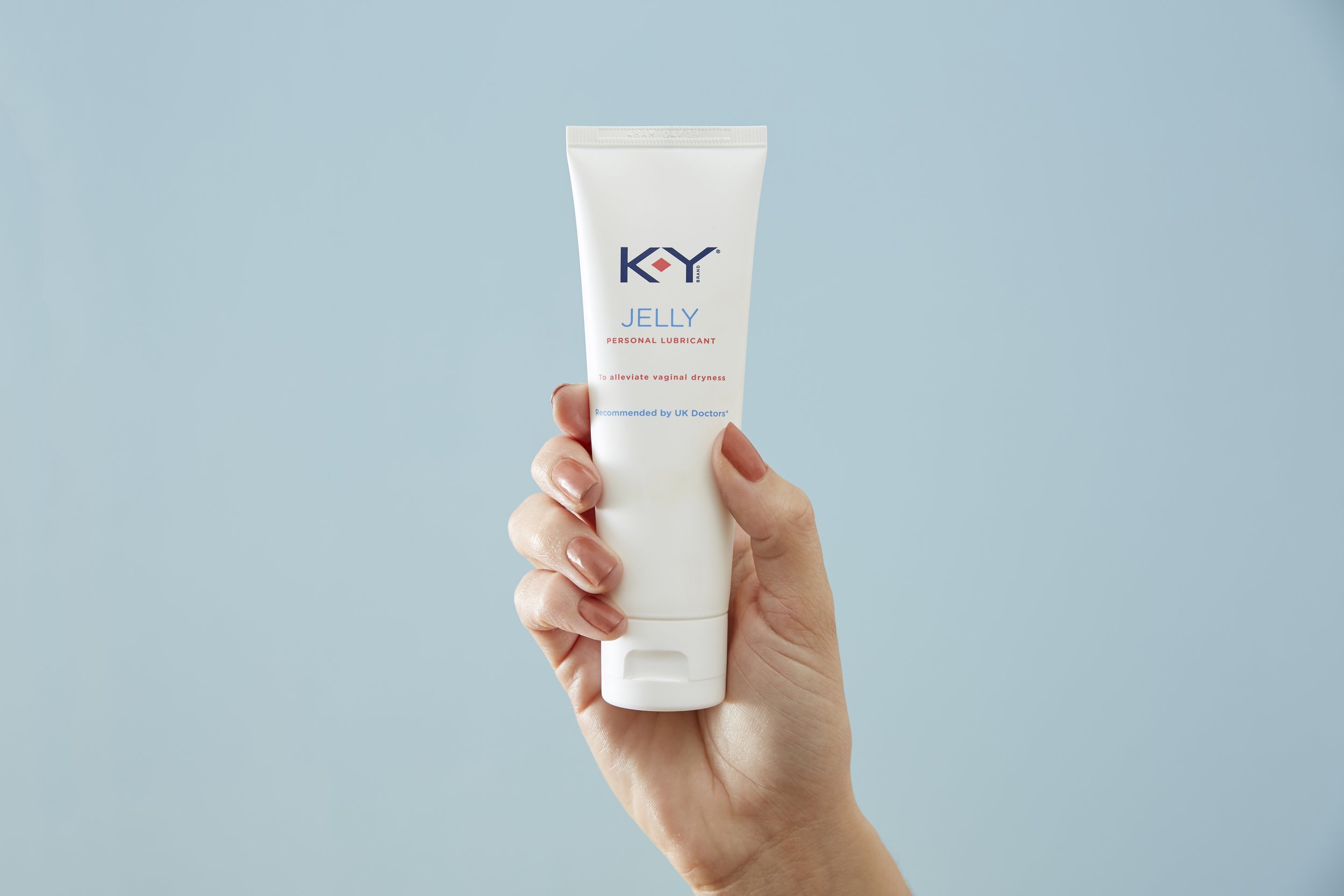
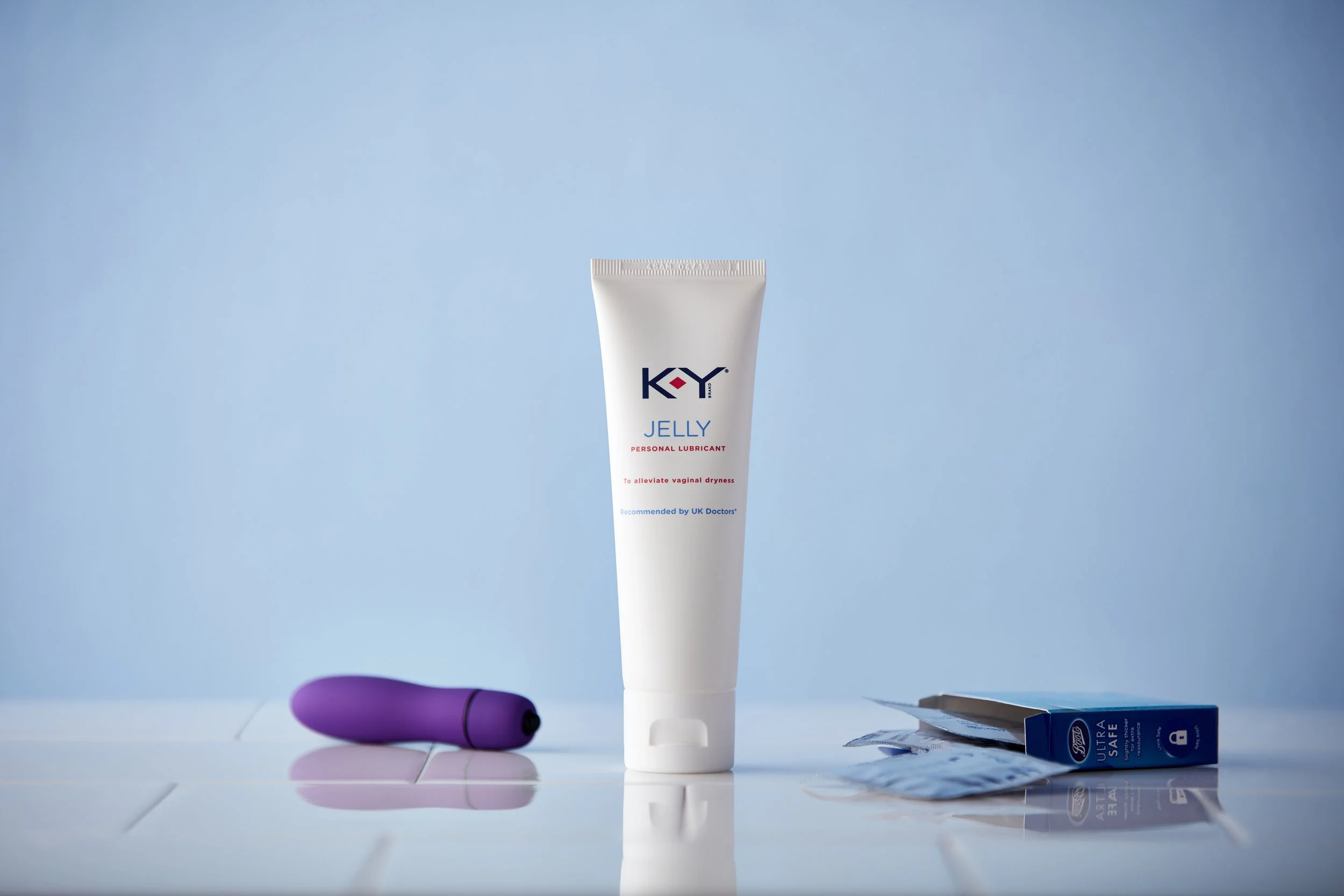
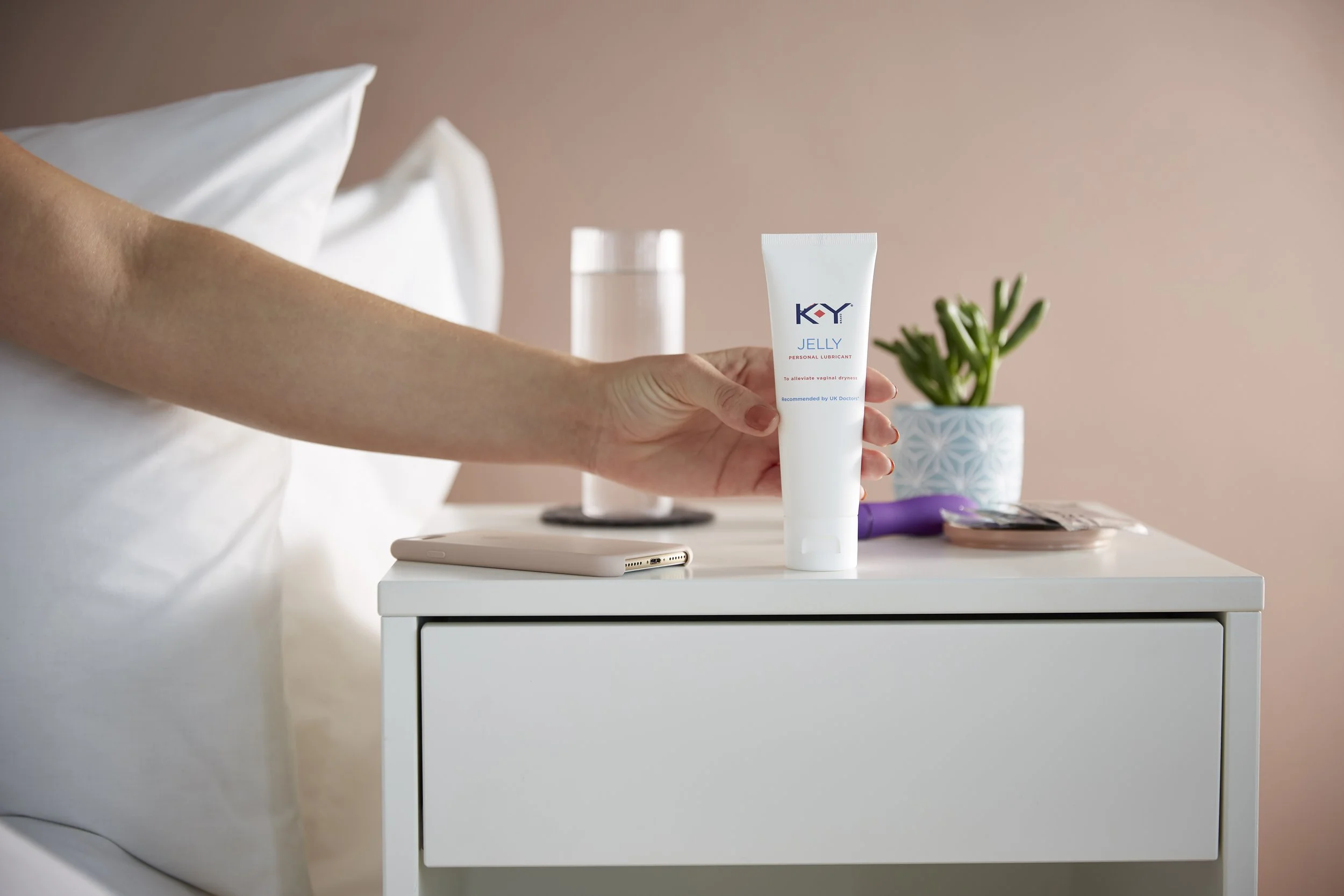
Photoshoot for Launch

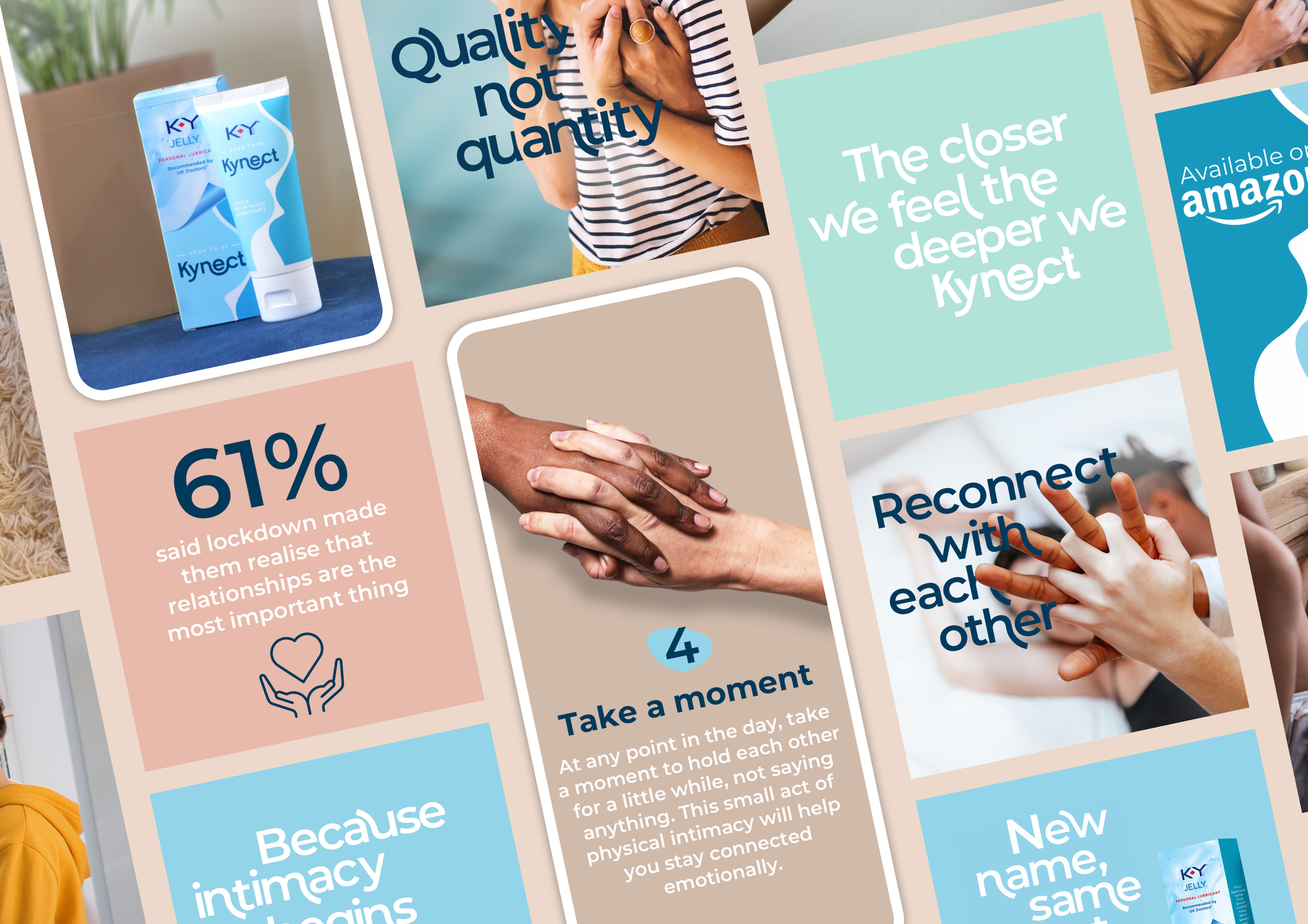
I also directed a photoshoot to create original imagery for the brand, supporting the initial launch across social, web, and print. The focus was on clean, lifestyle-led visuals that built a cohesive visual library, giving the brand a consistent and flexible set of assets to use across channels.

Paid & Organic Social

I created a range of paid and organic social assets built around the new visual language, using imagery from the photoshoot I art-directed. The work was designed to feel approachable, fun, and distinctive, helping the brand communicate clearly and consistently while standing apart from a traditionally dated category.
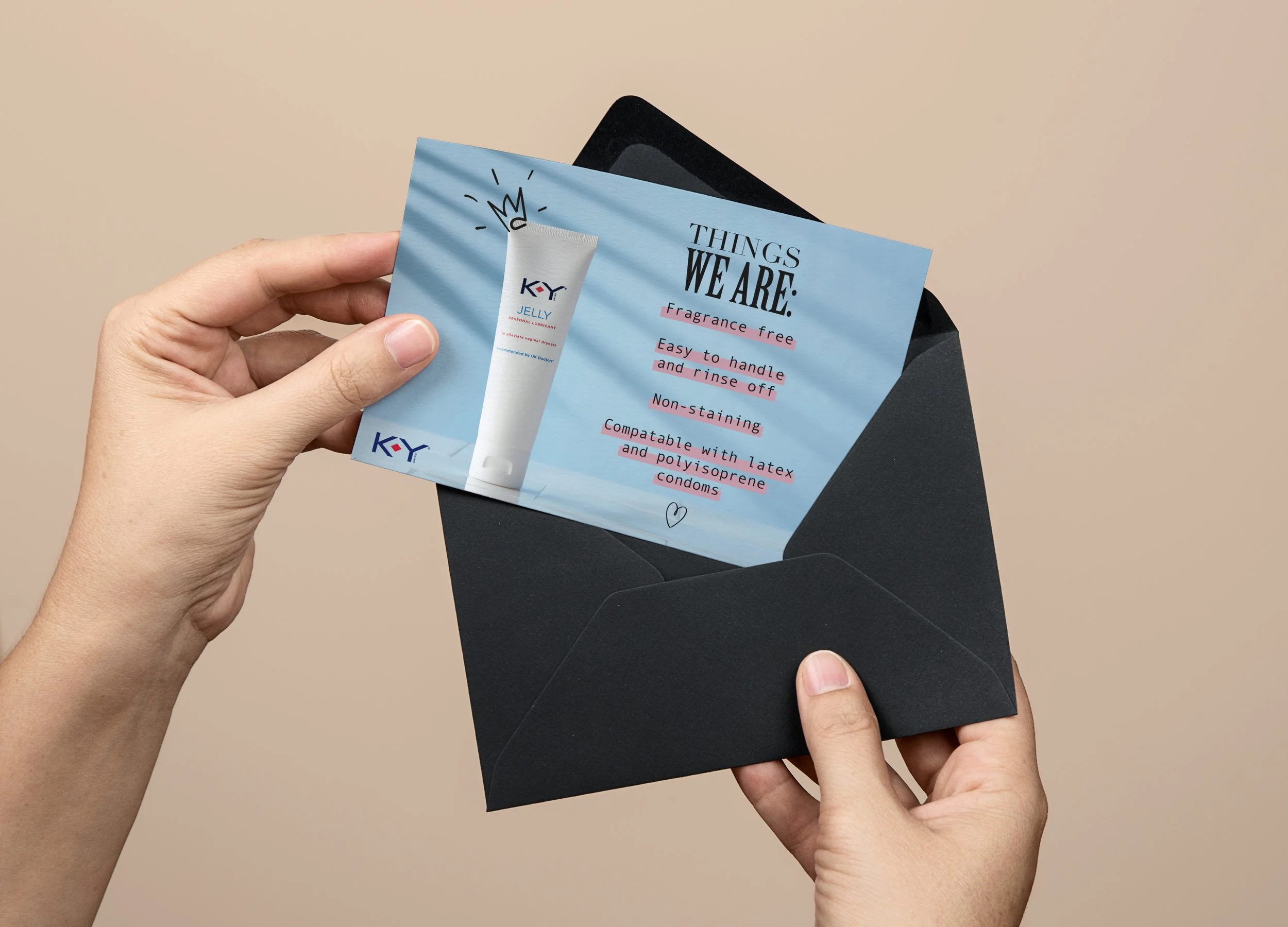
To support partnerships and influencer outreach, I designed printed promotional cards that carried the same identity system.
These pieces were designed to feel tactile and considered, reinforcing the themes of neutrality, confidence and connection.
A while later, KY Jelly was rebranded as Kynect in the UK. By this point a new design system had been developed & my role shifted to applying this identity across key digital touchpoints.
From KY Jelly to Kynect.
Re-brand
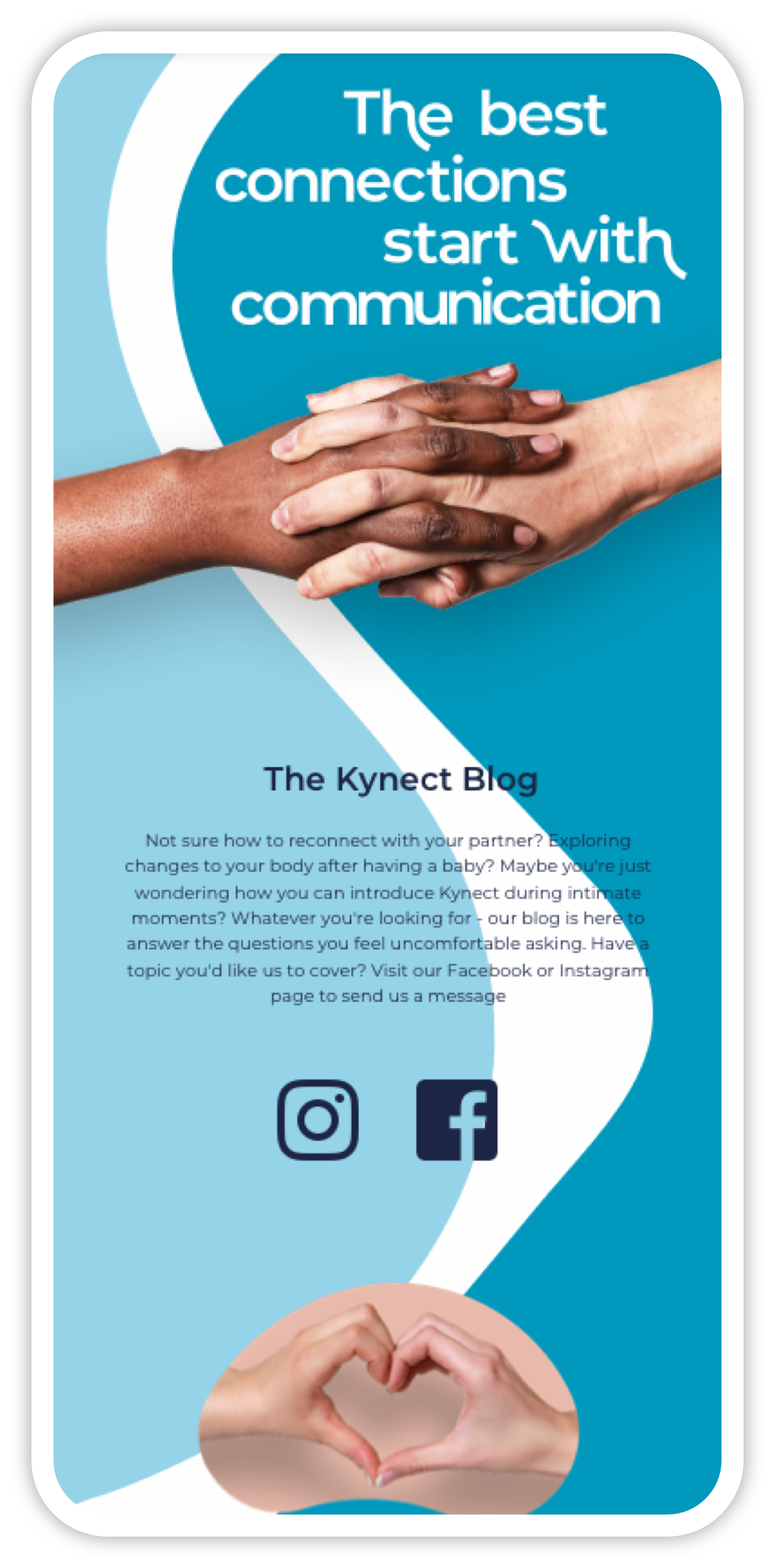
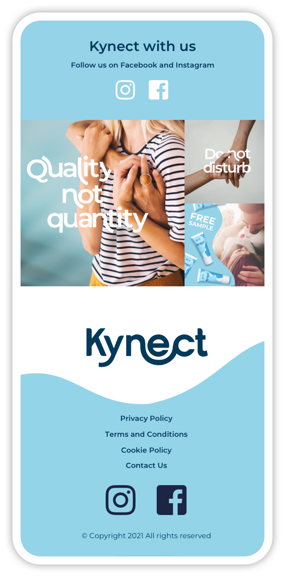
Website

I designed a new website using the existing Kynect design system, translating the brand into a clear & contemporary digital experience. The layout, typography & visual elements were applied consistently to create a unified & recognisable online presence.


Re-brand
Social
To coincide with the launch of the rebrand, I carried through design elements from the new website such as typography & icons, giving the new social channel a fresh & colourful look & feel.
Outcome
The initial KY Jelly work established a more contemporary and inclusive brand presence, bringing greater clarity and consistency across social, print, and digital - while helping shift perception away from a dated category identity.
A key part of this was the art-directed photoshoot, which provided a cohesive set of bespoke imagery that strengthened the brand’s rollout and ensured a consistent visual language across web, social, and print from initial launch.
The later transition to Kynect allowed the updated design system to be applied across digital platforms, resulting in a more unified and recognisable brand experience online. The rebrand translated smoothly across web and social, supporting a clearer and more confident expression of the brand at launch.