

Aequilibrium — Brand system overhaul for a digital transformation consultancy
Refreshing the identity of a Vancouver-based digital transformation consultancy to communicate confidence, clarity and strategic balance.
Client: Aequilibrium (AEQ)
Role: Lead Designer
Deliverables: Brand identity refresh, logo update, iconography, gradients & visual elements, web design support, marketing asset system.
Brief
Refresh the identity of a digital transformation consultancy to create a modern, cohesive brand system that communicates confidence, clarity and strategic balance across digital and print.
Objective
Create a refreshed brand system that reflected AEQ's positioning as a forward-thinking consultancy, while providing a flexible visual language that could be applied consistently across presentations, marketing materials, websites and internal communications.
Challenge
AEQ's previous identity lacked consistency and distinction, making it difficult to communicate the professionalism and confidence expected within the technology and consulting sector.
The challenge wasn't simply to modernise the visuals. The identity needed to express balance and clarity while providing a scalable system that could support multiple touchpoints without losing consistency.
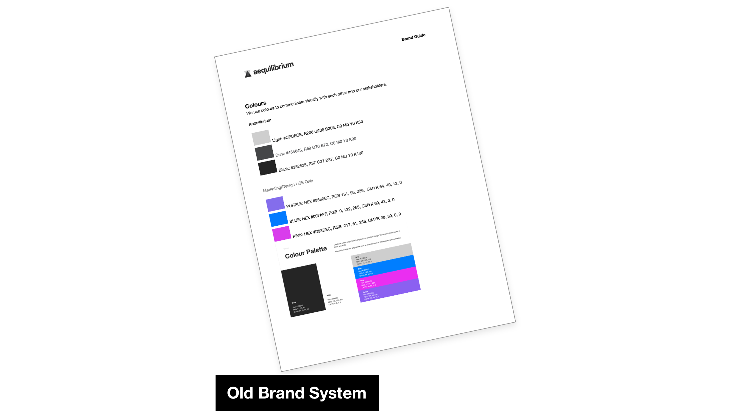
Strategic Visual Approach

Exploring the company's name revealed a clear strategic opportunity. Aequilibrium means balance, a concept that reflected the consultancy's role in helping organisations navigate complex digital transformation. Rather than treating balance as a visual motif, I used it as the organising principle for the identity.
This idea informed the structure of the entire system, influencing spacing, hierarchy, composition and the relationship between visual elements. Every decision was made to create a brand that felt confident, modern and considered, while remaining flexible enough to evolve across future applications.
The visual language was designed to communicate structure without feeling rigid, creating a system that balanced clarity with personality.
Brand System & Identity Components
I developed a complete identity system including a refreshed logo, geometric iconography, colour palette, gradients, typography and supporting graphic elements.
Every component was designed to work together as part of a cohesive visual language, making it easier to maintain consistency across both digital and print. The aim wasn't simply to create a new look, but to provide a practical toolkit that internal teams could apply confidently without relying on bespoke design for every new asset.
The geometric forms reinforced the idea of balance while introducing a distinctive visual language that felt modern, recognisable and ownable.
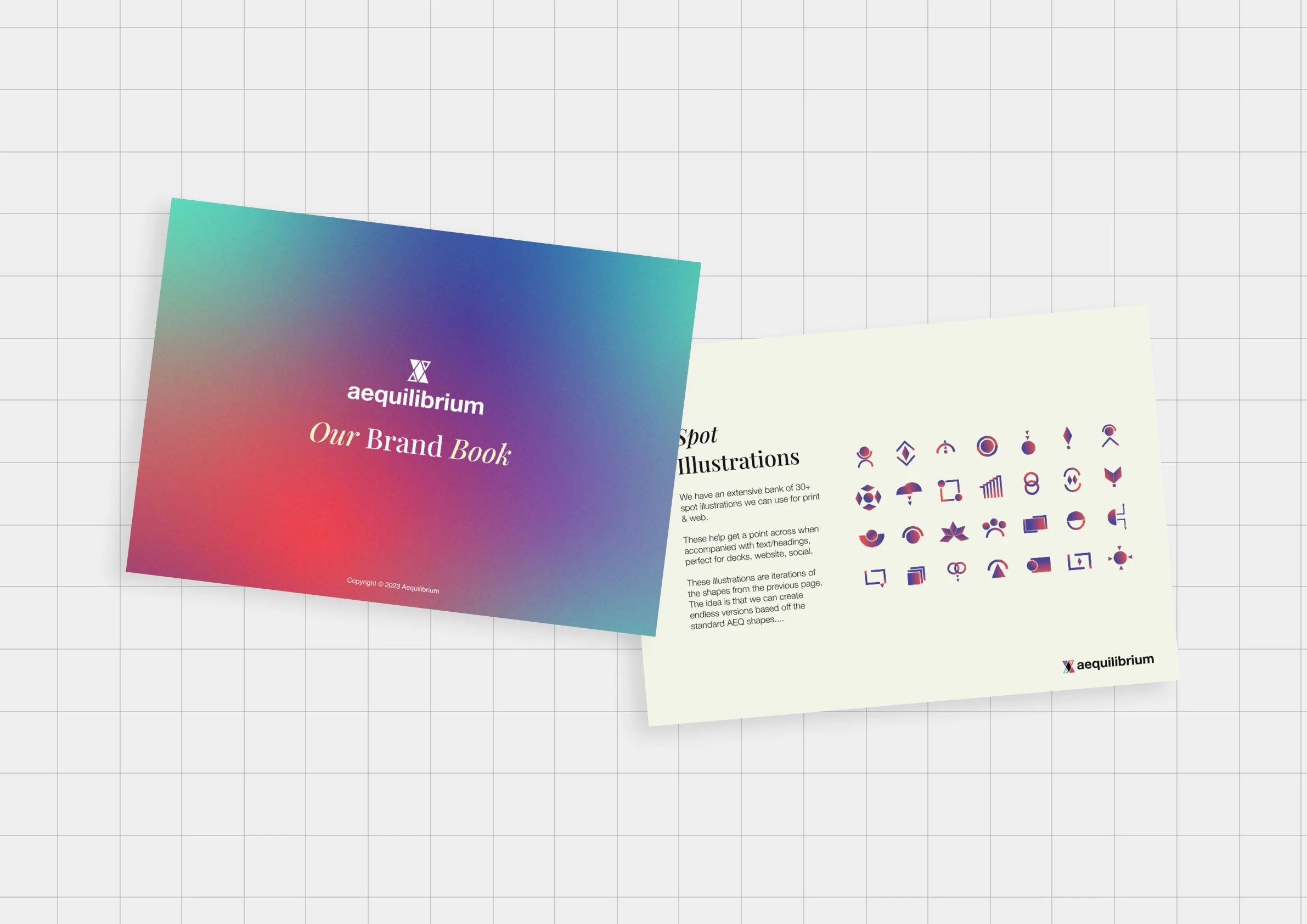
Design Applications
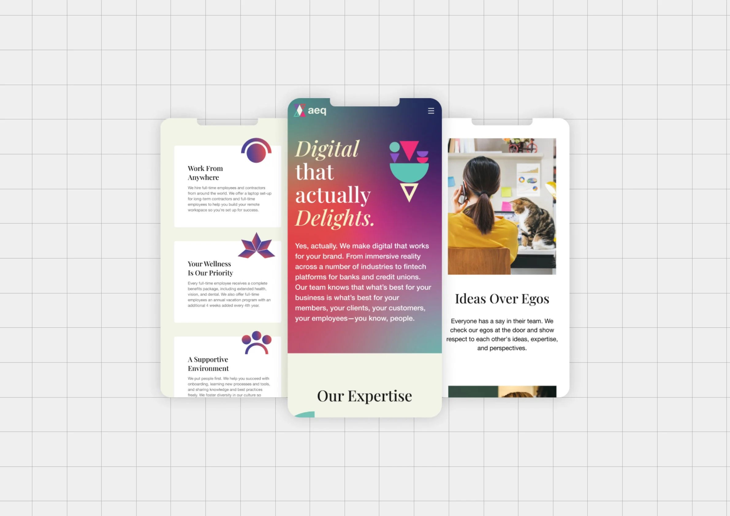
Web Interface & Visual Assets
I designed the website experience from wireframes through to high-fidelity interface designs, creating a clear user journey that translated the refreshed brand into a cohesive digital experience. The updated colour palette, gradients, typography and iconography reinforced the new identity while improving clarity, navigation and overall usability.
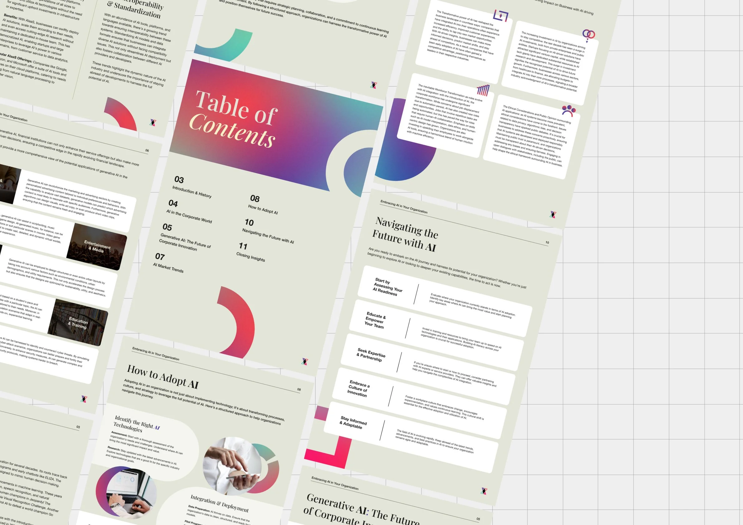
Marketing & Print Materials
Traditional AEQ materials, including white papers and one-pagers, were redesigned to feel clearer, more modern and easier to navigate. A balanced layout system, strong visual hierarchy and consistent use of the new brand elements helped communicate complex information more effectively while creating a more cohesive experience across every document.
Together, these applications created a more cohesive and recognisable brand experience, helping AEQ communicate with greater clarity and consistency across every touchpoint.
The refreshed identity gave AEQ a more cohesive and confident visual presence that better reflected the quality of its work and expertise.
It helped the consultancy communicate more clearly in client-facing situations, particularly through pitch decks and presentations, where the new brand system, improved hierarchy and visual language made complex ideas easier to understand and more persuasive.
The refreshed identity also improved consistency across future collaborations and marketing output, helping AEQ present itself more professionally while providing a flexible visual system that could continue to grow with the business.
Outcome & Impact
The biggest takeaway was that a strong idea creates stronger systems. Once the concept of balance became the foundation for the identity, every design decision became easier to evaluate. It stopped being about individual assets and became about whether each element strengthened the system as a whole.
Reflection
“I’ve had the chance to work with Josh on a few occasions & each time I am impressed with his thoughtful design, great demeanour & great communication.”