

FARO: Brand Identity
FARO is a platform designed to support people going through separation or divorce. The goal was to shape a brand system & digital experience that feels clear, calm & reassuring, helping users feel supported during a stressful time.
Client: FARO
Role: Lead Visual Designer
Deliverables: Brand identity, logo design, brand system, website design prototype
Timeline: 5 Months
Brief
Design a brand identity, logo & website direction that reflects FARO’s mission: to bring clarity, guidance & structure to people facing a difficult life transition.
Objective
Communicate trust, calm & guidance & create a visual language & logo that feels confident but not clinical.
Challenge
People engaging with FARO are often overwhelmed & uncertain. The brand needed to feel professional & credible, yet warm & supportive. The visual system had to balance clarity with emotional resonance without becoming sterile or generic.
Approach
I developed two visual directions early on, grounded in the brand’s core values: trust, clarity & guidance. The chosen direction leaned into muted, calming tones with gentle typography and an understated visual language that feels reassuring rather than loud or distracting.
Option A - Muted & Calming
This route emphasised muted tones, gentle typography, and understated visual language, prioritising a calming, reassuring aesthetic appropriate for sensitive subject matter.
Option B - Bold & Bright
A more vibrant direction using stronger colour contrasts, bolder typography, and expressive graphic elements to communicate confidence and forward momentum.
Every design choice was made with empathy in mind - from colour & type to spacing & hierarchy - helping users focus on content without unnecessary noise.
Logo Exploration & Meaning
The FARO logo was explored & developed with careful consideration of the platform’s guiding ethos. Faro means “lighthouse” in several languages - a universal symbol of guidance & safe passage. I explored various logo options, applying the ethos in multiple ways, I pushed these concepts further across web & app design ideas to get a strong overall feeling.
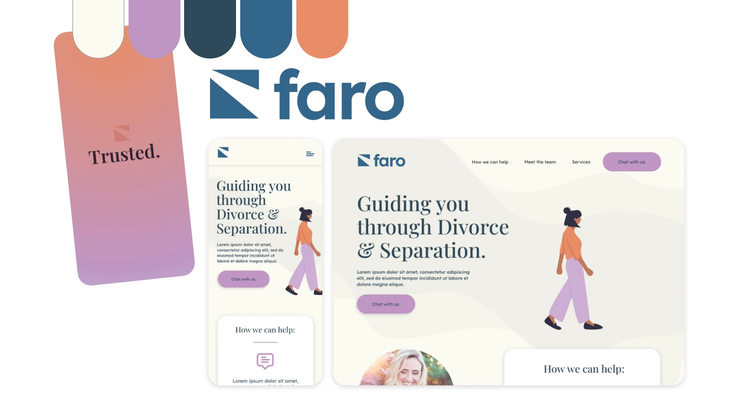
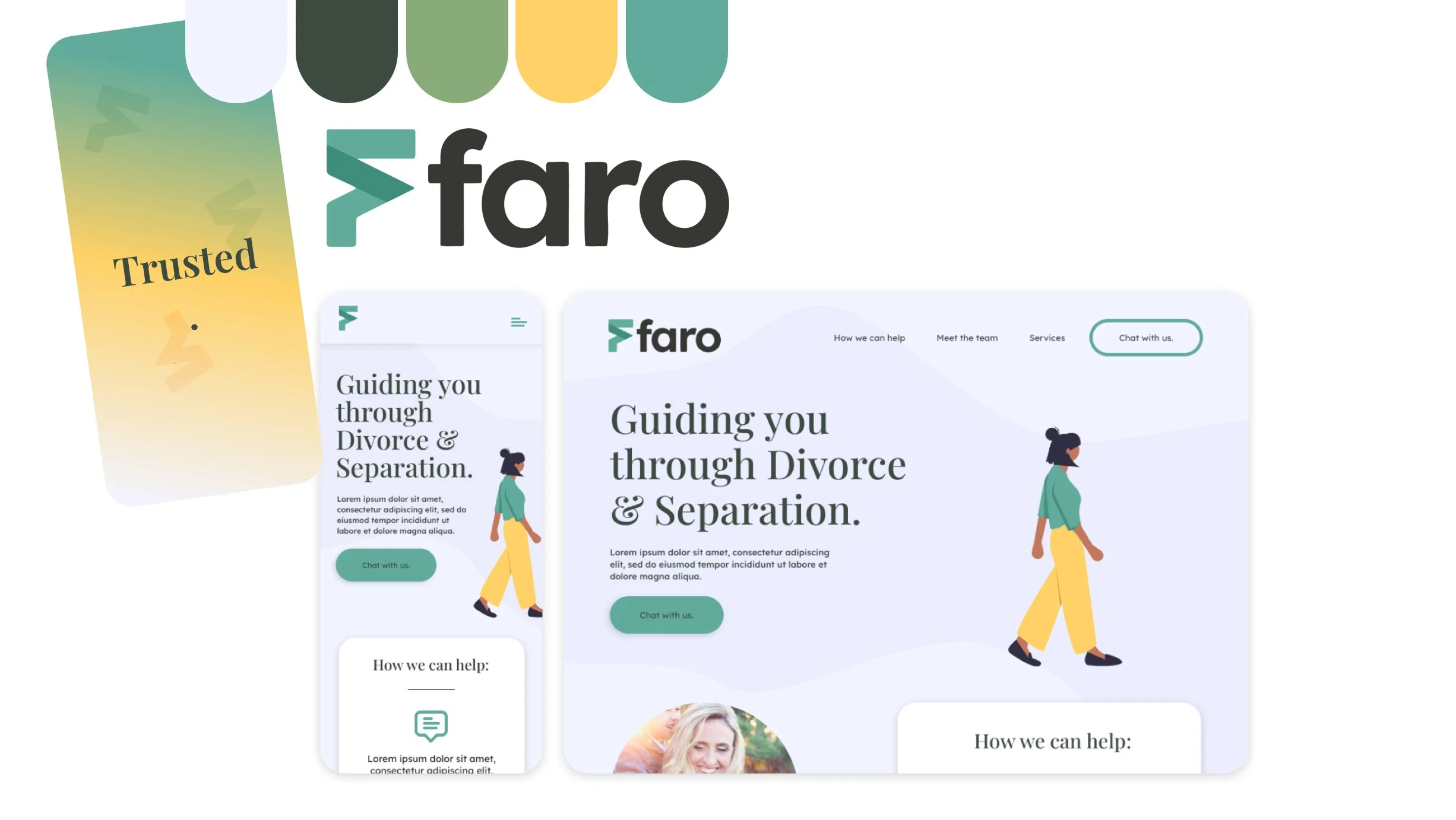
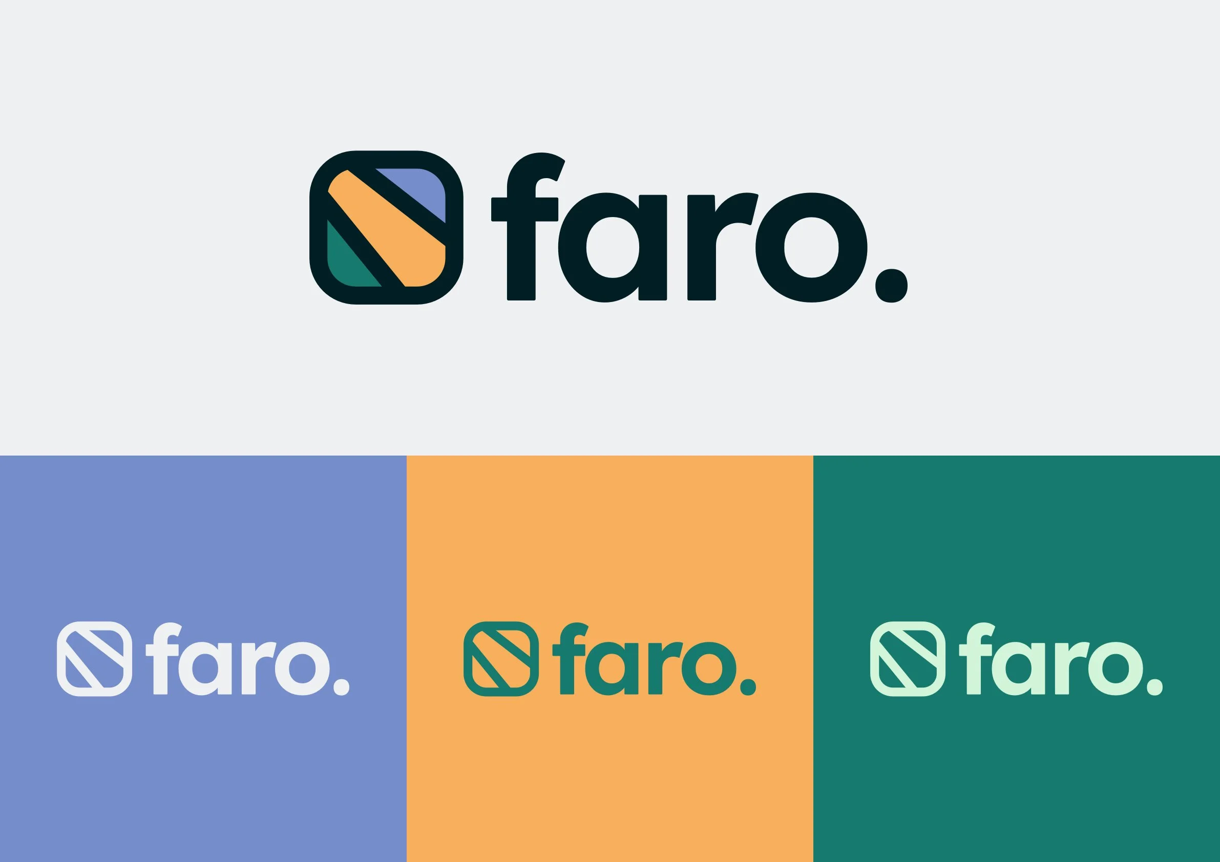
The FARO logo was designed to feel stable simple & dependable. Rather than being expressive or decorative, the mark focuses on clarity & balance, reinforcing the idea of guidance & direction.
It’s simplicity allows it to sit comfortably across digital & print touchpoints without distracting from the content or emotional context of the platform.
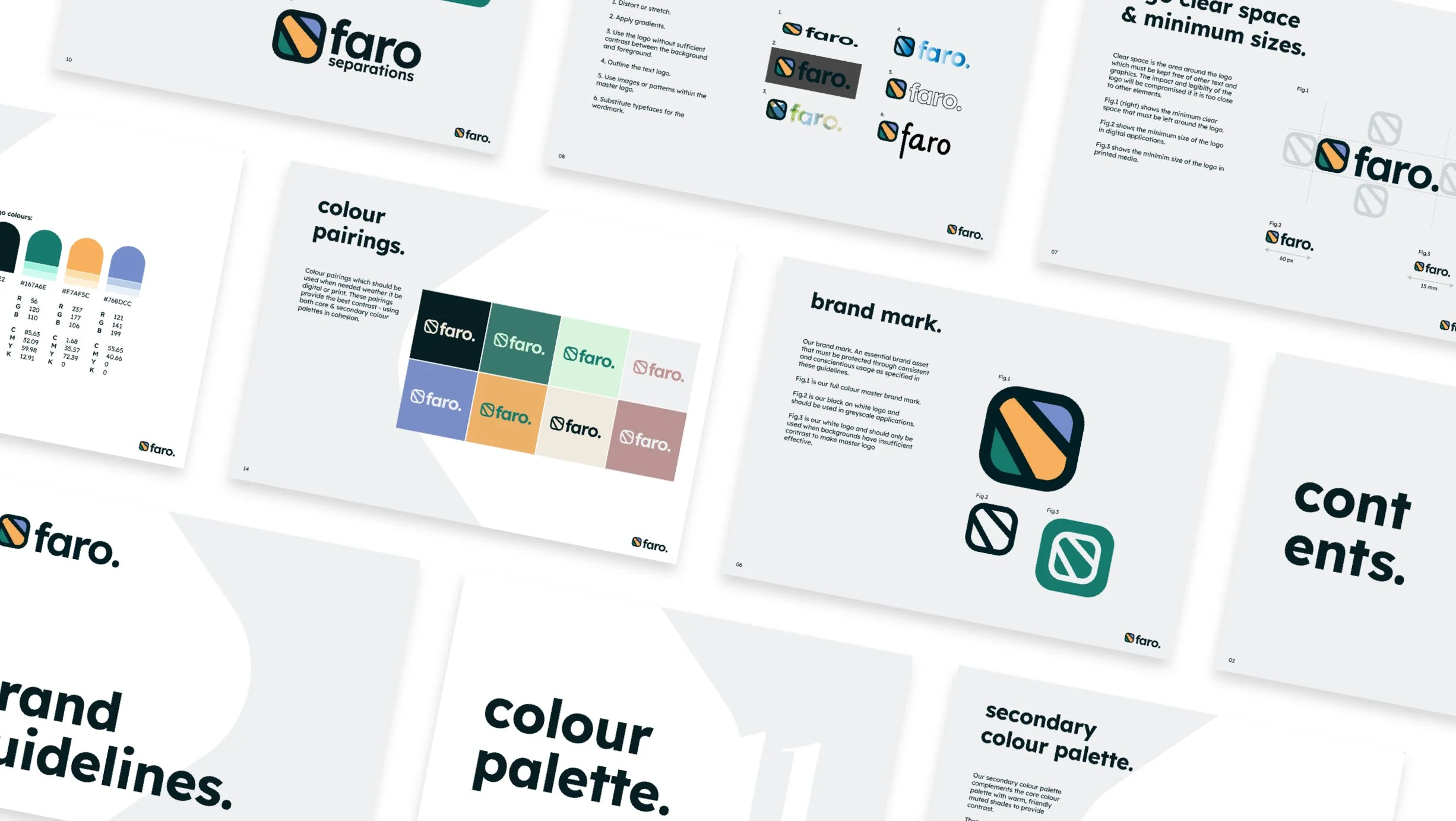
Brand System
The wider brand system builds on the same principles as the logo:
A muted, calming colour palette
Clear typographic hierarchy to support readability
Minimal graphic elements used sparingly
Together, these elements create a consistent & flexible identity that can scale across web, social & printed materials while maintaining a supportive tone.
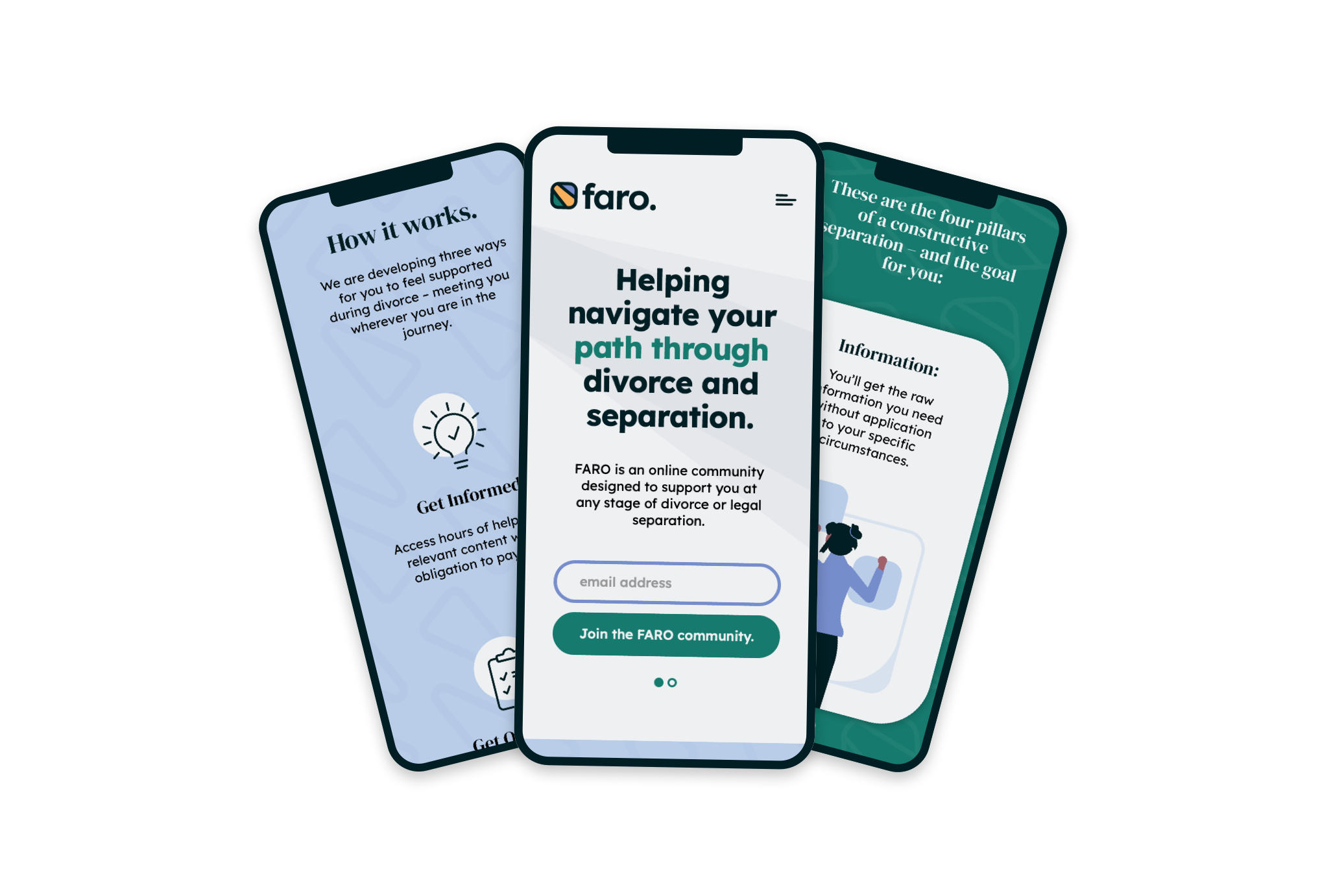
Website Design Prototype
The website prototype demonstrates how the brand system translates into a digital experience. The focus was on structure & flow, it’s logical & reassuring.
The prototype acts as a visual blueprint for how FARO could exist online. https://faroseparations.com/
The final identity gives FARO a calm, confident presence. The brand feels trustworthy & human, providing a clear foundation for supporting users through a difficult life transition.
FARO now has a cohesive brand system that can grow with the platform. The identity supports future development across digital & print, while maintaining consistency & emotional sensitivity.
Outcome & Impact
Reflection
This project reinforced how important restraint is when designing for sensitive topics. Small decisions around colour, spacing & typography had a big impact on how the brand feels. It was a reminder that good design doesn’t need to be loud to be effective - especially when empathy is the priority.
“I had a Fantastic experience working with Josh on Faro. His speed of delivery & efficiency were impressive! I highly recommend him for any design projects.”