

Network — Creating a clearer, more scalable email design system
I created a scalable email framework for HealthServiceDiscounts, designed to bring greater clarity and consistency to its member communications.
Client: Network Digital/HealthServiceDiscounts
Role: Visual Designer
Deliverables: Email design system with component library, email re-design.
Brief
Redesign Network’s HealthServiceDiscounts email communications to make them easier to digest, more engaging and more effective at driving clicks.
Objective
Create a clearer hierarchy that helps members quickly understand what’s on offer, while giving the most important promotions greater impact.
Challenge
The existing emails were packed with strong offers, but too much was competing for attention. Similar visual weight across offers, logos and promotional content made the experience feel dense and difficult to scan.
The opportunity was to create a clearer hierarchy, giving priority offers more impact while creating a flexible structure for supporting content.
Approach
Rather than simply refreshing the visual style, I focused on how the content was structured and consumed.
I introduced a clearer hierarchy between priority and supporting offers, softened the colour palette and used whitespace to create more breathing room.
From there, I developed a modular component system that could be rearranged depending on the content and commercial priority of each email.
Audit
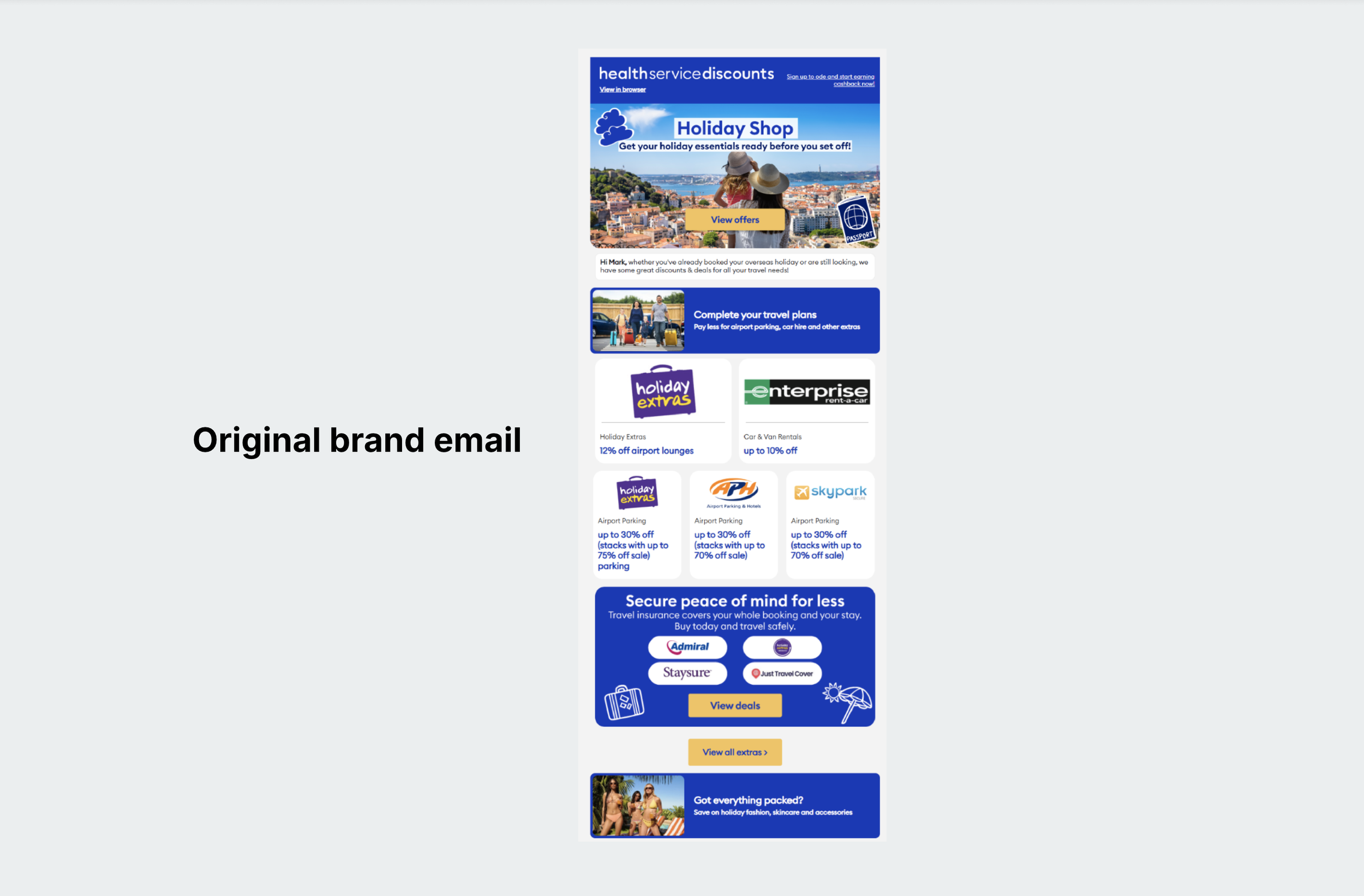
Across the three email formats, the same core issues kept appearing:
Too many competing offers
Weak visual hierarchy
Heavy use of stark electric blue
Inconsistent spacing and structure
Difficult to scan quickly
Email design system
I built the new system around six core principles:
Clear hierarchy — prioritise the most important messages and offers.
Focused offers — make the primary action obvious.
Easy to scan — concise copy, considered imagery and generous whitespace.
Consistent typography and spacing — create a cohesive experience across different emails.
Softer colour palette — guide attention without overwhelming the content.
Flexible components — adapt the system to different campaigns and commercial priorities.
The aim was to create a framework that could evolve with the content, rather than requiring each email to be designed from scratch.
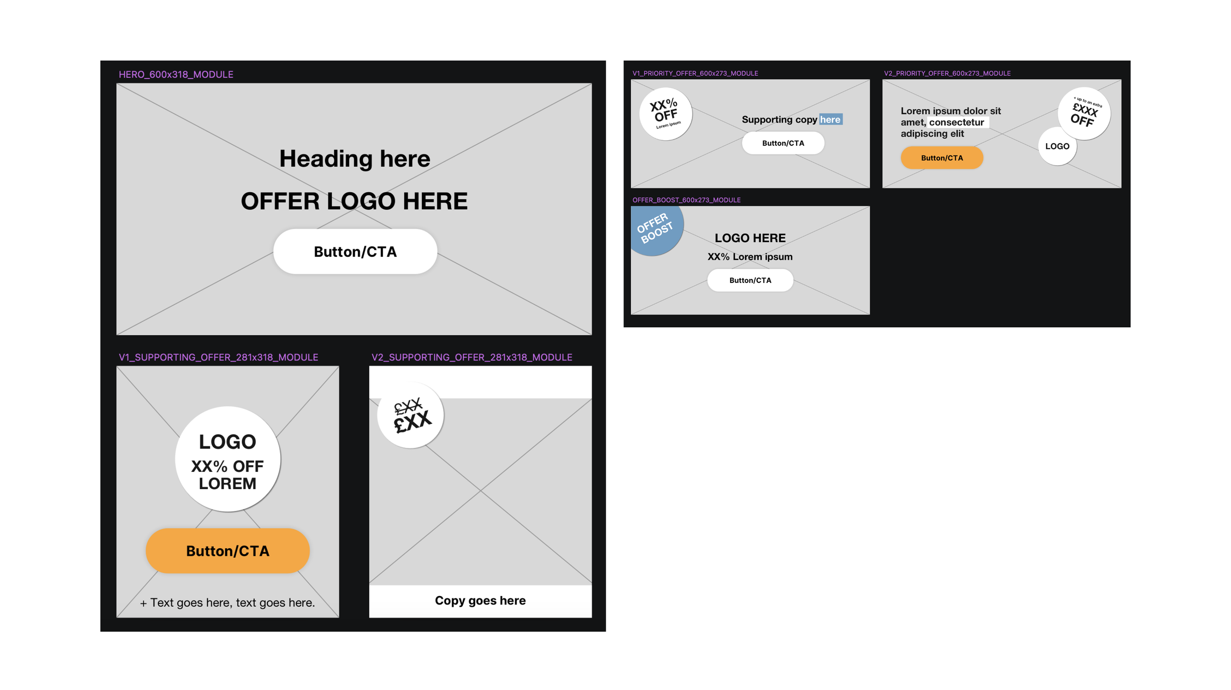
Flexible, modular component library
I created a library of reusable hero, priority offer, supporting offer, offer boost and CTA modules.
These could be combined in different ways to create different email structures, while keeping the overall experience consistent.
This meant the system could flex around the content, whether one offer needed to lead the experience or several supporting offers needed to sit alongside it, it would work.
Bringing it all together

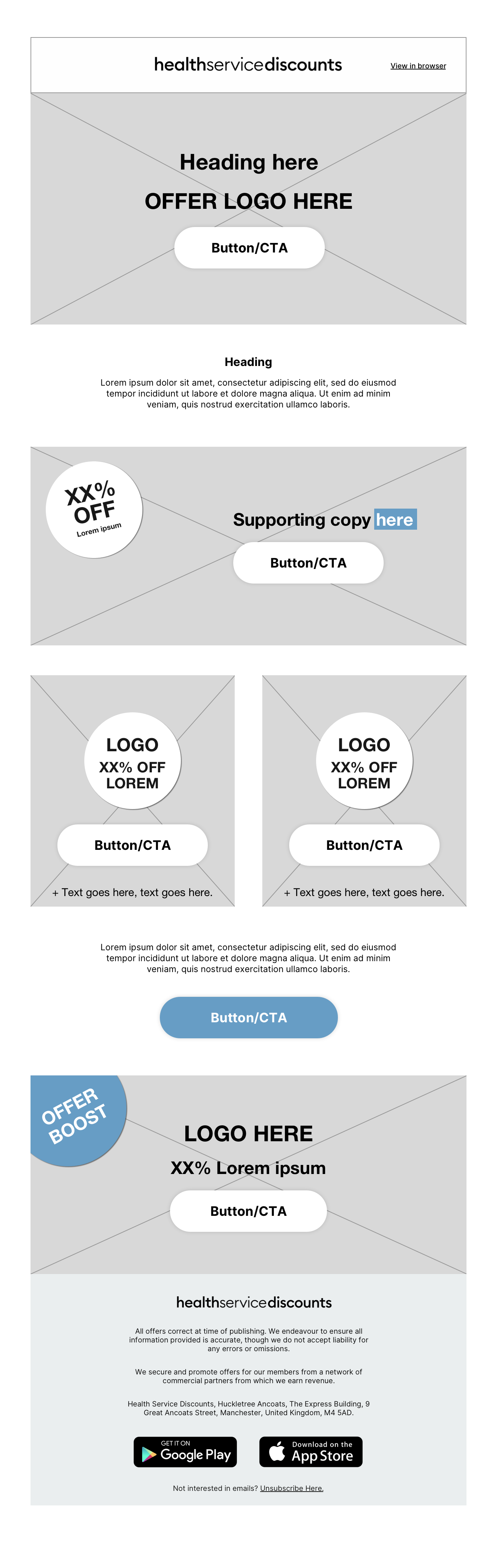
I used the component library to build a series of email designs, testing how the system could work across different content and requirements.
A stronger hierarchy gives offers room to shine while creating a clear journey through the email.
The modular system can flex between multi-offer newsletters and more focused Solus communications, using considered imagery and cropping, clear visual hierarchy and confident whitespace to keep each experience engaging without letting supporting content compete with the main offer.

The redesign moved Network’s emails away from an equal-weight list of promotions towards a clearer, more considered experience. Offers are easier to navigate and understand, with stronger visual focus on the content that matters most.
The modular framework also provides a more consistent foundation for future communications, allowing different email formats to be built from the same core system.
My aim wasn’t simply to modernise the emails visually, but to make the content easier to discover, understand and act on, giving each promotion room to stand out and breathe.