
Moss & Adams — Elevating an affordable product into a premium brand
Moss & Adams is an affordable British hand soap brand inspired by the landscapes and fragrances of the UK countryside. With the launch of new packaging, I created a refreshed brand system and website designed to give the brand a more premium feel, while retaining its everyday, accessible nature.
Client: Moss & Adams
Role: Lead Designer
Deliverables: Brand system, website design, social design, photoshoot & print design.
Brief
Create a refreshed identity, website and launch imagery for an affordable hand soap brand that feels considered, elevated and distinctive.
Objective
Raise the perceived value of the brand by creating a visual language rooted in the British countryside, translating fragrance, place and product into a richer brand experience across physical and digital touchpoints.
Challenge
The hand soap category is crowded and visually noisy, with many competitors relying on bright colours, generic layouts and familiar luxury cues to signal quality.
The challenge was to create a brand that felt premium without appearing exclusive, using storytelling, craftsmanship and a strong sense of place to create a more authentic point of difference.
Exploring the fragrance concepts revealed that every product was inspired by a real countryside location. That insight became the foundation for the creative concept, shifting the identity away from conventional luxury cues and towards memories, place, nostalgia and storytelling.
Approach
Rather than relying on premium cues like dark colours or metallic finishes, I focused on creating a brand built around craftsmanship, storytelling and a sense of place, helping the product feel elevated without becoming exclusive.
This approach gave the brand a more authentic point of difference, creating a recognisable personality in a category where premium products often rely on the same visual language.
Because the fragrances were inspired by countryside locations, I wanted the brand to feel personal and nostalgic, almost like a scrapbook collected over time. This concept gave each scent its own story while creating a flexible visual language that could grow as new fragrances were introduced without losing the brand's identity.
Polaroid-style photography documented the locations behind each fragrance, reinforcing the idea that every scent had a genuine origin. Rather than acting as decorative imagery, the photographs became evidence of the stories behind the products, strengthening the connection between place, memory and fragrance while making the brand feel more personal and believable.
Photoshoot
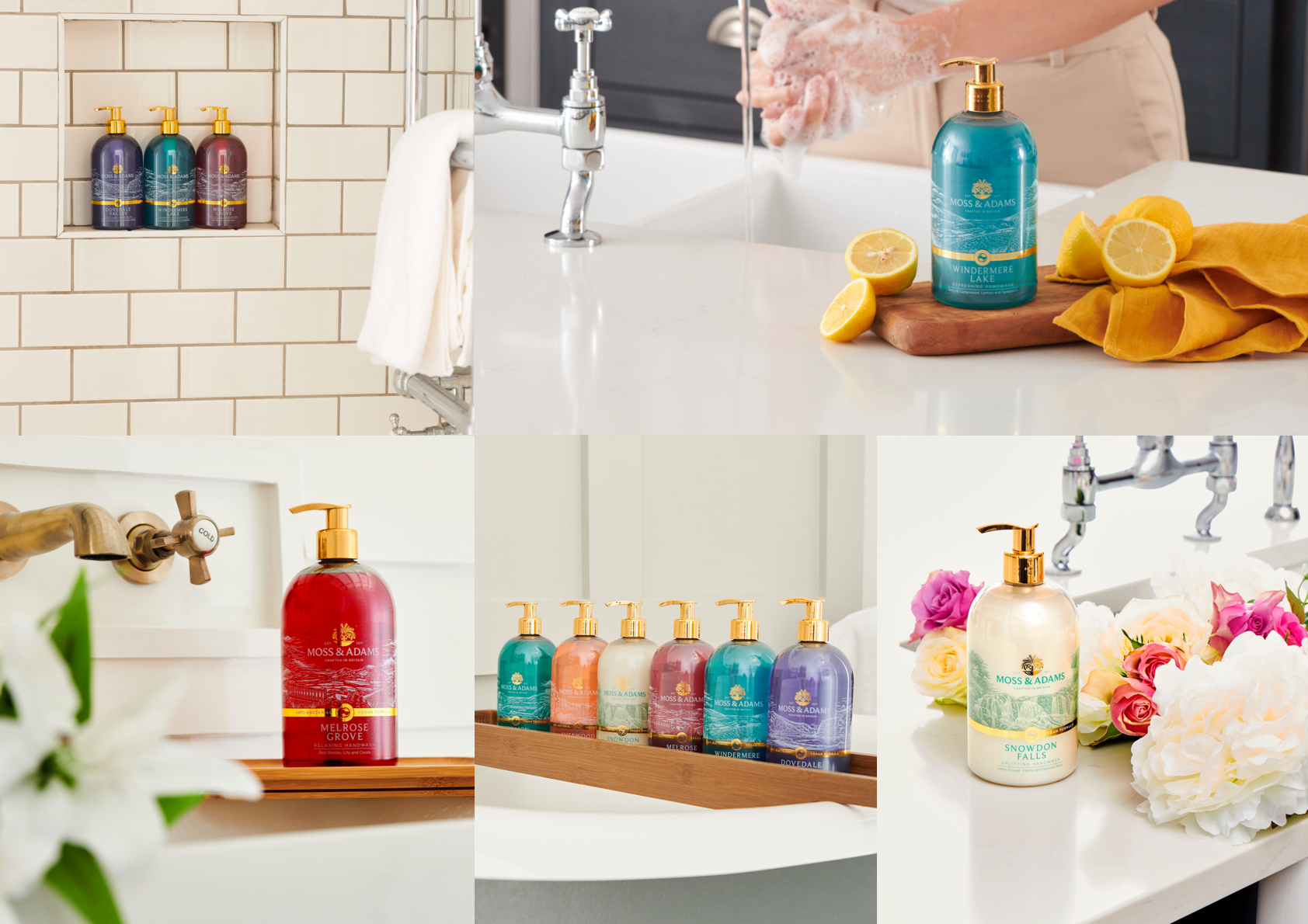
I art directed the launch photoshoot to create a versatile image library that could be used consistently across the website, social content and printed materials.
Every aspect of the shoot, from the shot list and styling to props, location scouting and lighting direction, was planned to reinforce the brand's visual identity, ensuring the imagery felt cohesive across every touchpoint.
Rather than aiming for highly polished product photography, the goal was to create honest, natural imagery that reflected the brand's storytelling, making the products feel elevated while remaining approachable and at home in everyday spaces.
Web Design
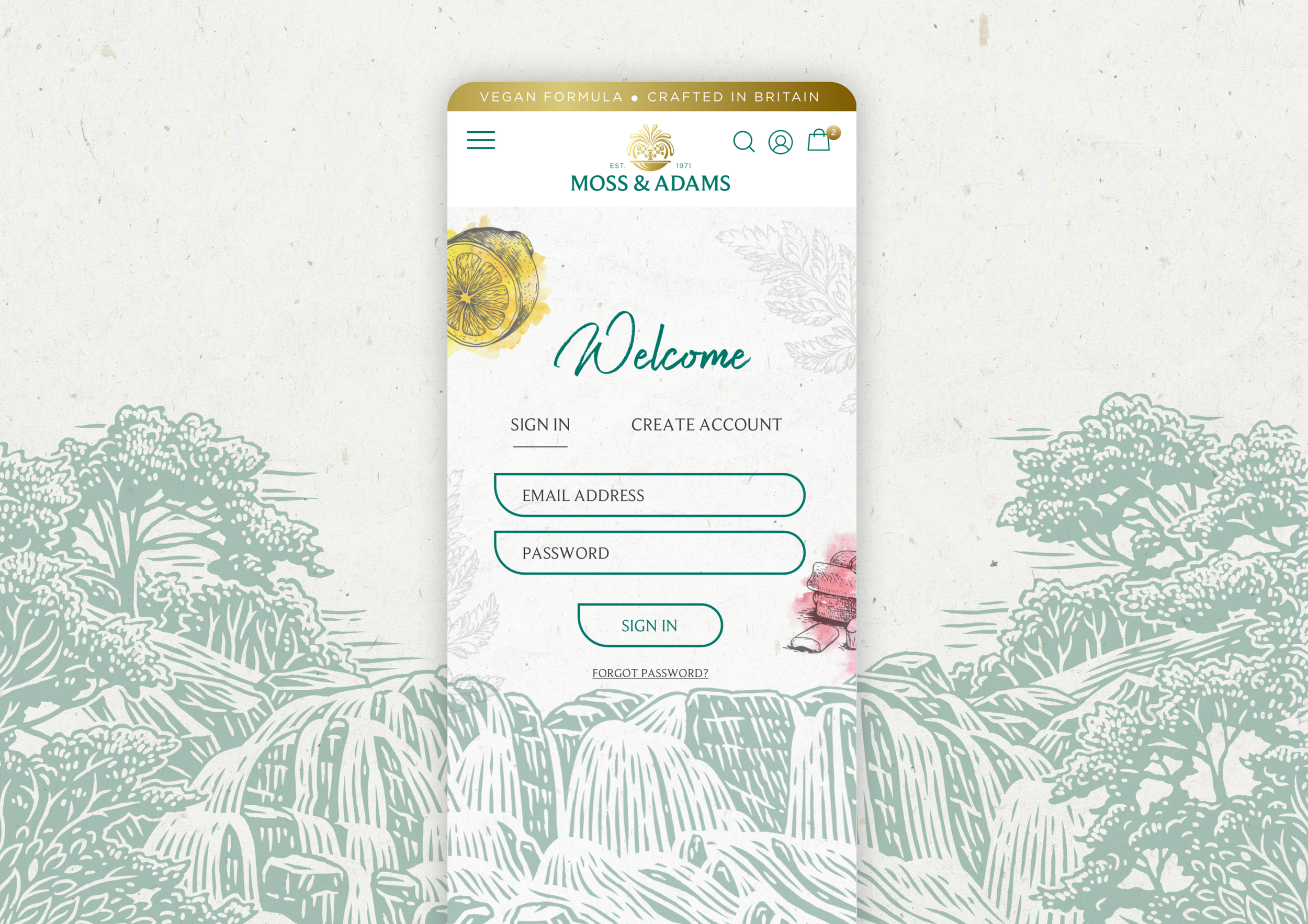
The website translated the scrapbook concept into a digital experience. Layouts were intentionally relaxed, allowing photography and illustration to lead while maintaining a clear visual hierarchy. This preserved the brand's nostalgic, handcrafted feel without compromising usability.
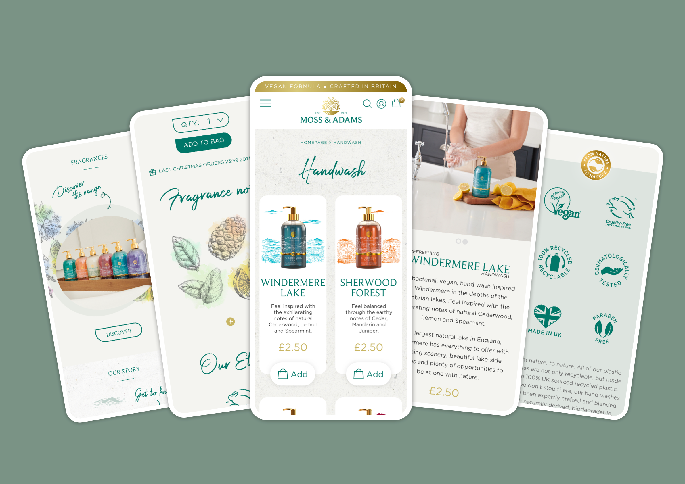
Hand-drawn elements, subtle textures and a soft colour palette carried this aesthetic throughout the site, creating a warmer, more tactile experience that remained consistent with the packaging and wider identity.
The result balanced brand storytelling with usability, creating an experience that felt considered, premium and easy to browse.
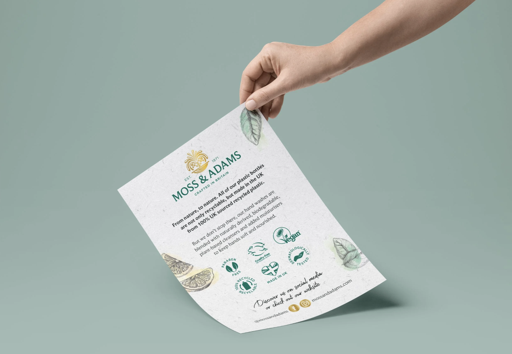
To align with the brand's recyclable packaging and biodegradable ingredients, I designed an influencer mailer card made from seed paper.
Rather than creating a piece that would simply be discarded, the mailer became an extension of the brand's sustainability values. Once planted, it grew into wildflowers, creating a memorable brand experience that felt thoughtful, elevated and low-waste.
Organic & Paid Social
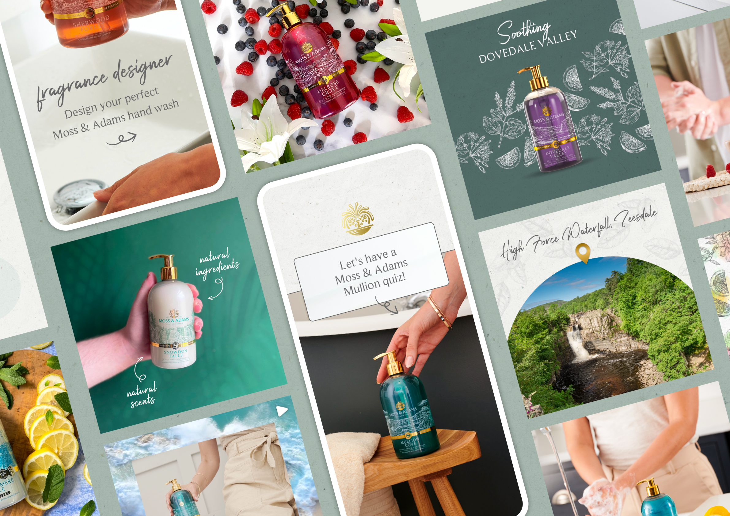
I created paid and organic social assets using imagery from the art-directed photoshoot, extending the refreshed identity across digital channels.
The assets were designed as a flexible system that could support both campaign activity and day-to-day content, maintaining a consistent visual language while adapting to different formats and messages.
Outcome & Impact
The final outcome was a cohesive brand identity and website that elevated the perception of Moss & Adams while remaining approachable and accessible.
By building the brand around storytelling rather than conventional luxury cues, the identity feels calm, considered and distinctive within a crowded category. The flexible visual system also provides a strong foundation for future products, campaigns and brand storytelling.