


Moss & Adams — Elevating an affordable product into a premium brand
Moss & Adams is an affordable British hand soap brand inspired by the landscapes and fragrances of the UK countryside. With the launch of new packaging, I created a refreshed brand system and website designed to give the brand a more premium feel, while retaining its everyday, accessible nature.
Client: Moss & Adams
Role: Lead Visual Designer
Deliverables: Brand system, website design, social design, photoshoot & print design.
Brief
Create a refreshed identity, website and launch imagery for an affordable hand soap brand that feels considered, elevated and distinctive.
Objective
Raise the perceived value of the brand, build a visual language rooted in the British countryside, and translate fragrance, place and product into a richer digital experience.
Challenge
The hand soap category is crowded and visually noisy. Many competitors rely on bright colours, generic layouts and obvious luxury cues.
Moss & Adams needed to stand out in a quieter, more thoughtful way — feeling premium through detail, tone and restraint rather than price positioning.
Approach
Because the fragrances were inspired by countryside locations, I wanted the brand to feel personal and nostalgic — almost like a scrapbook collected over time.
Polaroid-style photography was used to capture the places behind each scent, while hand-drawn illustrations referenced individual fragrance notes. Grain, texture and a muted palette helped give the brand a sense of memory and place, making it feel crafted rather than manufactured.
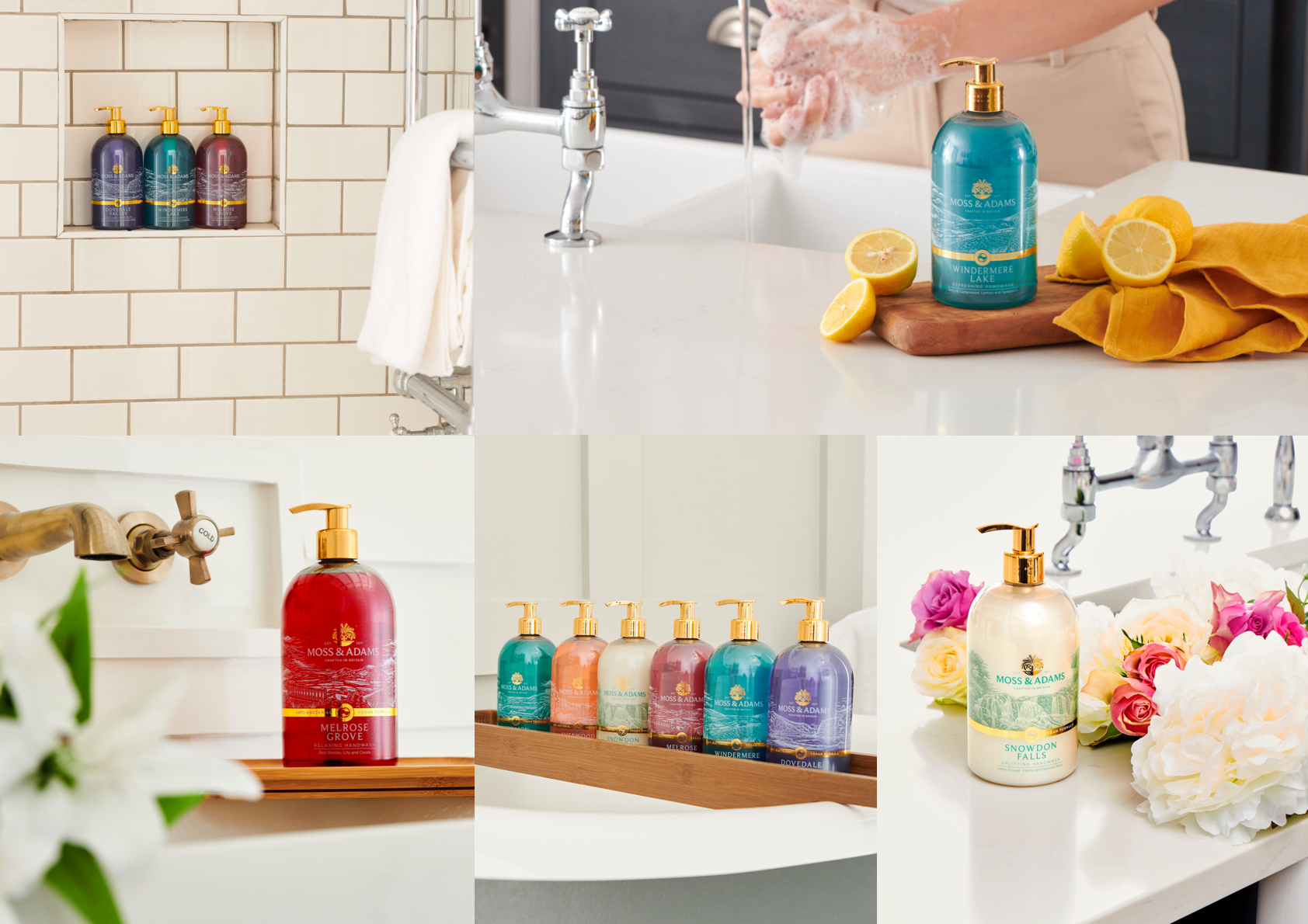
Photoshoot
I art directed a launch photoshoot for the new packaging, creating a versatile image library for the website, social content and printed materials.
This included planning the shot list, props, styling, location scouting, composition, lighting direction and final image selection.
The aim was to create honest, natural imagery that made the product feel elevated but still at home in everyday spaces.
Web Design
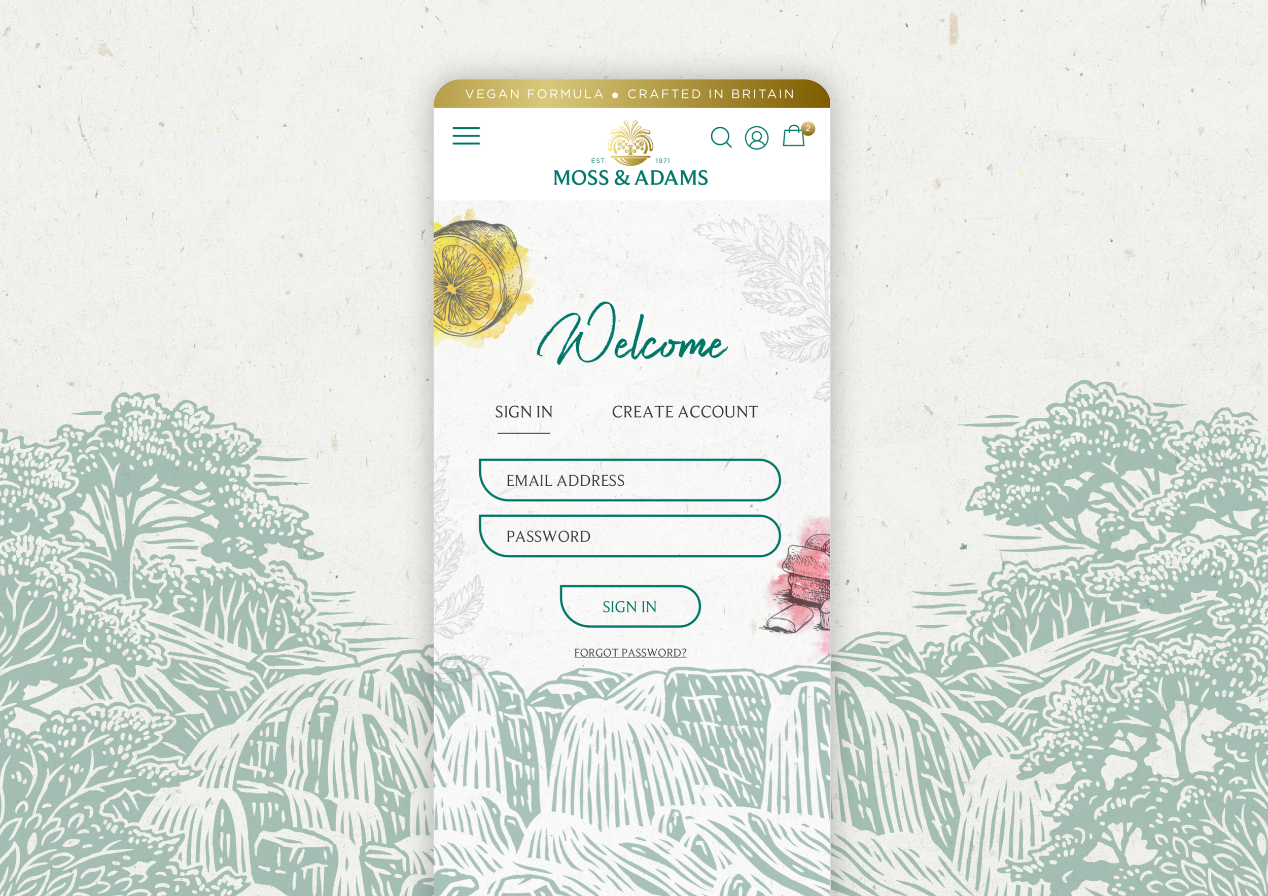
The website brought the scrapbook concept into a digital format. Layouts were intentionally relaxed, allowing imagery and illustration to lead without feeling cluttered.
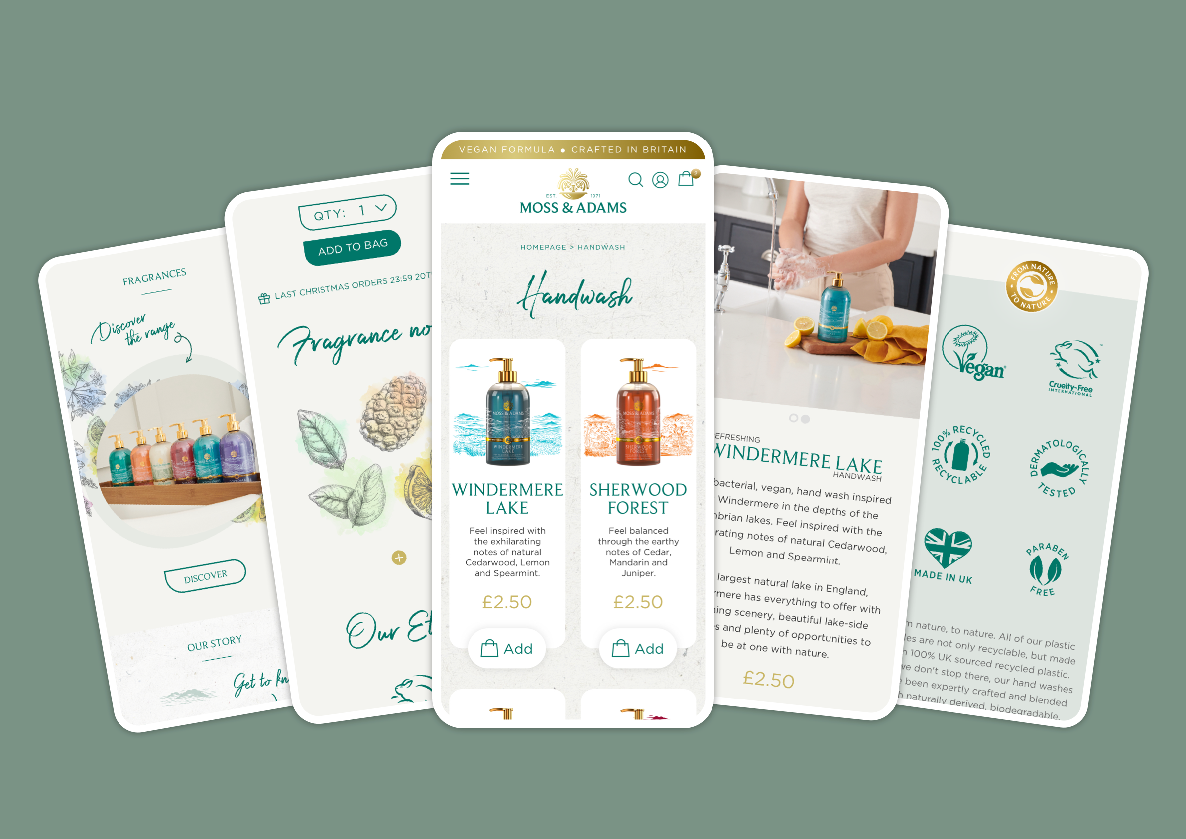
Hand-drawn elements, subtle textures and a soft colour palette helped create a warmer, more tactile online experience.
The result felt considered and premium, while remaining easy to shop and navigate.
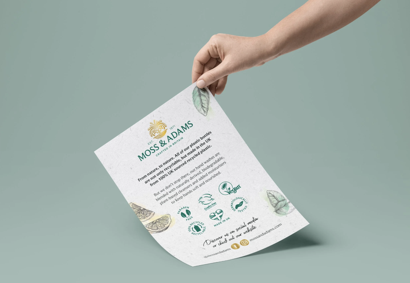
To align with the brand’s recyclable packaging and biodegradable ingredients, I designed an influencer mailer card made from seed paper.
The card could be planted and grow into wildflowers, creating a tactile brand moment that felt thoughtful, elevated and low-waste.
Social Media
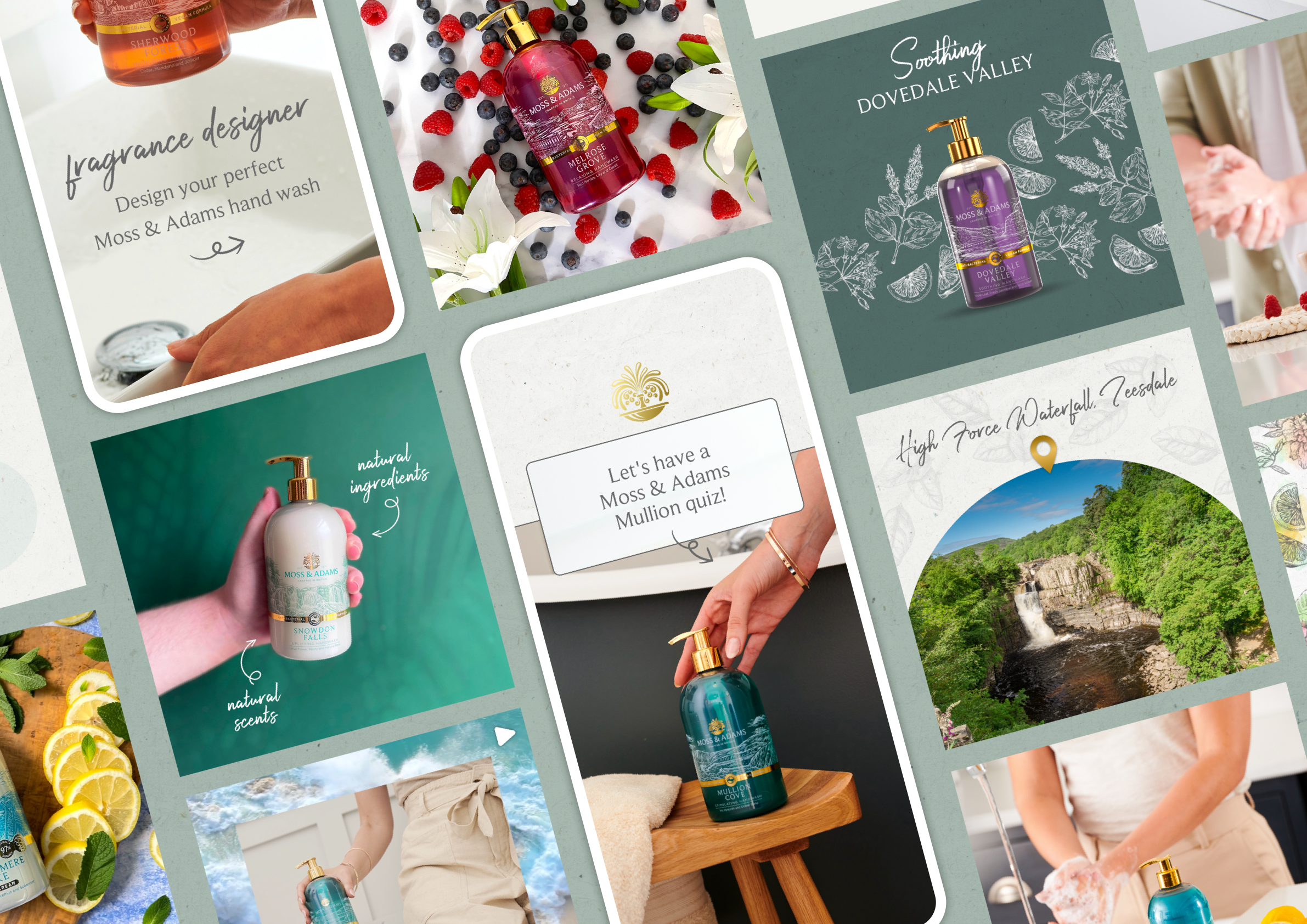
I created a range of social assets that brought the refreshed brand to life in a warm and engaging way.
The content was designed to feel premium, recognisable and approachable, helping Moss & Adams build a more consistent digital presence.
Outcome & Impact
The final outcome was a cohesive brand system and website that elevated the perception of Moss & Adams while keeping it accessible.
The brand now feels calm, considered and distinctive within a crowded category, with a flexible visual system that can grow across future products, campaigns and storytelling.