

Lawrence&Co Rebrand Project
L&Co is a coaching agency that help entrepreneurial companies sustain & accelerate their growth with a keep-it-simple & direct approach. The CEO likes to describe L&Co as ‘Simple. Impactful. No BS. No Fluff’ - these key words helped influence my design choices for the new brand system & logo.

After the initial brainstorming sessions, I started the task of creating a new logo which included rounds of concepts to really explore & whittle it down. The client wanted the new logo to be clean & simple so I created a modern, ‘no fluff’ logo, highlighting the chevron to represent the companies tag line…Simplified Growth.
Logo redesign
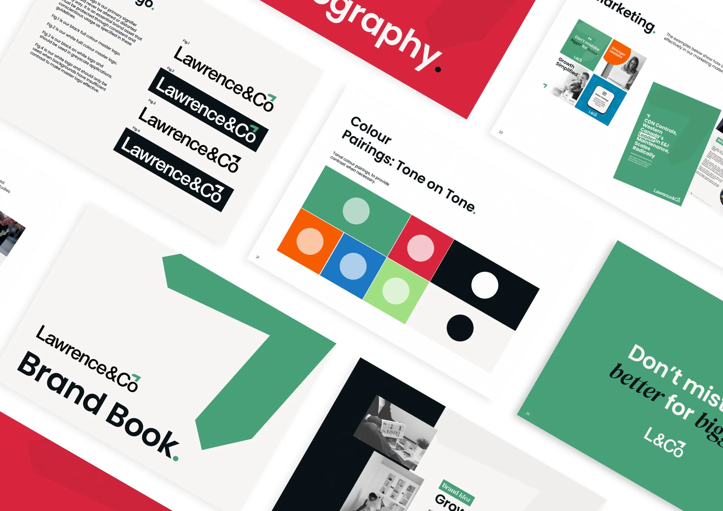
After a logo had been agreed upon & created, I designed a 40 page brand system consisting of rules for typography to brand patterns & the best ways to display.
The client’s original brand system consisted of single page showing only a limited colour palette, my goal was to bring in a fully usable brand system to help the coaches, marketing & sales teams create cohesive brand assets.
Brand system

I applied the new brand system to outgoing materials such as pitch decks, brand presentations, social & web.